Breaking Bottlenecks: How Hack Week Transformed Crosscut's Performance
Early last year, we cleared our calendars, canceled our meetings, and hunkered down to focus on one critical challenge for an entire week. We called this "Hack Week" because we needed to solve a technical bottleneck that was preventing us from scaling to larger countries with more complex mapping needs.
If we wanted to scale, we had to rethink how Crosscut handled geospatial data. For that, we relied on Hack Week. I'd like to share what we learned and why we'll do it again soon.
From Maps to Meaning: What is Crosscut?
For those unfamiliar with our work, the Crosscut App helps various types of organizations create catchment area maps that show which communities are served by which facilities or distribution teams. These geospatial maps support resource planning across global health and other fields, whether for distributing vaccines, planning malaria prevention, or optimizing logistics networks.
Breaking Performance Barriers
Where were we falling short leading up to Hack Week? While our app worked just as intended for smaller countries, we hit significant performance barriers with larger countries. The larger the country, the worse the user experience started to feel.

Luckily, we had a rough idea of the problems we could start with to optimize performance for larger clients:
- Sluggish load times – Maps could sometimes take 5,10, 20 seconds to load – if at all.
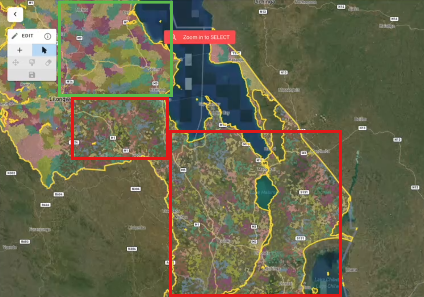
- Incomplete data display – Sometimes users would see blank spots or “dead zones” where data couldn't load due to necessary server thresholds. (Image)
- Limited country coverage – Users analyzing larger countries with complex geographies couldn't use our app–or were hesitant to try.
- Clunky map editing – Making changes to catchment areas felt slow and unresponsive.
- System-wide slowdowns – The heavy processing demands were affecting maps and other parts of the app and broader website.
Working with partners across 43 countries, we've seen how valuable accessible mapping can be. Since the Crosscut App was working great for smaller partners, we decided it was time to focus on helping larger ones. But bigger partners bring bigger datasets that we just weren't prepared to handle.
Hack Week: Getting Into Flow
To tackle this challenge, we organized our first-ever Hack Week. We didn’t know exactly what would happen, but we jumped in with total and unencumbered focus. No meetings, daily stand-ups, or other distractions. The goal was to create uninterrupted time for deep work—space to think, test, and iterate without distractions.
Our talented engineers are fantastic at solving complex technical challenges. We're lucky to have them on our team. Given uninterrupted time without constant notifications, calls, meetings, or side projects, they accomplished in days what might normally take months. It was exciting! What began as a simple experiment quickly turned into a major performance breakthrough.
Peeking Under the Hood
At the core of the problem was how we handled geospatial data. We were using GeoJSON, a common mapping format that works well for smaller datasets and benefits from a simple data structure that can even be read by text editors. It had served us well and helped organizations do great work to this point. But for larger countries with complex boundaries, it became a bottleneck. There was simply too much data trying to load at once.
That’s what Hack Week set out to fix. Our team needed a way to make Crosscut scale without compromising speed or usability. After exploring different approaches, we landed on a solution: a tile-based mapping system, similar to how Google Maps handles large datasets.
Instead of loading an entire country’s dataset at once, like trying to download a massive file every time you open the app, we now break the map into smaller, more manageable pieces. These map tiles load dynamically, so users only download the data they actually need as they zoom in and out.
The real breakthrough was swapping GeoJSON for FlatGeobuf, a more efficient format that loads data faster. We also integrated Mapbox Vector Tiles for smoother rendering and removed file size limits that had been slowing things down.
Technical Recap
- Data Format Change: From GeoJSON to FlatGeobuf
- Dynamic Rendering: Mapbox Vector Tiles for more efficient front-end rendering
- Removing Server Constraints: Lifting file-size limits for faster data retrieval
Reworking a system like this in a week wasn’t easy, but the difference was noticeable right away. Straight off our app was clocking faster load times, smoother navigation on the front end, and no more getting stuck waiting for maps to appear.
From Seconds to Milliseconds
The results honestly exceeded our expectations. Load times for large countries dropped from 20+ seconds to under 1 second in most cases and our GTMetrix scores (like a performance review from Google) skyrocketed. Users can now seamlessly pan and zoom across any country without experiencing lag or incomplete data.
Beyond raw performance, the improvements unlocked several key benefits:
- Support for any country – We can now onboard any country, regardless of geographic complexity
- Smoother editing experience – Users can now modify and update catchment areas with immediate visual feedback
- More comprehensive data layers – The efficiency gains allow us to include additional contextual data on maps
- Eliminated "dead zones" – No more missing data in maps due to server limitations
Hack Week Surprise
What surprised me most about Hack Week wasn't just the technical achievements, but the energy it created among our team. Each day brought visible progress as the solution took shape. There was a tangible sense of accomplishment watching performance metrics improve day by day.
The format also created space for deeper learning. We gained insights into areas of our codebase we hadn't previously explored, sparking ideas for future improvements. Sometimes the most innovative solutions come from diving deeply into complex problems rather than applying quick fixes.
What We Learned
Of course, with any intensive development sprint, we discovered new challenges along the way. Some were easily fixed, while others will require future attention. For example, we found some visual glitches when zooming out to extreme levels (we've implemented temporary guardrails while working on a more elegant solution).
The success of Hack Week has us planning to make it a recurring event. We've compiled a list of high-impact challenges that could benefit from this focused approach, from accessibility improvements to new analytical capabilities.
Real-World Impact
These technical improvements have genuine real-world implications. For instance, in malaria prevention efforts, our app now enables detailed microplanning for campaigns like indoor residual spraying and insecticide-treated net distribution. Health ministries in larger countries can now use Crosscut to plan national campaigns, helping more communities get the necessary prevention and treatment services.
While our primary focus remains on making our app freely available to public health users worldwide, these improvements extend to other sectors. The same capabilities help optimize logistics networks, plan infrastructure projects, or analyze market coverage—all areas where our advisory services can support your needs.
Have you tried the Crosscut App yet? It’s free to use at crosscut.io, and we’re eager to hear your feedback. If you’re in logistics, market analysis, or infrastructure planning, let us show you how these enhancements can streamline your operations.
Related Posts
An independent evaluation of the Crosscut App
.JPG)

How to set up a Microplan Collector project in the Crosscut App

May 2026 updates: Shared microplan projects and easier supervision analysis