
Triangulating Microplans Using Satellite Imagery
.png)
Health teams rely on microplanning because it reflects real-world knowledge of those closest to the front lines of health services. These local teams understand population shifts, informal settlements, and seasonal trends that census projection and population models may miss, picking up what centralized planning drops.
In our article on Excel and email microplanning workflows, we walk through how most teams usually plan: receive Excel templates, estimate populations for each health post's catchment area, then submit detailed community-level data upstream, where they are aggregated, analyzed, adjusted where necessary, and approved.
A key part of the microplanning process is when the microplans are analyzed and adjusted. Basically what happens is the higher ups in the health system receive the microplans (i.e. the target population estimates of the lower level staff). They look for potential data errors and outliers and have a back-and-forth with the lower level to either accept it or adjust it.
For example, is the population too high by mistake or has there been a recent influx of which the upper level persons of the health system are unaware? When the estimates you’re getting from the field differ dramatically from satellite baselines, you need a practical way to spot why that’s happening.
Automatic triangulation bridges these approaches
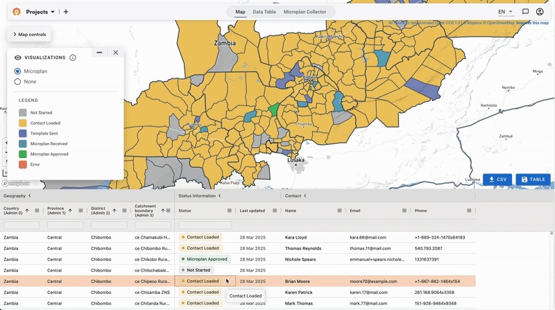
Rather than choosing between satellite precision and local knowledge, our approach automatically compares them. When district teams submit population estimates through our free Microplan Collector, their data gets compared against multiple satellite sources instantly.
This view from within the Crosscut App shows submitted field estimates alongside WorldPop, Meta, and GRID3 data in the right-hand panel. When these sources align but field teams submit something dramatically different, that may be worth investigating. Not because the satellite data is automatically correct, but because triangulating multiple imperfect data sources is a proven method for improving target population estimates.
This validation process is still a bit of an art because you're looking for outliers more than absolute truth. You don't want to say "go with WorldPop over what was submitted." But if field numbers are significantly below what satellites suggest, that triggers follow-up to investigate what happened during collection.
Three patterns worth a closer look
When field data diverges from satellite-based estimates significantly, it typically follows one of these patterns:
- The conservative estimator: Field teams consistently report numbers below satellite estimates. This could be the result of enumerators only using public school registrations and ignoring students at private schools, or this could reflect teams only counting households they directly verified, missing settlements they couldn't reach due to security or access issues.
- The ambitious counter: Submitted numbers are consistently higher than baselines. This sometimes happens when field teams receive financial resources for the campaign in relation to the number of persons in their area.
- The outlier: One district reports dramatically different numbers than other sources suggest. This usually points to either a data collection problem OR legitimate local conditions the satellites miss, like displacement camps or seasonal worker populations.
When your field data differs significantly from multiple satellite sources, the WHO best practice is to analyze and adjust where necessary. Is there a displacement camp the satellites don't capture? Have people moved to the area because of seasonal work? Benchmarking helps you figure out which one it is.
Buildings and accessibility add context
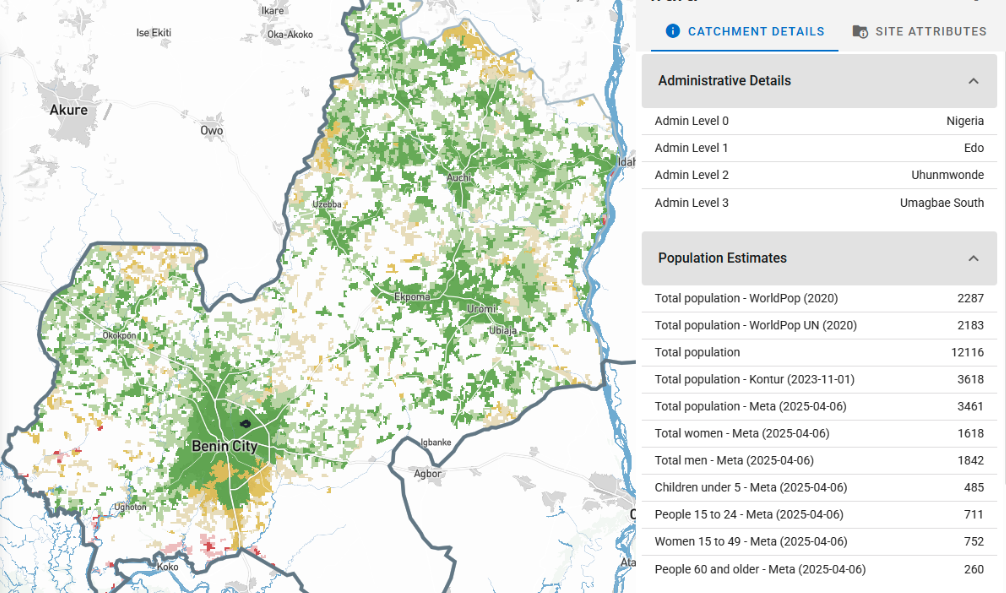
For campaigns like indoor residual spraying, where building counts matter most, the same approach applies.The Crosscut App pulls in Google's building footprint data and OpenStreetMap building counts so spray teams can easily validate their structure estimates using the same automatic approach.

Travel time analysis adds another layer planners can apply. Our app overlays travel time heatmaps that show actual walking times to health posts, accounting for terrain, buildings, borders, and road networks. If a district reports serving villages that are actually closer to a different facility, that insight helps you allocate resources with less guessing work.
Quality control, not replacement
The goal isn't to replace field expertise with satellite feeds. Data triangulation supports better decision-making by giving project managers the tools to ask better questions when something doesn't add up. The art of this microplan validation process is knowing when these outliers reveal problems versus when they reveal nuances the models missed.
Sometimes the challenge is that you're dealing with missing data entirely. Not all field staff submit their microplans on time, which leaves gaps in coverage planning. When campaign deadlines approach and you still have blank spots on the map, satellite imagery is a much-needed backup source to estimate populations for those areas.
When a district's submission differs from satellite estimates, that starts a conversation:
- Did the team encounter access barriers?
- Are there displacement camps the satellite data doesn't capture?
- Did administrative boundaries change since the last census?
Effective planning teams use benchmarking as a quality control step for field-level data collection. Satellite estimates provide the baseline for comparison. Local teams provide the context and ground truth. Good triangulation combines both perspectives.
Precise planning without GIS expertise
As we saw in our recent survey of 50+ global health leaders, many planning teams are looking for more accurate numbers, but they don't have the tools or resources to validate them.

The solution is integrating benchmarks without the GIS complexity. No downloading shapefiles. No GIS software. No hunting down Meta's population layer or sorting through building footprints in Google Earth. You just zoom in and see whether the numbers add up.
The Crosscut App makes this validation accessible to teams who understand their programs but don't necessarily need to become GIS specialists to get better data.
Related Posts

How the Crosscut App helps plan health campaigns in Nigeria

An independent evaluation of the Crosscut App
.JPG)

How to set up a Microplan Collector project in the Crosscut App
