
Paint, Don't Point: Simple Catchment Area Editing (No QGIS Required)

Organizations often struggle with outdated catchment area maps and inaccurate service areas. A new road changes how people access facilities, local knowledge reveals better boundaries, or program needs shift. But updating the maps to reflect those changes usually means tracking down a GIS specialist or figuring out how to use software that was never built for field teams.
What happens as a result? Map updates don’t get made. Or they get made slowly, expensively, and with enough friction that teams just work around the problem instead of solving it.
To see how much the editing experience has really changed, we compared how to edit maps on the Crosscut App with how this is done in QGIS – still the most common open-source tool for GIS mapping today.
The current state of catchment maps
For decades, creating and editing catchment area maps has meant using Geographic Information Systems (GIS) software. QGIS is one of the most popular free options and the go-to tool that governments, NGOs, and consultants use worldwide to create service area maps.

QGIS is absolutely a great tool, and we use it all the time during our work. But we are map experts. As a data analyst and programmer, I'm comfortable in QGIS. Yet even for me, it's clear the software was built for GIS specialists. While QGIS can handle virtually any mapping task you can imagine, that power comes with more complexity. Even when you’re trying to do what should be simple edits.
Why planners hesitate to open QGIS
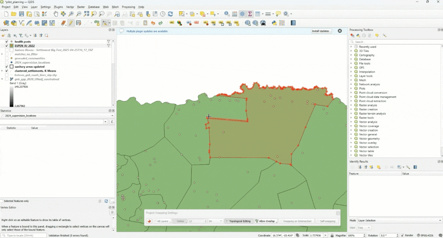
Let’s edit a simple boundary in QGIS. Imagine the outlined green areas below show health facility catchment zones you're responsible for updating based on feedback from field teams. Based on the feedback, you just want to adjust the boundary line to the right:

The grey dots indicate health posts that serve the surrounding communities. Maybe your field team found certain services weren't reaching a certain community. Sounds straightforward, right? If you’ve tried to edit catchment areas in QGIS, you know it rarely is.
⚠️ Why the warnings are there
QGIS doesn’t show editing warnings for no reason. With dozens of pages in the official editing documentation, a few of the risks are concurrent edits, broken topology, and irreversible mistakes. The system puts the burden on the user.

A look at how to edit maps in QGIS:
Seeing the process unfold is probably the best way to show why these warnings exist. Here's how you'd actually update those boundaries in QGIS:
1. Enable topology settings (to avoid gaps and overlaps)
First you navigate to Project > Snapping Options and enable topological editing. This prevents you from accidentally creating gaps, overlaps, or orphaned land. The initial map before editing is topologically correct, with no gaps. The fact that it's turned off by default tells you QGIS wasn't really designed with this use case in mind for non-GIS experts.
▸ Snapping options

▸ Topological editing

2. Enter edit mode and select the vertex tool
In GIS, map boundaries aren't drawn as curves. They're built from shapes called polygons, and each polygon is defined by a series of tiny anchor points called vertices. As confusing as that may sound, these are essentially just the anchor points that define every boundary line.
▸ Toggle Vertex Tool

3. Manually adjust vertices one by one
To change a catchment border, you have to adjust those points manually. One by one, you click and drag each vertex to reshape the area. It's precise and proven, but it's tedious. And because these polygons often share borders, a single wrong move can throw off neighboring catchments.
▸ Catchment start

▸ Catchment after one edit

▸ Move all vertices one by one
4. Troubleshoot the shared border problem ⚠️
The real challenge comes when you're working near the edges of other areas you don't want to change. Here's where shared borders become a problem as moving one boundary changes every adjacent catchment that shares that edge, so a small tweak can ripple through multiple service zones. These cascading changes can create slivers of unassigned land or overlapping zones that throw off accurate population counts. You can see the gap left behind at the end where land on the northern border that was previously covered is now left out.
▸ Troubleshooting borders

5. Fix topology errors (if you can spot them)
These orphaned areas mean some households, schools, or groups might fall outside any catchment area by accident. Sometimes these errors happen without the user even realizing. A small adjustment that seems fine until the maps are actually deployed in the field. Fixing topology errors without creating new ones takes real GIS expertise. That’s rarely practical during live planning sessions.
▸ Mapping gap

6. Mentally visualize the final result
The vertex-by-vertex, or dot-by-dot, approach also means mentally visualizing the final boundary as you move individual points. It's like trying to draw a smooth curve by placing dots on a grid – you have to imagine how all those individual anchor points will connect into a coherent shape.
For complex boundaries that follow rivers or roads, this means keeping track of dozens of vertices while trying to envision the final catchment area. Most planners aren't trained to think in terms of polygons, making this mental leap extra challenging during live planning sessions.
This method works for GIS analysts and has for a long time. But for planners or field teams trying to make changes on the fly? It's just not realistic.

The Crosscut approach: Paint, don’t point
When we designed edit mode for the Crosscut App, we started with a simple question: How would someone naturally want to adjust a boundary?
The answer seemed obvious. You'd want to paint or drag areas from one zone to another, similar to how you might use a paintbrush in an image editor. So that's exactly what we built.
Instead of asking users to edit complex geometry point by point, we offer a more familiar paintbrush experience. As we'll go over, you just select the catchment you want to change, click Edit Catchment Areas, and then simply drag across the map to add or remove territory. We knew the specific challenges associated with editing polygons point by point, because our team member who built out the Crosscut App edit function also built the polygon editing feature for Mapbox, so we knew how we wanted to improve this experience.

Easy-to-edit catchment area maps
There are only a few tools you need. A paintbrush to add area. An eraser brush to remove it. You brush over neighboring zones to reassign land from one catchment to another. And it's just as easy to undo.
As you brush, the map responds immediately, updating the population counts and other stats in real time.
Here's how updating a catchment boundary works:
1. Starting point
The process starts with a view of all the catchment areas in the country, Ethiopia in this case. Each outlined area represents a different health facility's service zone.

2. Select and enter edit mode
Now you choose the catchment to work on and click the edit button. In this example, we're looking at the Abobo catchment, with the right hand panel showing current population data and administrative details.

3. Zoom in on catchment borders
Just as you would with Google maps, you zoom in on the specific area you want to edit in order to get more granular and accurate with your decisions.

4. Activate editing tools
Select Edit Catchment Area in the left hand column to activate edit mode. The map changes to show a satellite view with underlying land blocks and the new editing toolbar, including the paintbrush tool (blue icon). Bottom right, the total population of this catchment area is currently 22526 people.

5. Continue refining
Paint to include or exclude areas as needed. The interface provides immediate visual feedback showing population changes (23243) and which areas belong to which catchment. You can also overlay population and travel time heat maps to guide decisions about communities to include. The extra 717 people come from the neighboring blocks we just painted into the catchment.

6. Save your changes
After a few simple brush strokes, the new boundary takes shape. The updated population statistics reflect the changes automatically. It's a very similar experience to Microsoft Paint, and you can revert any changes easily.

7. View the result
The edited catchment now includes the desired areas, with clean boundaries and updated data ready for use across your reports and planning tools.

A key advantage with this paintbrush approach is that you can't accidentally create unassigned land. The tool only lets you paint within a pre-existing grid that covers the entire area, like coloring in a coloring book where the lines are already drawn.
Once you edit them, these maps integrate directly with existing systems like DHIS2 and work within the Excel-email workflows that most teams already use for data collection and planning.
The technical challenges of user-friendly maps
The paintbrush interface looks simple, but making it work required solving some complex problems under the hood. Every time someone drags their cursor across the map, the system is making thousands of calculations to ensure the edit actually makes sense.
What happens during each brush stroke:
- Identify which geographic units are being reassigned
- Validate that boundaries remain mathematically sound
- Recalculate population and accessibility data in real-time
- Preserve natural edges like roads and rivers
A recent breakthrough we had was breaking countries into what we call “land blocks,” pre-generated geographic units that fit together like puzzle pieces. This preprocessing takes significant computing power upfront, but it means users get instant feedback whether they're editing a small health district or mapping boundaries across an entire country like Nigeria.
Because all edits happen within this pre-loaded framework, the system can't create the topology errors that plague traditional GIS editing. There are no gaps to accidentally leave behind, no overlapping areas to untangle later. Users can also overlay contextual data, like the accessibility heat maps mentioned earlier, to account for terrain like rivers, lakes, buildings, or borders. This data leads to more realistic travel times.

You don't need to hunt for the exact vertex to drag or worry about adding dots. If you want to include an area, you just brush over it. If you overshoot, switch to the eraser and paint it back out. The real-time highlight shows exactly which area will be included, so it's hard to go wrong.
Real-world shifts in how planning happens
Until recently, updating a catchment area map in just about any GIS tool required back-and-forth between planners and GIS analysts. Changes that took days or weeks can now happen in minutes. Updating a map can now happen during a planning session, meaning local teams can test arrangements in real-time and see the population impact of their choices right away.
The key change? Who can participate in planning processes. Instead of technical edits happening behind the scenes, they happen in the room with people who understand the terrain best. In one district in Ghana’s Northern Region, a health officer used Crosscut to adjust health facility boundaries in real-time. He incorporated local knowledge about seasonal access patterns that would have been very difficult to capture in a traditional workflow.
The paintbrush approach works even for people who've never used GIS software before, and you can always undo with a single click. The “fear factor” is all but gone.
Small change, big ripple effects
This edit feature isn't flashy. It simply solves a real problem that extends beyond just QGIS. Similar challenges exist with other mapping tools, including commercial GIS platforms like ArcGIS. They're powerful but require technical expertise that many teams simply don't have.
The broader principle that drives our work is that complexity should be hidden behind user-friendly interfaces, not eliminated. Users shouldn't need to understand vertices and topology to make practical map updates. The field work should come first, not the GIS expertise.
As funding models shift and teams need to do more with less, intuitive tools add real value. Not just for GIS teams, but for planners, partners, and district officials who need to make quick decisions. Traditional GIS tools still have their place for complex spatial analysis, but for day-to-day microplanning, the math and topology should work in the background.
Sometimes the best way to modernize a workflow isn't to add more features. It's to take away the barriers.

No GIS degree required
If your team is looking to strengthen your planning, the Crosscut App is free to use. We’d love to hear how your team is managing catchment area maps.
Related Posts

How to set up a Microplan Collector project in the Crosscut App

May 2026 updates: Shared microplan projects and easier supervision analysis

How to find the communities your health campaign is missing
.JPG)
