
Pinning "points of interest" on catchment maps

The Crosscut App's Points of Interest feature lets you drop pins on any catchment map, label them, and save the GPS coordinates for later use. These pins function like a note-taking system on catchment maps that capture both where something is and why it matters to your campaign.
This feature is less about the pins and more about improving planning workflows. Teams use it to connect what they find in their analysis to what happens in the field. You just identify where follow-up is needed, pin those locations, and can keep an eye on any problematic areas.
What’s a “point of interest”?
While you're working with catchment maps in the Crosscut App, you can drop pins anywhere that need attention. You give each point a name, assign it to a category you create, and the GPS coordinates save automatically. When you need to act on those locations, you can use or print them in the app or export the data as a CSV file that works with most GIS mapping tools.
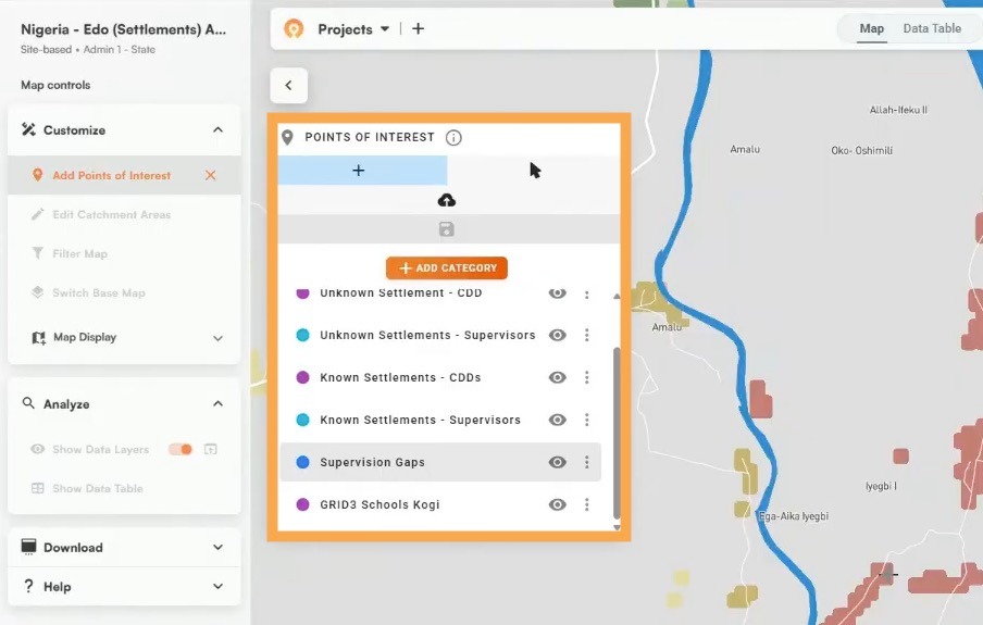
What counts as "needing attention" will depend on your specific campaign. It might be settlements that are difficult to access, verifying drug administrations, or checking areas with questionable data. We'll walk through a few examples of how teams use their pins below.
Not your standard map pins
Most mapping tools let you add pins to save locations. Google Maps does it. ArcGIS does it. Our pinning solution isn’t revolutionary but what makes it different is how it fits right into the work you're already doing.
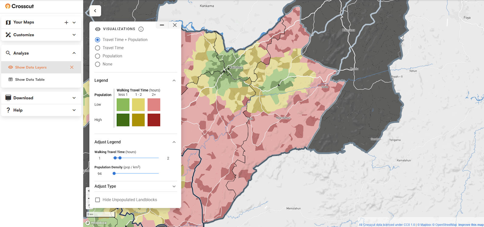
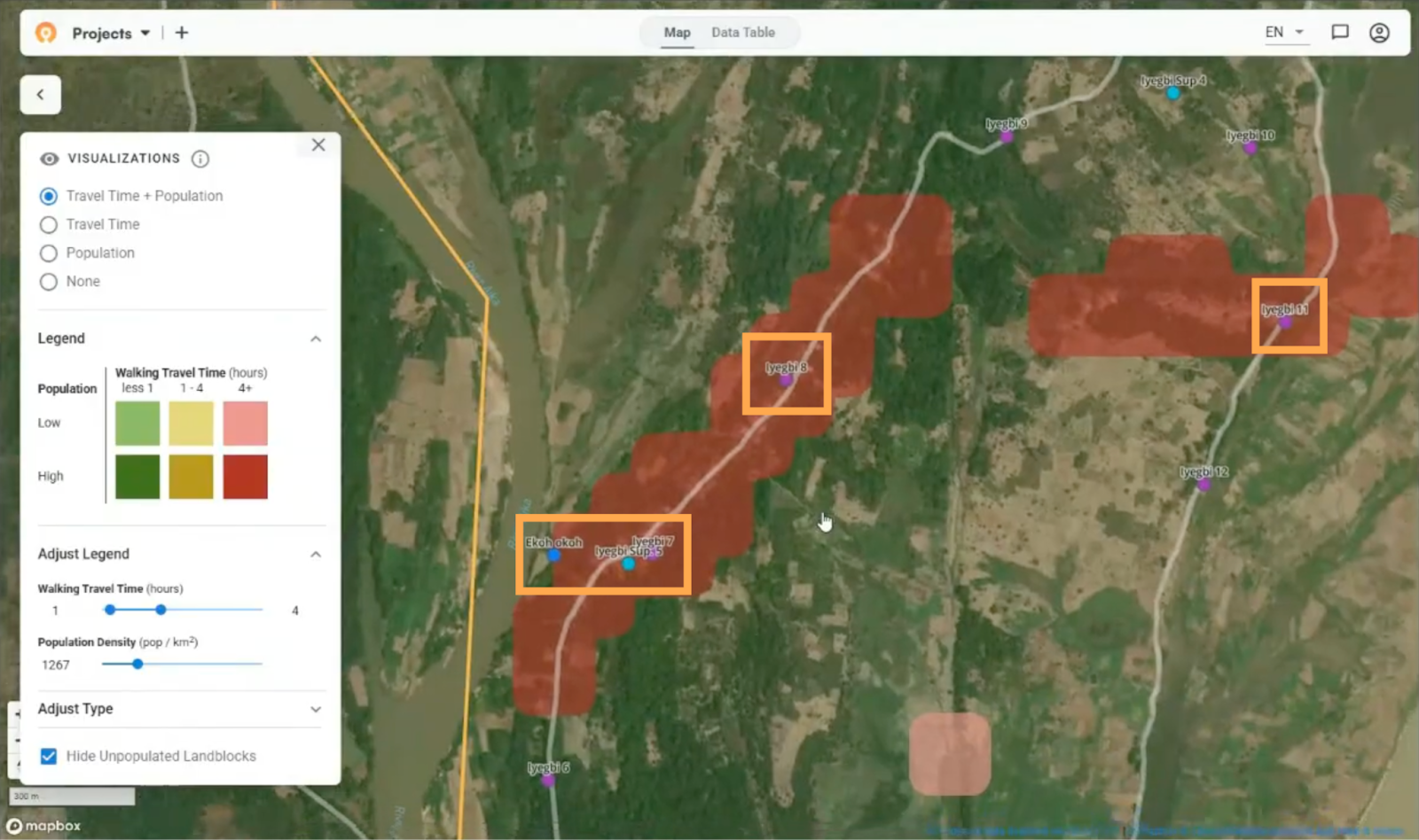
When you drop a point in the Crosscut App, you're marking it on a map that already shows catchment boundaries, population data, travel time calculations, and accessibility patterns. The value is in using these different analytical layers to figure out where you need to act.
See a red zone in an accessibility heat map indicating poor access to specific locations or facilities? Mark it as a point of interest. Seeing population estimates look inconsistent with other data? Flag it. Area missing supervisor verification? Drop a pin.
The map tells you where the problems are, and points of interest help you remember to do something about them.

You can then export a CSV and load coordinates into data collection tools like CommCare, analyze them in ArcGIS or QGIS, or import them into monitoring dashboards. The benefit of here is that they integrate with the mapping tools and workflows most teams already use.
How and where teams use points of interest
Whether you’re analyzing supervision visits during a health campaign, planning emergency response, or scouting new retail locations, using points of interest stays pretty much the same. You find gaps in coverage, drop pins, and share the locations with stakeholders who need them.
Here's an example of how that works in practice:
Planning mobile clinic locations
A health program creates site-based catchment areas around their facilities to understand which populations each one serves. When they layer on the accessibility visualization, red zones appear showing settlements more than two hours from the nearest facility.
These distant settlements need regular access to services, so the team could drop points of interest in those red zones to mark locations for monthly mobile clinics. They could categorize the pins by district and priority level, making it easier to plan outreach schedules without any important information falling by the wayside.
Once these points are marked on the map, program coordinators can print maps showing exactly where mobile clinics need to be established. Field teams get the coordinates from there and can track whether those locations are being served each month
Other ways teams use points of interest
Planning teams use this same approach to different ends:
- Tracking coverage gaps: Mark areas where supervisors haven't conducted verification visits to prioritize follow-up
- Flagging data issues: Pin locations where population estimates look inconsistent so field teams know what needs checking
- Identifying infrastructure needs: Mark underserved settlements as candidates for new permanent facilities
- Emergency response: Flag priority communities that need immediate attention during crises
- Retail planning: Mark potential store locations while analyzing market coverage
Each of these scenarios follows the same basic pinning workflow. The benefit is bridging the gap between seeing problems in your data and actually addressing them in the field.
Connecting analysis to action
Going through this pinning process helps turn problem areas into action items. You create catchment areas to understand service coverage, layer on accessibility data to identify hard-to-reach areas, and use points of interest to flag specific locations that need a follow-up.
After you create your pins, you can export the exact coordinates into monitoring systems to track progress, upload to other mapping tools, or send them to field teams who can get to those exact locations. You use the data within your existing tools however works best for your team.
One more tool for better microplanning
Points of interest aren’t flashy but they can complement your overall microplanning workflow. We’ve designed these features to fit into the spreadsheet and email workflows most teams already use for planning, meaning they work without expensive new GIS software or specialists.
The Crosscut App is always free to use and includes points of interest, catchment mapping, accessibility analysis, and other planning tools. Get started with the app or contact us about advisory services for custom mapping solutions and support.
Related Posts

How to create catchment area maps in DHIS2 with the Crosscut App
.JPG)
How the Crosscut App helps plan health campaigns in Nigeria

An independent evaluation of the Crosscut App
