
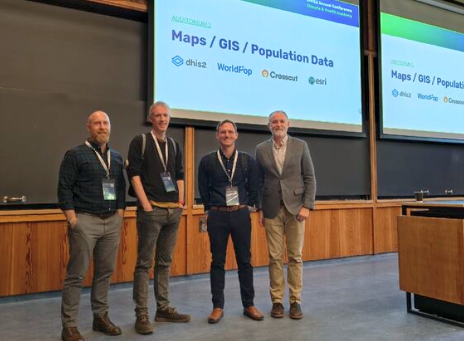
Hack Week II: Merging the bigger picture

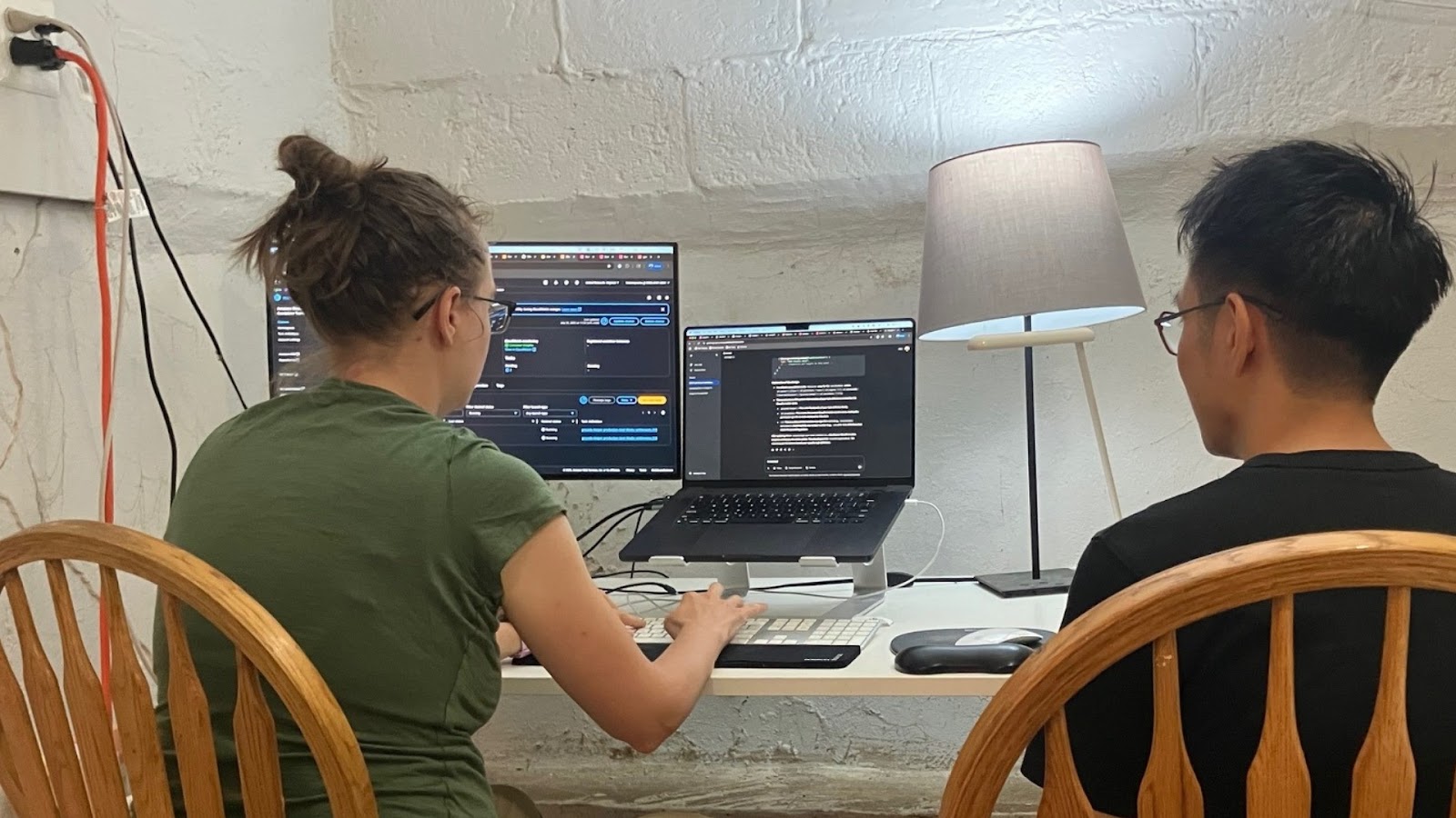
After our hack week breakthrough earlier this year, we'd been planning another key update to build on that success. So last week we cleared our calendars again, canceled meetings, and got the team back together (minus James from overseas) for another week of focused work.
This time I loaded tables into my pickup truck and set up shop at the Poulos' house. We arranged pairing workstations, set up whiteboards, stocked up at Costco, and dug in for a big week.
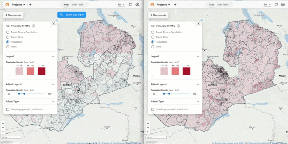
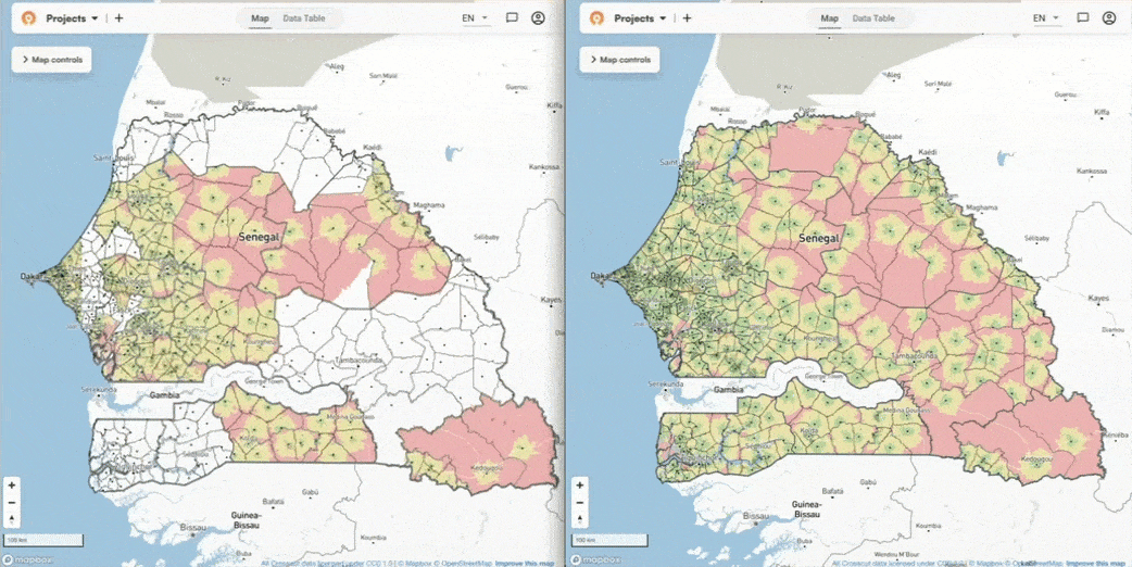
What were we after? The land block fix from our first hack week led to much smoother loading and rendering. But larger country maps with more data couldn't keep up when you zoomed out. We had to force visualizations like accessibility heat maps to just disappear at a certain threshold, cutting off the macro view that planning teams can use for big-picture regional planning.
The data overload problem
The wider you zoom out in the Crosscut App, the more data you're grabbing. Each land block carries information about travel times, population density, accessibility details, etc. Larger countries might need to display thousands, tens of thousands, or possibly even hundreds of thousands of land blocks at the same time. At some point this causes the system to choke and freeze up before eventually failing.
A main bottleneck was how our system was handling all the this information. The app was merging land blocks with their smallest neighbor regardless of whether that neighbor was in the same catchment area or administrative boundary. You'd end up zooming out and see a summarized view that crossed over the boundaries you'd told the app to respect.
Users weren't totally sidelined by this issue, but it was limiting. Normally your eyes could spot problem areas by comparing different regions at once. But when you can't see the data zoomed out, you have to pan around and look at each section. Stitch by stitch. You'd get stuck in this fog of war situation where you miss the broader patterns at play.
On top of that, we were hitting capacity limits with Mapbox, the backend system we use to generate map tiles for the app. When there was too much data in the and blocks to display, Mapbox would simply drop the overflow. You'd zoom out expecting to see travel time or population colors across the whole country, but only one section would load while other areas blanked out entirely.

The technical solution (for smarter merging)
We had to totally rethink our data aggregation process. Instead of our previous approach where land blocks merged with the nearest neighbor, we built new logic that respects the catchment and administrative lines you designate by only merging within the same areas. This fix lets us merge land blocks sooner and reduce the amount of data in tiles when you're farther out.
With Mapbox limits, we ditched it entirely and built our own tile system. This switch eliminated much of the load limits that were causing sections to go blank. We now generate custom tiles based on each user's specific catchments, which handles the data overflow that was breaking Mapbox by enabling us to merge sooner without being concerned about how jarring it was for land-blocks to merge across catchment boundaries.
FlatGeobuf is how we’re handling all the land block data. It's basically a more efficient file format to store and load geographic data compared to traditional routes. We learned from our first hack week that this format works better for catchment boundaries because it just works way better with massive geospatial datasets. Now we’re using that same approach to handle all the map data.
Patching the equator bug
We also tackled something left over from our first hack week. We'd noticed a bug where tiles seemed afraid of the equator and would run away from it when users zoomed out.
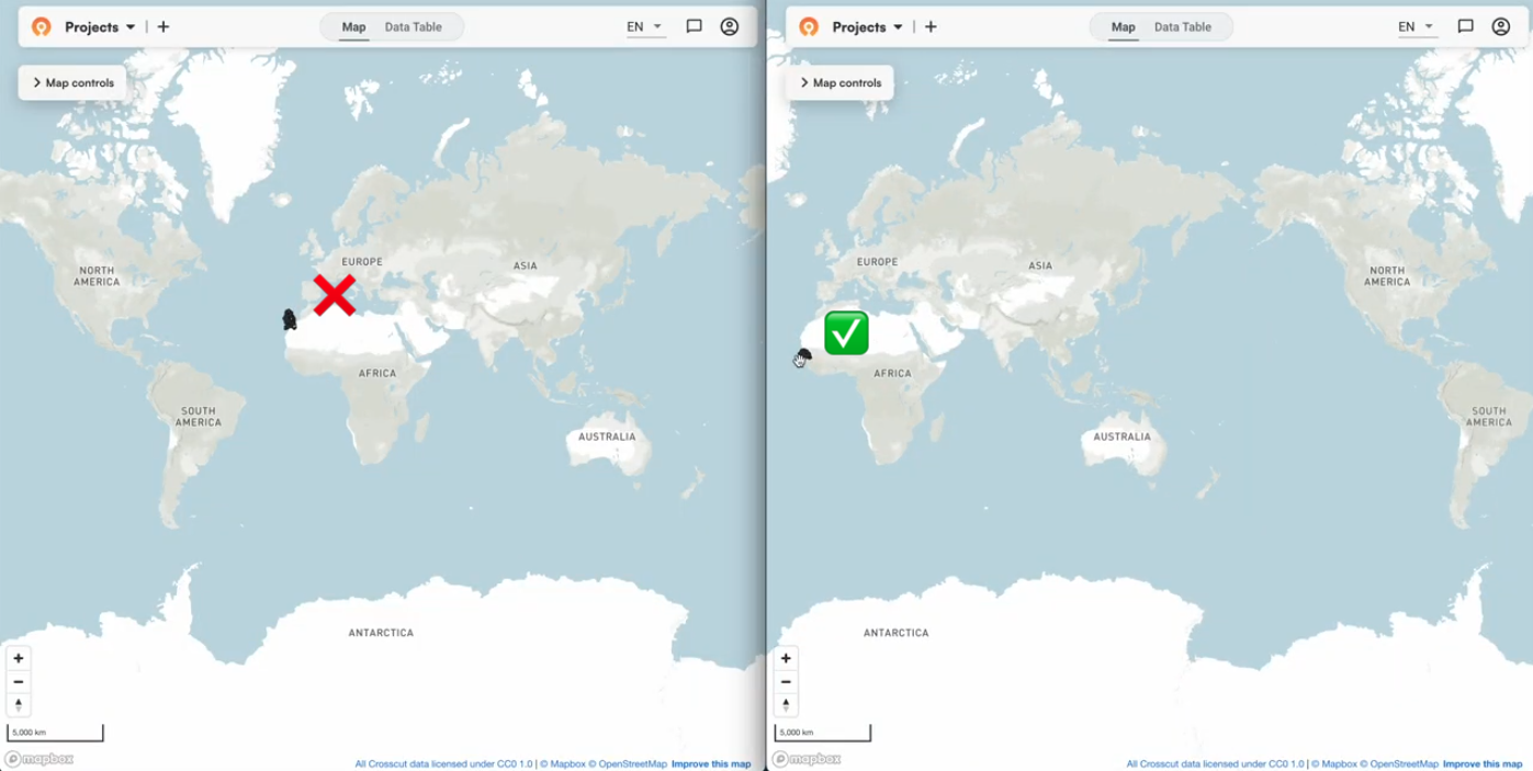
Back then, we just prevented users from seeing catchment lines at those zoom levels. This time, we fixed the underlying coordinate reference system (CRS) issue so everything stays in the right place.
The big breakthrough moment
We were grinding on this smart merging solution the whole week basically. We had all the individual pieces working as far as we could tell, but you can't really experience what it feels like until you actually deploy it and test everything together. That’s the real moment of truth.
Friday afternoon we deployed to staging, created a catchment, and started zooming around. It felt different right away. We were confident it would work, but seeing such fluid responsiveness for the first time was genuinely satisfying. It was a huge victory (and sigh of relief) that we all got to share together.
The new zooming experience was exactly what we'd been working toward. You can zoom in, zoom out, back and forth – and it all just works. No equator bug or empty spots. We'd heard from users who were taking screenshots and having to stitch them together manually to get that macro view. That workaround is no longer necessary.
The performance beats almost any other geospatial applications out there today. Most GIS mapping tools force you to choose between having all the information or having a smooth experience. We managed to keep both.
The in-person advantage for big updates
Working together on hard problems in the same space really makes a difference, especially when you're dealing with something as complex as data aggregation and coordinate systems. While remote work gives us flexibility to work from anywhere on our day-to-day tasks, there’s no substitute for being able to point at parts of the code, draw data flows on whiteboards, and have rapid-fire discussions that lead to breakthroughs like you can when you're in the same room.

Emanuel and his wife drove down from Boston and stayed with the team. We had a cookout Thursday night with kids and it was a true family affair (though we definitely missed James). When we got the final piece working on Friday afternoon, the celebration represented not just the technical victory for all of us, but the team intensity that made it possible.

Having all the mindshare in the same room also just makes it easier to tackle less pressing issues. With everyone focused on the main zoom problem and whiteboards mapping out the system, we could quickly identify and fix related bugs, like that equator-related CRS issue from our first hack week and automatically restarting AWS ECS tasks when they get interrupted.
Looking ahead - Hack week part III
Hack week has become a recurring part of how we work. The success of these focused sprints has us excited about tackling more technical challenges that can unlock new capabilities for users later. James's supervisory areas algorithm work is setting up some interesting possibilities for hierarchical territory management that we're excited to share more about soon.
For now, the Crosscut App is free to use, and these improvements are already live for all users. If your organization is dealing with complex mapping challenges that go beyond our standard features, our advisory services can help develop custom solutions.
Related Posts

How to create catchment area maps in DHIS2 with the Crosscut App
.JPG)
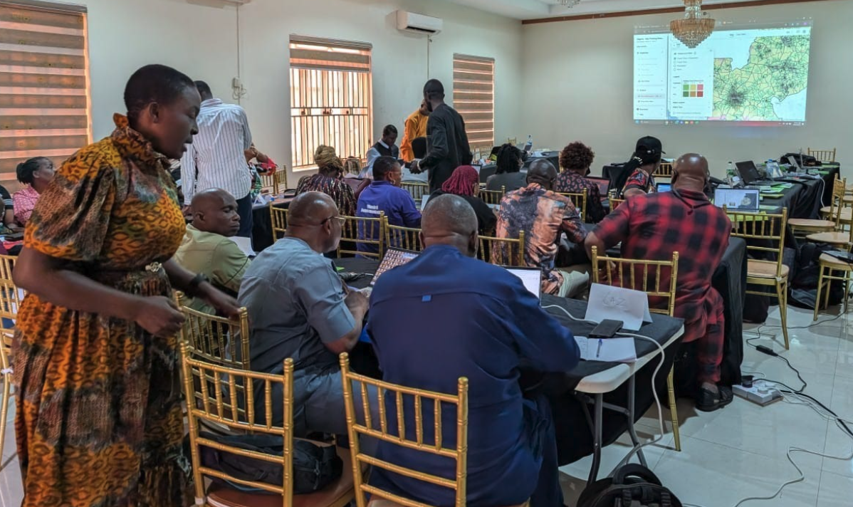
How the Crosscut App helps plan health campaigns in Nigeria

