
Make PowerBI Maps More Awesome with Crosscut

Over the years, I've stared at plenty of Power BI dashboard maps. The built-in Power BI visuals, like bubble maps, filled maps, and shape maps, each have their place, but they are restricted to either basic point data or boundaries that come pre-loaded in Power BI, and thus are limited in what they can show. In this overview, I'll show you how to convert scattered point maps into catchment area maps to get clearer, more actionable insights from your facility data.
Doing more with the same data
Let's start with the end result so you can see the problem we're solving with just a few simple steps. These two maps are displaying the same exact set of school data in Mozambique, but they tell completely different stories about youth education program coverage in this region.
The map on the left is a point map, one of the most common types used in PowerBI and other BI tools (Tableau, etc.). It plots facility locations as individual dots based on latitude and longitude, sometimes sized or colored to represent underlying data. But while it shows where things are, it doesn't show how far their services reach.
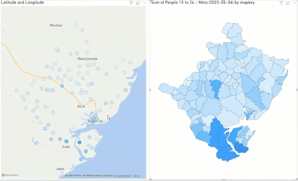
On the left: The standard PowerBI "bubble" or point map approach. Each school appears as a colored dot based on coordinates you provide, with darker shades indicating higher youth populations nearby. It’s useful for showing locations, but it doesn’t really help you understand how far a school services actually reach or who gets left out. While you can spot schools with more young people around them, the overlapping points in areas like Angoche lead to visual chaos. Multiple dots cluster together so you can’t identify how many schools are there or which district each serves.
Ask yourself: which map above is easier to digest?
Our brains tend to process area-based information differently than point-based information. Large colored areas naturally draw attention, helping you identify priority areas for resource allocation. This isn't just about prettier maps but taking action on the data you have at hand.
Notice how when you look at the polygon version, your attention is drawn to the areas that matter most – the large rural catchments that might be underserved or the dense urban areas where services overlap.
On the right: The same data displayed as catchment area polygons – the actual service territories or districts each school covers. Instead of just showing where schools are located, you see the full geographic area each one serves. Now you can immediately see which areas each facility covers, identify uncolored gaps where young people might lack access, and understand the true scope of who’s getting left behind. Check out how that school on the island near Aube transforms from a single dot into a clear service area with defined boundaries.
These boundary lines aren't arbitrary. They're realistic service areas generated by analyzing travel time, road networks, population density, and geographic barriers like rivers or mountains in the Crosscut App. Your eye naturally goes to larger service areas that might need additional support, while dense coverage patterns become clearly different from sprawling rural territories.
Notice again how when you look at the polygon version, your attention is drawn to the areas that matter most – the large rural catchments that might be underserved or the dense urban areas where services overlap.
▶ Why polygons anyway?
The Crosscut App and other GIS platforms use polygons to create catchments because they're flexible. They can represent territories from simple circles to complex shapes that bend to rivers (like the Meluli River below), roads, or administrative borders. Unlike fixed shapes, polygons can be easily modified, combined, or split as conditions change – showing realistic service areas that rarely follow neat geometric shapes.

Why Power BI defaults to dots (and why you shouldn’t)
Dot-based visuals are popular for a reason. They’re simple, fast, and built into most reporting tools like Power BI. But when it comes to mapping populations and allocating resources, geographic polygons such as catchment zones are more useful--but these may not be available by default in Power BI.
If you need custom service areas based on accessibility, travel time, or catchment patterns, you're stuck with point maps by default.

Power BI offers some workarounds for overlapping points, but each has its limitations:
- Heat maps show population concentration but lose individual facility data and boundary precision.
- Clustered pins reduce visual noise but don’t show which communities each facility serves.
- Bubble sizing hints at population served, but not geographic reach. A large bubble could mean a high-density neighborhood—not a large territory.
There are more precise ways to decide where to build a new school or run a mass drug administration (MDA) campaign. The problem with Power BI’s built-in maps is they tend to under-utilize critical geographic context.
That’s why this workflow: point data → Crosscut catchments → Shape Map lets you create your own realistic territories and across sectors.
Why the spaces between dots matter
Point maps show where facilities are but not the spaces between them. That missing context is exactly what catchment areas provide. Real boundaries solve fundamental problems:
A school might serve an entire administrative district, but if there's no bridge across a river, kids on the far side actually attend a different school. These details matter when working in challenging geographic contexts where administrative boundaries don't reflect how people access services.
Crosscut catchment maps X PowerBI
Here's how to build your PowerBI dashboards with realistic catchment boundaries using our Mozambique schools example:
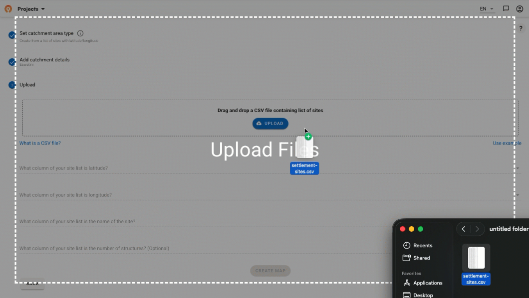
Step 1: Prepare your facility data
Start with your facility locations in a clean format. In our case, we're using school location data originally sourced from the Humanitarian Data Exchange (HDX), preprocessed into a manageable CSV format.

The important piece is including a unique identifier for each facility – what we will call a "map key." In this dataset, we've created a simple map_key column alongside the facility coordinates (latitude and longitude). This map_key acts like a postal address for each polygon – it's how Power BI knows which boundary belongs to which school. Without this direct connection, you'd have beautiful catchment areas but no way to color them with your data.

Step 2: Generate catchment areas and population data
Upload your facility coordinates to the Crosscut App, which is always free to use. The GIS platform automatically generates realistic service boundaries based on real-world factors like travel time, road networks, population density, and geographic barriers.

These aren't just circles drawn around points. Crosscut’s algorithm considers terrain and broader accessibility, as well as population distribution to create realistic service territories that reflect how people actually access facilities. A school near a major river will have a catchment boundary that reflects the reality of crossing that river, not just straight-line distance.
Once the catchment areas are generated, the app provides population estimates for each area using multiple data sources, including WorldPop, Meta's Data for Good, and others. In our example, we're focusing on the youth population (ages 15-24) using Meta's estimates, which gives us target demographic data for each school's catchment area.
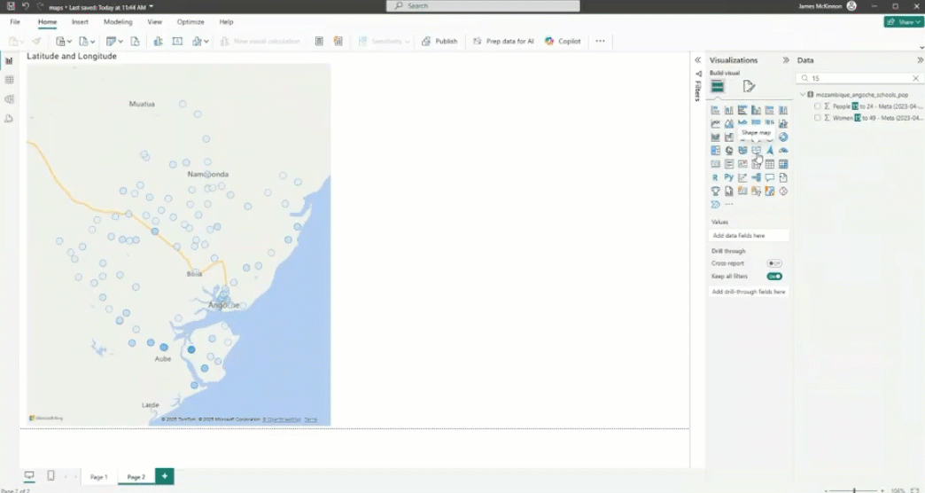
Step 3: Create your baseline Power BI visualization
Back in Power BI, load your facility data and create a standard point map to establish your baseline.

Use the latitude and longitude columns to plot your schools, then color or size the points based on your population data. In our case, we're coloring dots based on the number of young people (ages 15-24) in each school's catchment area.

You'll immediately see the limitations, especially in urban areas like Angoche where overlapping points make it very difficult to interpret individual facility coverage with any kind of precision. This gives you a clear before-and-after comparison for the transformation we're about to make.
Step 4: Export and convert catchment boundaries
Download the catchment boundaries from the Crosscut App as a GeoJSON file. Here's what makes this export powerful: Crosscut automatically includes all the population data in the same file. You're not just getting boundary lines – you're getting boundaries with pre-calculated population estimates for each catchment area using multiple data sources like WorldPop and Meta's Data for Good.

Since PowerBI's Shape Map visual requires TopoJSON format, you'll need to convert this file using mapshaper.org. This is a free online tool that handles the conversion in seconds. Maybe we’ll add TopoJSON as an output option from the Crosscut App in the future. If you’d be interested in this, let us know.

Upload your GeoJSON file to mapshaper.org, preview the boundaries to confirm they look correct, then export as TopoJSON. The converted file contains all your catchment polygons with their associated map keys, ready for Power BI import.
Step 5: Build the Shape Map in Power BI
Add a Shape Map visual to your Power BI dashboard. Initially, it displays default geographic boundaries, but you can customize this by importing your TopoJSON file to specify the region where you need to generate your catchment maps. This step is where you tell Power BI where and how to create the boundaries using the same population data.

Navigate to the Format pane, find Map settings, change the map type to "Custom," then browse to your converted TopoJSON file. Your catchment boundaries will appear on the map, but they won't yet display your population data.
Step 6: Link boundaries to data using the map key
This is the ah-ha step that injects your population data (and color) into the map and makes everything work. Drag your map_key field to the Location field in the Shape Map visual's field wells. This creates the connection between your geographic boundaries and your tabular data.

Because we’ve set up the map key, Power BI now knows how to match each polygon in your TopoJSON file with the corresponding row in your data table. Once this connection is established, you can drag your population field (youth ages 15-24) to the Color saturation field, and your catchment areas will be colored based on the population they serve.
Seeing is believing
The transformation is immediate. Instead of guessing coverage from overlapping dots, you see exactly which areas each facility serves. Rural schools serving large geographic areas become visually distinct from urban schools with smaller but dense catchments.
The visual impact extends beyond just seeing boundaries. This is the cognitive shift that transforms what were cluttered point maps into decision-making tools. Your eye naturally processes these territorial views differently, scanning for patterns and priorities rather than hunting through overlapping dots.

Integration with existing workflows
One advantage of this approach is that it builds on your existing Power BI setup. You don’t need to start from scratch or switch tools and you're not changing data collection processes. You're adding more user-friendly geographic context to dashboards you're already building.
The Crosscut App also works with tools many planning teams already use. The platform integrates with DHIS2 for health information systems, making it easy to pull catchment data into national reporting systems. It was also designed to support the existing email-to-Excel based data workflows that just about everyone relies on for field data collection.
Linking with other Power BI visuals
Once you have catchment boundaries in Power BI, they interact with other dashboard elements just like any other visual. Click on a row in a data table, and the corresponding catchment area highlights on the map. Use slicers to filter by region or program type, and only the relevant catchments display.
This interactivity is largely what puts the power in Power BI. You can combine your geographic insights with traditional charts and tables, creating comprehensive dashboards that show both the "what" and the "where" of your program data.
For example, you might have a bar chart showing enrollment numbers by school, a data table with demographic breakdowns, and your catchment map, all neatly linked together. Select high-performing schools in the bar chart, and their catchment areas highlight on the map, helping you understand the geographic factors that contribute to success.
Turbocharged geographic insights anyone can use

What we're really discussing is making geographic analysis available to everyone. Creating accurate service territories used to require specialized GIS skills. Now it's available to program managers and data analysts who understand their programs but aren't geographic specialists.
This matters because there's a huge difference between knowing "School A serves 500 students" versus "School A serves 500 students across a 200-square-kilometer area with limited road access." Geographic context fundamentally changes how you think about resource needs and program implementation.
The next time you're building a PowerBI dashboard with your newest facility data, those dots represent real coverage challenges. When you trade dots for boundaries, you’re setting yourself up to get answers you can actually act on.
Ready to transform your facility maps? The Crosscut App is free to use and most organizations can generate their first catchment maps in a few minutes.
Related Posts

How to set up a Microplan Collector project in the Crosscut App

May 2026 updates: Shared microplan projects and easier supervision analysis

How to find the communities your health campaign is missing
.JPG)
