
Understanding site-based catchment areas in Crosscut
Health programs need to understand the geographic accessibility of their facilities. The hurdle is that traditional GIS mapping to do this can be expensive and technically out of reach to health workers. That’s why many programs resort to hand-drawn maps or rough administrative boundaries, leading to uneven coverage where some areas get missed while others receive duplicate services.
Site-based catchment areas solve this problem by starting with your facility locations and creating realistic service boundaries around them. Instead of just seeing dots (representing your facilities) scattered across a map with no indication of who they serve, you get territorial boundaries that show which communities each facility actually serves.
The approach I’ll cover today gives you and your planning team a better understanding of how to create site-based catchment areas with the Crosscut App.
How to create site-based catchments in the Crosscut App
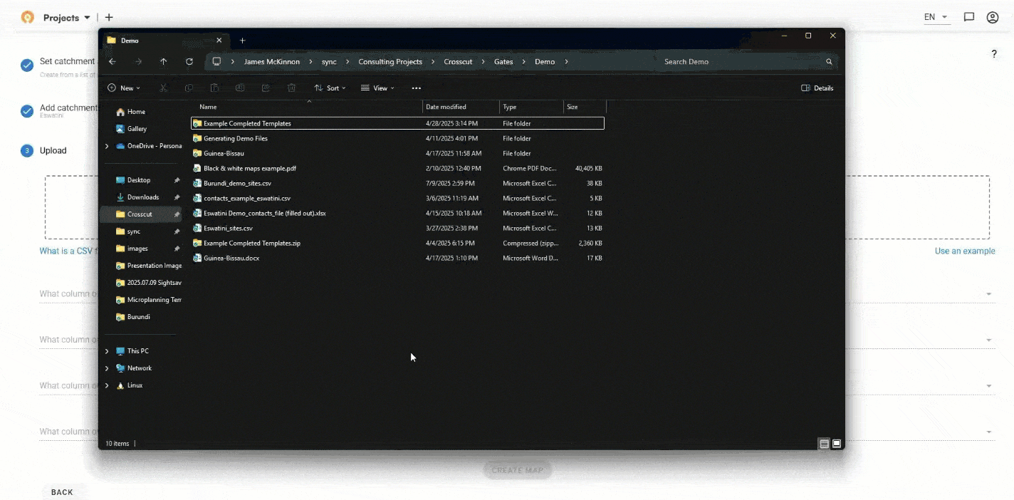
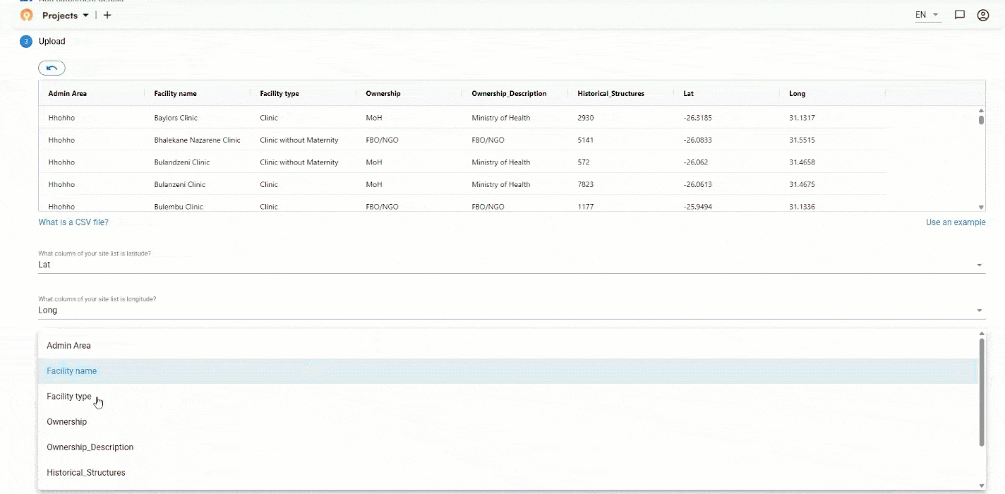
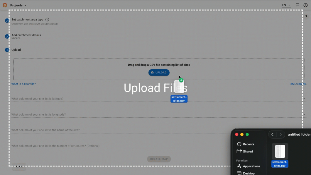
You don’t need technical GIS expertise to generate site-based catchments in the Crosscut App. You can start with a simple upload of facility names, latitude, and longitude. We’ll use the country of Eswatini for this example. Three columns of data is all you need to generate the maps, though you can also include more variables like facility type or capacity.
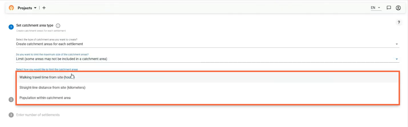
Once you’ve uploaded your data, you set coverage parameters based on your program needs. By default, catchment areas have no size limits, meaning that all land area will be assigned to their nearest site. However, you can set your catchment area size such as saying all area accessible to the site up to a two-hour walk. You also choose whether you want your catchment areas to be nested within administrative boundaries, which you choose from a user-friendly dropdown menu – country, region, or district level depending on your requirements.
This is where the Crosscut App does its thing: the software uses advanced geospatial modeling that considers land cover, water bodies, and settlements to create boundaries that follow rivers, roads, and real geographic features. Instead of working with arbitrary circles drawn around each facility (which don't reflect how people actually travel), you get practical boundaries created specifically for people on the ground… quickly and easily.
Each black dot represents a health facility, with interactive boundaries showing the realistic service area around each one. You get more reliable coverage with minimal gaps and overlaps and clean territorial divisions based on actual accessibility.
Understanding your service population
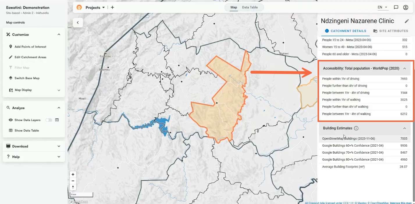
Now that you have these realistic service boundaries, you get access to a range of new data. Click on any catchment to see who lives within the service area and how they can reach facilities. In the Eswatini example, clicking on the Tjaneni catchment area (highlighted in orange) shows detailed population and accessibility data in the side panel.
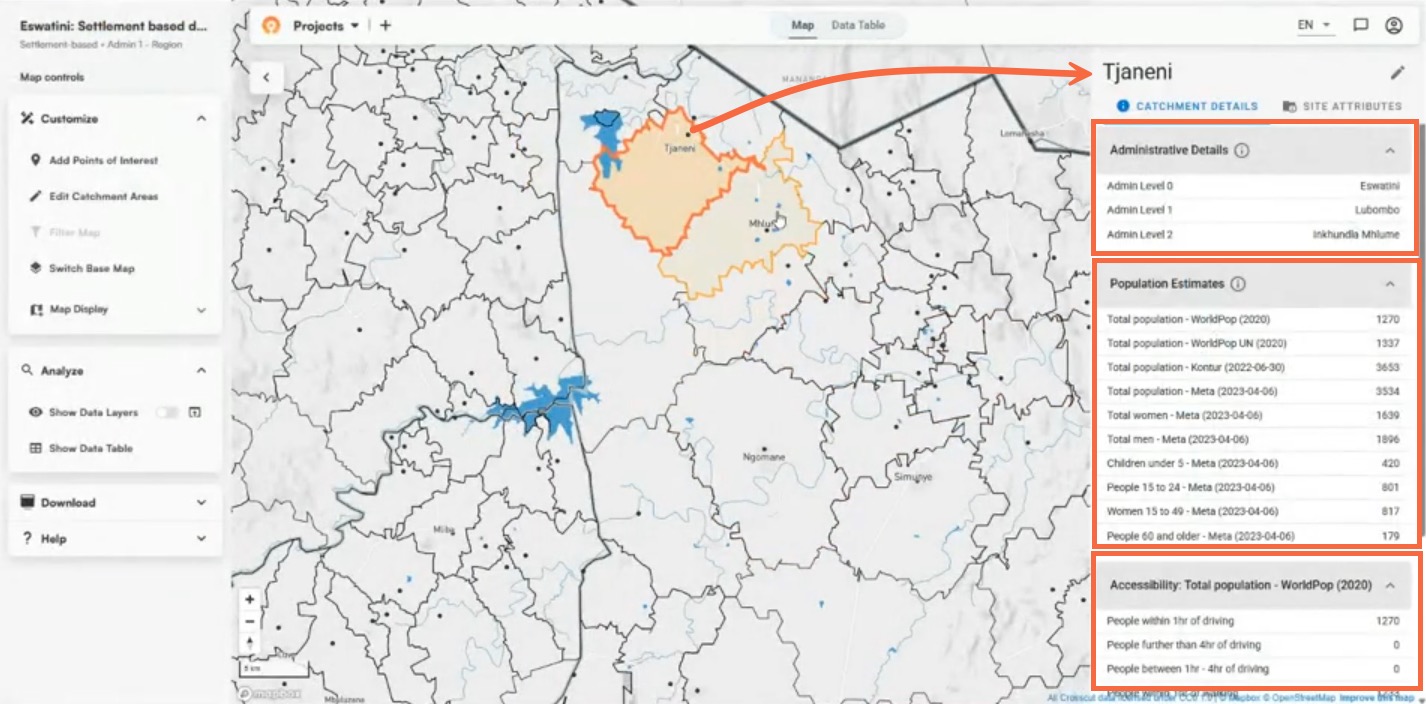
This shows you the populations living in the catchment area based on WorldPop, Meta, and other modeled population sources. This means you can quickly see if a facility serves 5,000 people or 15,000 people, and plan staffing and supplies accordingly.
Layer in travel time and accessibility analysis
Overlaying heat maps on your catchment area maps reveals accessibility patterns for more accurate intervention strategies. Red zones highlight communities needing mobile outreach, while green zones show populations with reasonable access to your facilities.
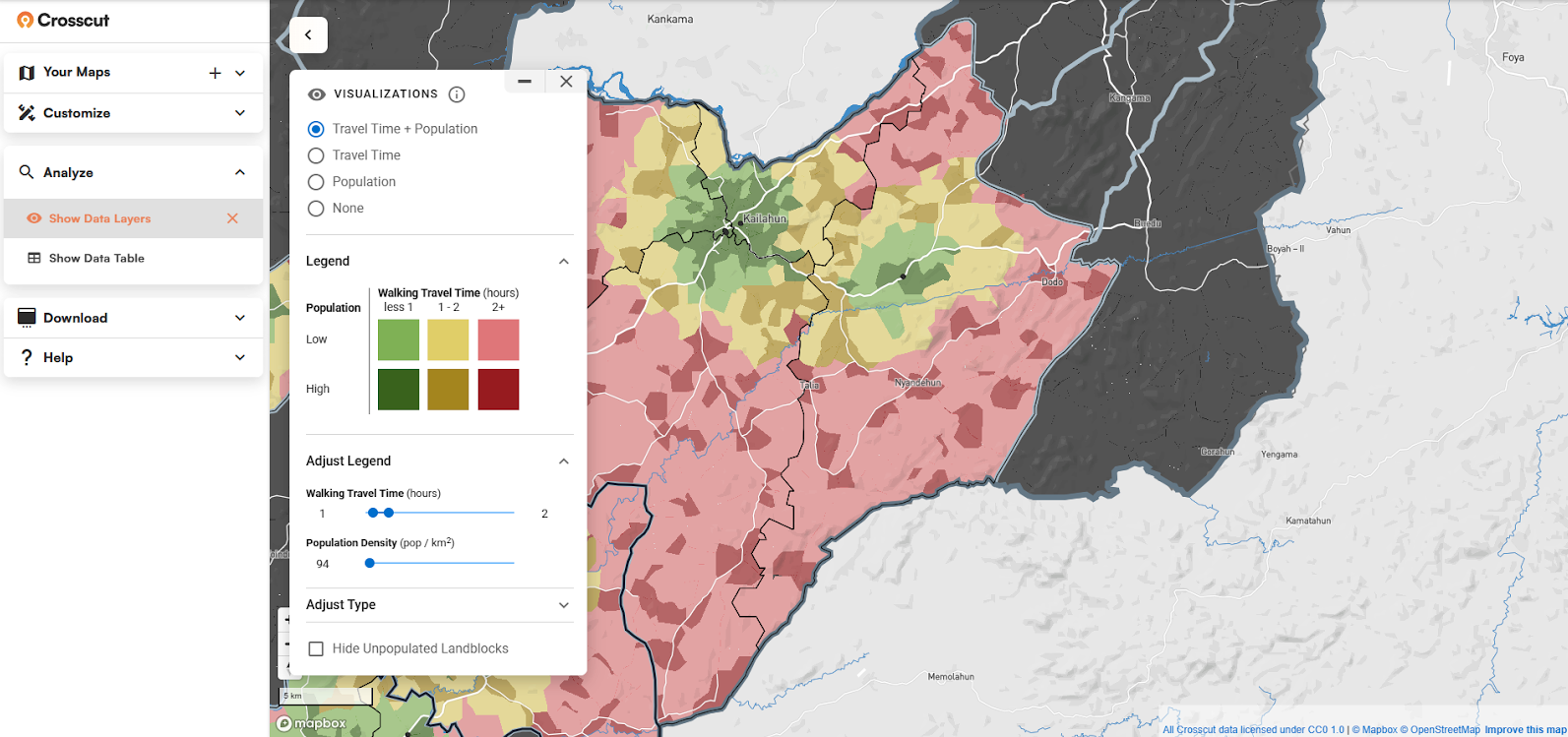
This transforms vague planning discussions into specific insights: "this catchment serves 10,000 people, but half live over three hours away." These details guide decisions about mobile team scheduling and resource distribution. We dive deeper into this methodology in our accessibility heat maps article.
Dealing with coverage patterns and gaps
These visualizations immediately help you find where facilities overlap in cities and where rural areas have no coverage at all. You can see which facilities are overwhelmed by large populations and which ones are competing for the same communities.
Having this information allows you to make strategic decisions about facility placement, mobile team routes, and staffing based on actual service areas instead of guesswork. If local field teams find the algorithm got something wrong – like communities that actually use a different facility due to cultural or transport preferences – you can easily edit boundaries directly in the app with an intuitive interface that feels as simple as using MS Paint.
 a
aThe paintbrush approach works even for people who've never used GIS software before, and you can always undo with a single click. You get the simplicity of hand-drawn maps with the accuracy and data integration of professional GIS services.
Beyond health: Universal applications
Site-based mapping answers "What does this clinic serve?" but the same territorial challenge exists everywhere. Schools need enrollment catchment areas, retailers need to map market coverage, and logistics companies need to optimize delivery routes.
From dots to better decisions
Traditional GIS puts these insights out of reach for most organizations due to cost, complexity, and technical expertise requirements. The Crosscut App democratizes this analysis – what used to require weeks of specialist work now happens in minutes.
Having access to clear service territories solves the fundamental problem we started with: understanding who can actually access your services. You move from highly technical mapping exercises to practical insights that guide where resources are needed most.
Once you have these insights, you can export results directly into Power BI dashboards for executive reporting, or integrate with existing systems. If your organization needs deeper integration with platforms like DHIS2 or national reporting systems, our advisory services provide custom solutions that work within your current planning workflows.
Related Posts

How to set up a Microplan Collector project in the Crosscut App

May 2026 updates: Shared microplan projects and easier supervision analysis

How to find the communities your health campaign is missing
.JPG)
