
The case for granular risk mapping in outbreak response

Global health security is about preventing infectious disease outbreaks from crossing international borders. Getting there is as much a geographic challenge as a clinical one.
Detecting an outbreak early and containing it before it crosses borders depends on being able to pull together a lot of different data into a single picture. Risk concentration, community accessibility, and real-time surveillance signals all come into play. But without a system that brings those together, the clinical and logistical response has nowhere to focus interventions.
We've been building mapping tools to improve risk surveillance for disease programs across sub-Saharan Africa for years. The mapping methodology works whether for a planned treatment campaign or an emerging outbreak. The inputs might change, but the logic doesn’t.
Risk has a geography
Not every country carries the same outbreak risk, and within high-risk countries, not every community does either. That risk can often be zoonotic, meaning it comes from diseases that jump from animals to humans. Approximately 60% of known human pathogens are of animal origin, and over 75% of newly emerging human pathogens originate from animals. The African continent had more than 100 outbreaks in 2024 alone.
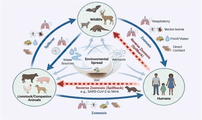
The places most likely to produce the next outbreak tend to share certain conditions: rapid urbanization, close human-animal proximity, and weaker health systems. Those factors are measurable and mappable in different layers. When you overlay them, you start to see where multiple risks concentrate in the same communities.
Knowing a country is high-risk is one thing. Knowing which specific communities to prioritize when something starts to develop is a different and harder question. That gap between "this area is likely at risk" and "here's where we act first" is what granular risk mapping is designed to address.
What granular risk mapping involves
Those measurable factors each become a layer in the analysis. If you stack them together, you get a composite risk layer that surfaces where exposure is high and access is low. The analysis works across three dimensions:
- Exposure. Where spillover from animal hosts is most likely, based on species distribution and land use patterns.
- Community vulnerability. Which communities are most at risk of undetected transmission given their access to care, connectivity, and health infrastructure.
- Epidemic potential. Which areas could seed broader spread if an outbreak takes hold.
“An ounce of prevention is worth a pound of cure”
The most valuable application of this kind of risk mapping is in prevention and surveillance. Knowing which communities sit at the intersection of high risk of exposure and limited access helps direct preventative health investments in the areas that need it most: where to run educational programs around risky human-animal interactions, where to strengthen surveillance coverage, where to concentrate health system resources. Risk modeling is built for that question.
When surveillance signals start coming in, whether that's unusual case clusters, lab flags, or field teams logging anomalies in specific areas, they feed into the same risk picture. The risk map updates and a pattern pops up before anyone has declared an outbreak. The same map that guided proactive prevention can also help health teams react with fewer delays.
How the Crosscut App improves risk surveillance
The Crosscut App is built to run this kind of risk analysis across an entire country, in a browser, without needing GIS software or local processing power. The inputs that go into a risk layer vary by program, but the app is built to handle them. Those inputs typically include:
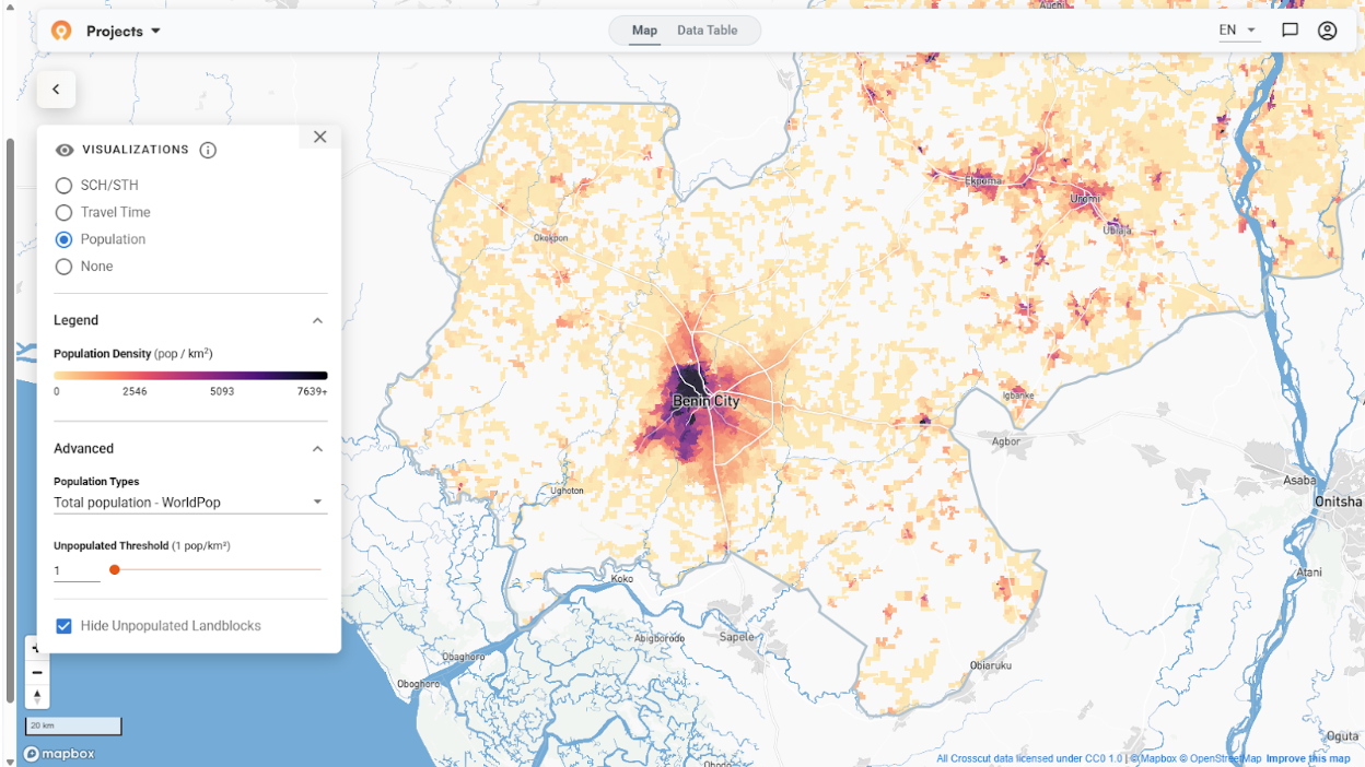
- Urban growth tracked through multi-year satellite comparisons at a 100m grid square level (fine enough to see where populations are concentrating and how fast)
- WorldPop settlement layers overlaid with animal habitat data to show where human and animal populations intersect at highest risk
- Health facility accessibility mapped against subnational wealth data to show where system capacity is thinnest
- Realistic travel time accounting for road networks, terrain, and population distribution to show which communities are genuinely hard to reach
Combine these layers and you have a composite picture of where risk is high and access is low. The thresholds are adjustable by program context and what they need. A rural NTD campaign in Madagascar uses different parameters than an urban surveillance program in Nigeria.
From that analysis, key outputs include:
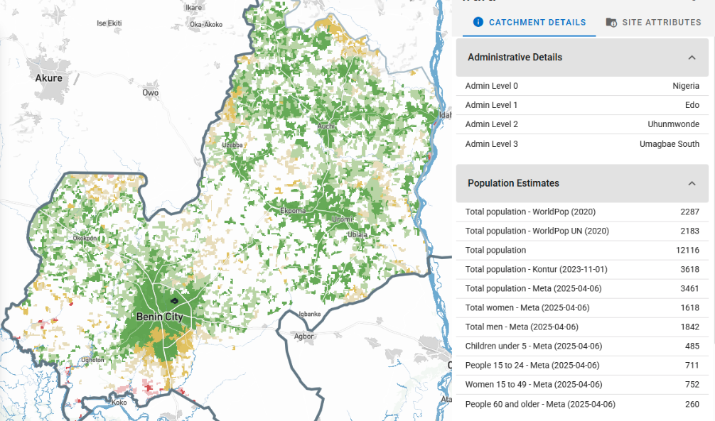
- Catchment area maps with population estimates from WorldPop, GRID3, and Meta
- Accessibility heat maps combining travel time and population density so programs can see service gaps in real time
- Risk layers and boundary data exportable in standard formats for any reporting platform
- Live dashboards that update as new field data comes in
Crosscut also integrates directly with DHIS2, the health information system in use across more than 120 countries. This access means risk layers and catchment data live inside the platform country teams already work in. Programs with more specific needs, whether that's custom integrations, additional data layers, or specialized analysis, can work with us directly on those.
Built for the planning teams, not just the analyst
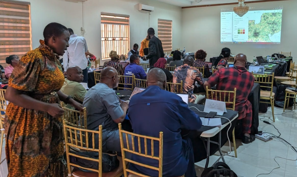
The data across those input layers isn't always complete or consistent depending on the country. That's a real constraint. The benefit of a tool like the Crosscut App is that it pulls from the best available sources for each context, runs in a browser, and doesn't require GIS software or specialist hardware. Program managers and ministry teams can use it during planning meetings or pull it up in the field.
Map the risk picture before you need it
Disease surveillance and outbreak response both depend on spatial decisions made well before a crisis. Where do diagnostics go, which communities get prioritized for contact tracing, where are resources already in place when the first signal arrives? Ministries and health programs that have mapped their risk landscape, built catchment boundaries, and connected their analysis to country health systems are the ones positioned to move when it matters.
The Crosscut App is free to use and available across 55 Sub-Saharan African countries, as well as other regions where outbreak risk is high. For programs that need custom data layers or deeper integration with existing systems, we do that work through our Advisory Services.
Related Posts
How the Crosscut App helps plan health campaigns in Nigeria

An independent evaluation of the Crosscut App
.JPG)

How to set up a Microplan Collector project in the Crosscut App
