
How catchment area maps calculate travel time accessibility
Accessibility mapping tools show you the area that can be reached within a certain amount of time. See the example below from Google Maps. The shaded area shows those places that can be reached within a 15 minute walk of the Giraffe Center in Nairobi, Kenya.

Google Maps will also show you the area that is a 15 minute drive from the Giraffe Center.

Pretty good, but there are a few challenges with it. The biggest challenge for using this in global health is that it doesn’t work everywhere. You can only use the accessibility tool where there is an existing point of interest in Google Maps. You can’t just drop a pin in a settlement of interest and have it work. Computing these accessibility maps requires major geospatial computation. Google Maps pre-computes accessibility for certain, more trafficked locations and makes them available via their application. That leaves gaps in most areas across Africa.
So if Google Maps won’t work for analyzing accessibility in Africa, what will? There are two main technical approaches for generating these types of maps. Almost all applications offering accessibility maps use one of these two approaches.
Road network approach: Routing along roads
As most of us have experienced first hand, one thing Google Maps and other services do quite well is compute travel time along roads. The key here is that this approach requires a well-defined road network to use for computing accessibility. Google Maps, Apple Maps, and purpose-built catchment tools like Smappen all work this way. They trace available roads, estimate travel speeds for each road, and calculate how far you can get in a given time. The result is an isochrone: a polygon showing everywhere reachable within 30 or 60 minutes. See Mapbox’s isochrone tool showing a 20 minute walk from the Giraffe Center. As you can see, the accessibility area is directly tied to the road network.

Road-network tools are useful for the contexts they're designed for, like navigating cities, estimating delivery zones, mapping service areas in places with reliable infrastructure. They produce accurate results where road data is complete and travel follows mapped routes.
But what if you’re planning a vaccination campaign in rural sub-Saharan Africa with incomplete road data, informal paths, and where people regularly travel off-road. If your tool only routes along road networks, you can't estimate access for communities without a mapped road connecting them to a facility. The map may show large blank areas where the tool has no data to work with. Or what if you need to create “territories” of areas that include land that is not near a road?
Cost-distance approach: Calculating across terrain
The second approach is computing cost-distance over a friction surface. What does that mean? Every piece of land has a cost to cross it based on how hard it is to move: roads are fast, forests are slow, rivers are barriers, and steep slopes add time. Friction surface maps offer travel time estimates that work on- and off-road.
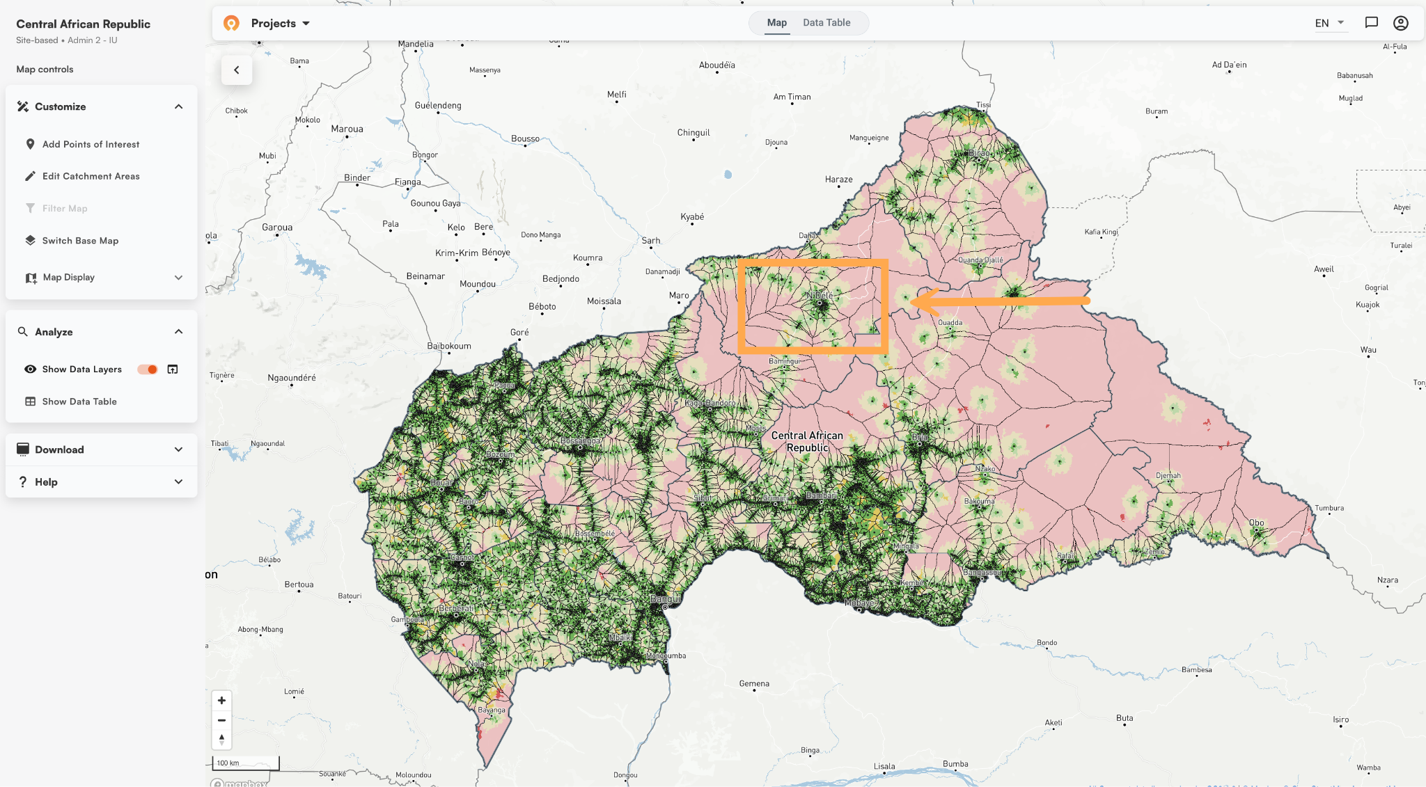
The Crosscut App is in this second class of tools that uses a friction surface to compute accessibility. With Crosscut, each facility point (black dot in the map below) you upload generates its own catchment based on cost-distance calculations. This computation below shown in the Central Africa Republic works regardless of the state of the underlying road map data.
Using cost-distance and a friction surface has existed in GIS research for decades. The WHO's Geo-enabled Microplanning Handbook (PDF) describes it as the most realistic way to create catchment area maps because it allows for combinations of travel modes and accounts for natural barriers. The tradeoff is that this method typically requires more setup, computing power, and GIS skill on the user’s end. This is way more than what can be done to quickly answer a question and move on, which is what most health workers want from an accessibility map.
Tools like AccessMod, as one example, use cost-distance. But you as the user have to pre-load all the elevation rasters, land cover layers, road networks, and population grids. You have to set up a virtual machine on your computer and run hours or days long analyses that may or may not complete. You have to know your way around a GIS service and wade through extensive technical documentation. The answer can be robust, but it is out of reach for many.
The Malaria Atlas Project also offers a friction surface to analyze accessibility, which was a great offering in its time. However, it has not been updated in more than 5 years at this point, is not actively maintained, and does not offer the solver to make use of that friction surface.
These tools might be reasonable for a GIS specialist, even if the underlying data isn’t up to date. For a ministry of health planning team preparing for a campaign, it’s a huge amount of time, effort, and training for a one-time use of something like a health campaign.
How the Crosscut App simplifies the process
The Crosscut App offers all the benefits of cost distance maps without all the setup. The only data you need is your list of sites with latitude and longitude. And the results are orders of magnitude faster than a cost-distance modeling approach.
Before a country appears in the Crosscut App, we pre-process administrative boundaries, road networks, elevation data, land cover, and building footprints. That upfront loading happens once on our end. We refresh this analysis once a year to use the latest input data available. When planning teams upload a facility list and generate catchments, they get cost-distance results in a few minutes rather than after days of data preparation.
Whether for five facilities in one area or 500 across a country, you just upload the spreadsheet once. All the computation runs in the cloud and renders in the web-based platform. You can read more about how that process works in the how to create catchment area maps guide.
Can I just use ChatGPT or Claude to recreate this process?
The data Smappen and AccessMod are missing is the same thing that makes AI a poor substitute. They don’t have prebuilt friction surfaces, preloaded data, and geospatial computation infrastructure. Dropping a CSV of coordinates into Claude or ChatGPT won't produce a reliable catchment map, because the data, context, and analytical pipeline isn’t there.
AI tools can help you write code or interpret outputs, but it can't run the underlying computation. Geospatial analytics relies on massive datasets. The data assembly and processing is the heaviest lifting, and that work happens before you build a catchment. We understand the inclination to use AI and use it in our own engineering process, but the geospatial processing and context that makes the Crosscut App work happens before any of that.
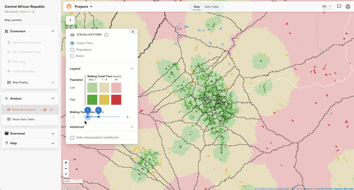
User-friendly accessibility heat maps
Once catchments exist, the same travel time surface that defines their boundaries also shows where populations sit relative to those boundaries. Red areas are more than an hour's walk from any facility. Green areas have good access. The map shows territory boundaries and travel time together, so you can see which communities are close and which are harder to reach.
Accessibility heat maps are built directly into the app. You can use the slider to set your walking time threshold and each catchment updates automatically, with population estimates from WorldPop, Meta, and Kontur, showing how many people fall within range versus further out. Tools like Smappen do offer heat map visualization, but the output relies on road data and doesn't include the preloaded population layers Crosscut pulls automatically.

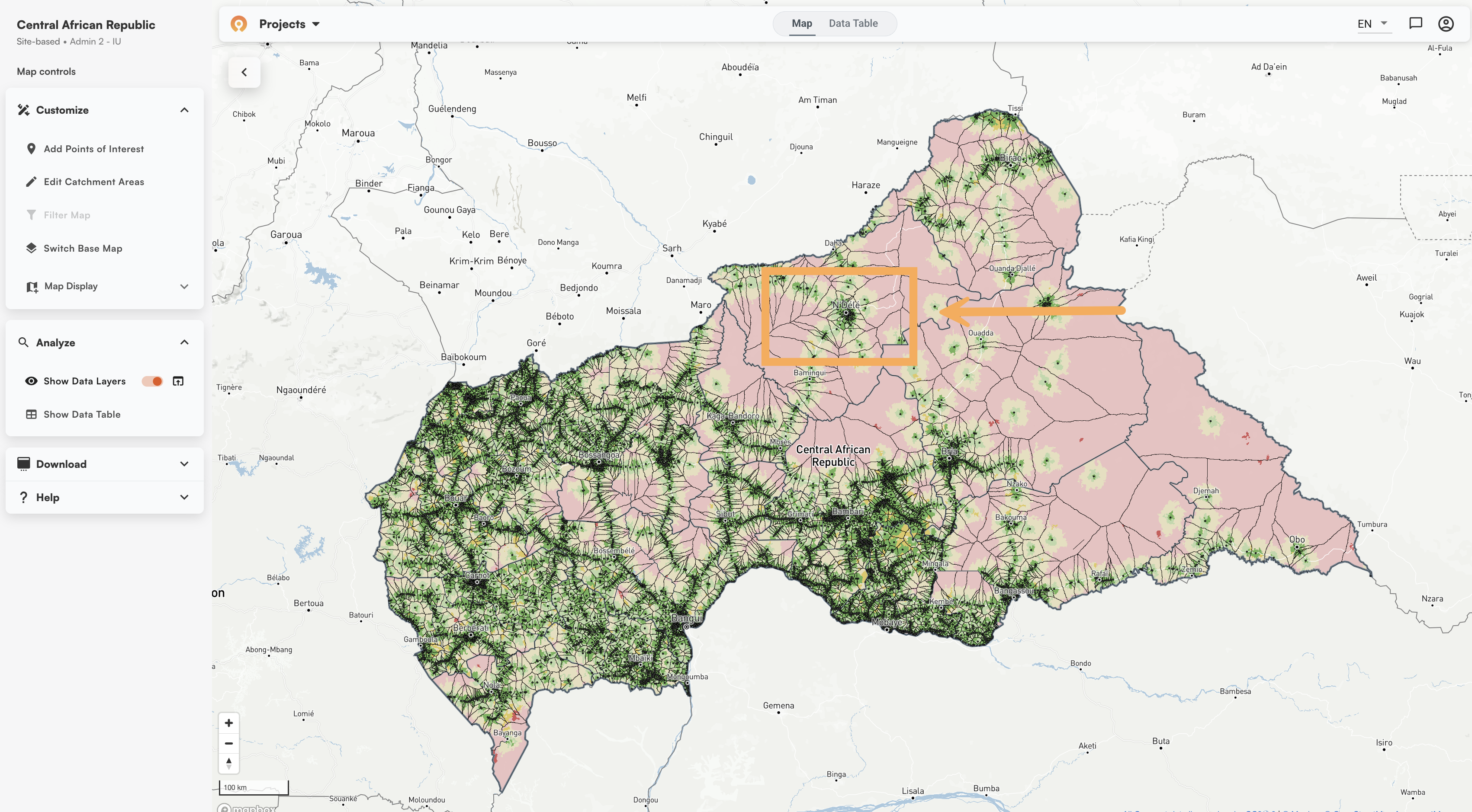
Testing approaches in Central African Republic
To illustrate the difference between the two methods, we loaded settlement point data from the Central African Republic into Google Maps and the Mapbox Isochrone API, then generated the same catchments in Crosscut.
Mapbox isochrone example (generated in Isochrone API playground)
The Mapbox Isochrone API playground produced a 60-minute walking isochrone around N'Délé. The polygon covers the town but follows road corridors closely. Where mapped roads thin out at the edges, so does the catchment coverage.

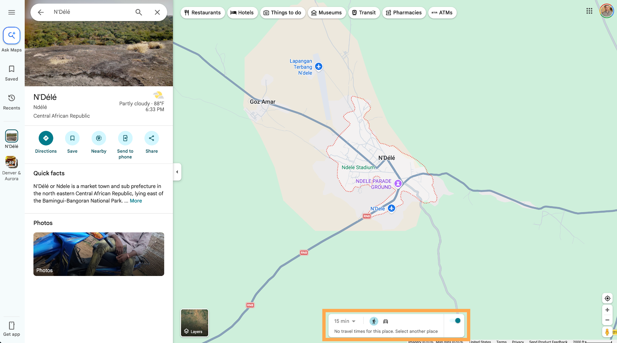
Google Maps isochrone example
Google Maps returned nothing at all for the same location. You can see "No travel times for this place." There was no isochrone to generate, and no catchment to draw.
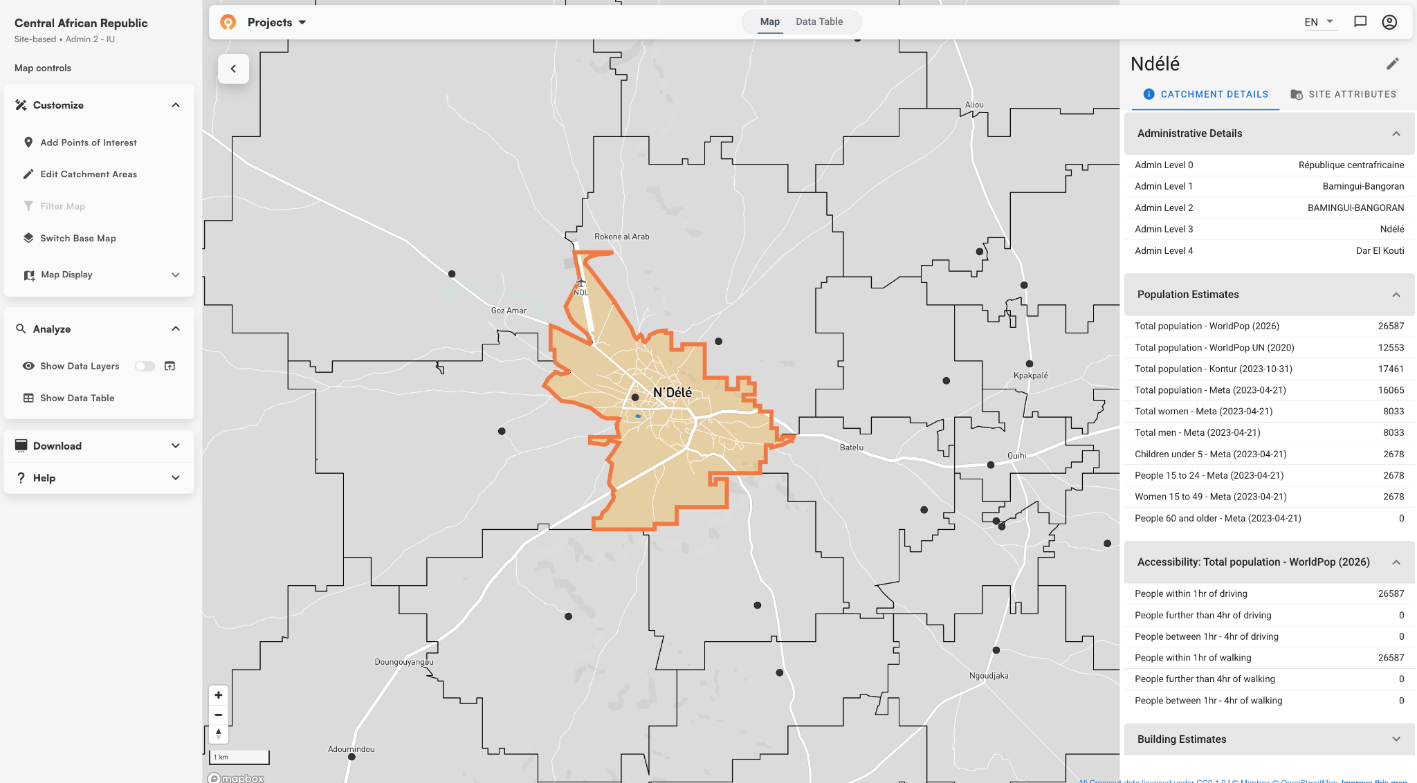
The Crosscut App catchment area map example
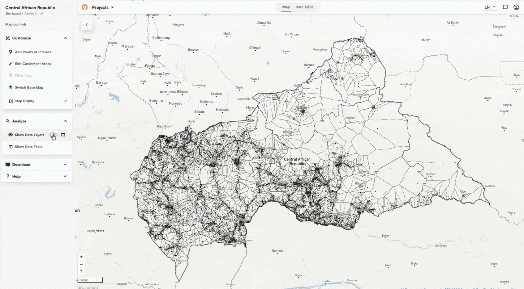
In Crosscut, we loaded a dataset of 6,000+ settlement points across the Central African Republic and generated catchments across the entire country. The catchment boundaries follow realworld terrain like forest and trees. Roads factor in, but they don't constrain it.
The Crosscut App accessibility analysis
Zooming into N'Délé shows the same area from the examples above, with coverage that extends well into the surrounding landscape rather than pulling back where road data runs out.

Walking time and driving time in The Crosscut App
Walking time is the default in most health campaign contexts, but the Crosscut App also supports driving time analysis. You can easily switch between them in the advanced settings based on what your program needs.
Free accessibility analysis without the GIS barrier
Health planning doesn't always come with good road data. Road-network tools work well where map data is reliable. Tools like AccessMod give specialists full analytical control at the cost of significant setup time and GIS expertise. The Crosscut App handles the data preparation and computation so planning teams can get cost-distance results without a GIS background.
The Crosscut App is free to use and handles the data preparation, computation, and accessibility analysis for you. Start creating catchment area maps
Related Posts
How the Crosscut App helps plan health campaigns in Nigeria

An independent evaluation of the Crosscut App
.JPG)

How to set up a Microplan Collector project in the Crosscut App
