
July 2025 updates: From black boxes to easier data collection
Last month, we shipped several improvements that came directly from user feedback. We regularly survey teams across 30+ countries and talk with program managers to understand where they get stuck. These new features address real problems – bounced email issues, file validation headaches, and workflow friction that can slow down health campaigns.
Starting with this post, we're excited to start sharing these monthly recaps on what’s being built behind the scenes.
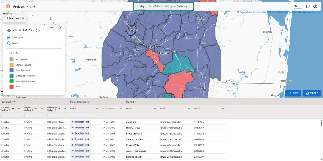
Making email-based data collection more reliable
A persistent pain point we heard about was the black box nature of email-based data collection. You send out templates, some come back, others don't, and you're left guessing whether someone's email bounced, got caught in spam filters, or they just haven't responded yet.
I’ve written about why email and Excel workflows persist – they're familiar, require no new software, and work with what teams already do. The missing piece has always been knowing what's happening behind the scenes. These July improvements fill those information gaps while preserving the familiar process.
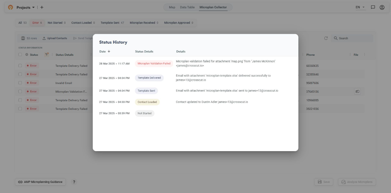
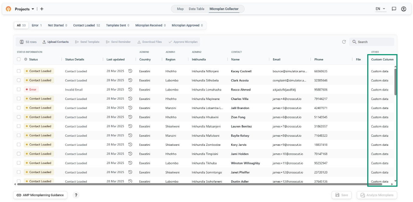
We also added error logging that shows you exactly what happened if a template delivery fails. You can now see whether it was due to a bounced email address or a spam complaint. This should eliminate some of the guesswork that's always been part of email-based data collection.
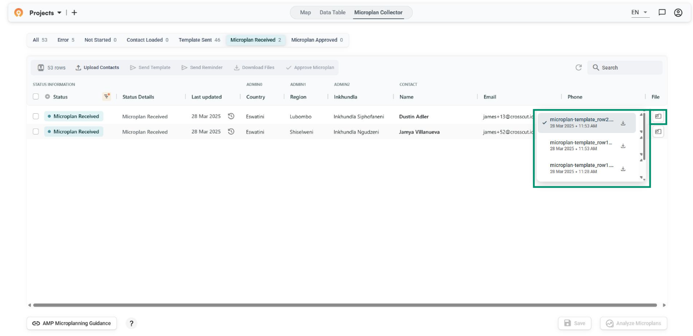
Better file handling and data consolidation
When people submit multiple versions of the same microplan template (which happens more often than you'd think), the system now lets you designate which one is the "primary" file for consolidation. You can still access all versions, but how data aggregates is now much cleaner.
We also improved the file validation process, switched the default template from CSV to Excel format (since that's what most teams actually use), and streamlined contact entry so you can start sending templates as soon as you have a valid email address.
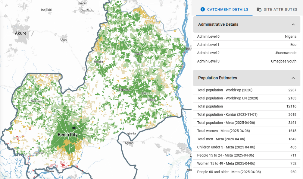
Once validated, the system can stack multiple templates into a single Excel file for download and benchmark field data against sources like WorldPop and Grid3 satellite estimates.
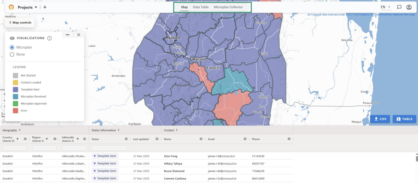
Easier navigation between views
Moving between different views of your data should be seamless. We added a navigation bar that lets you switch quickly between the map view and table view of your Microplan Collector project. Small change, but it eliminates the clicks and page loads that used to interrupt your workflow when you needed to cross-reference data or check map results.
Flexible contact management
Teams often need to track additional information about their contacts beyond the standard fields. That includes notes about previous campaigns, special instructions, contact preferences. Crosscut now supports custom columns when you upload contact lists, so you can stay organized without having to maintain separate spreadsheets.
Better loading experience
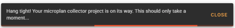
Tasks like generating a new project require back-end processing on our end. The app pre-loads all the geographic data so it runs smoothly once you're working with it. This only happens once, but you used to just stare at a blank screen wondering if anything was happening. Now you get clear progress indicators showing exactly what's being processed and how much time is left.
Bridging language barriers
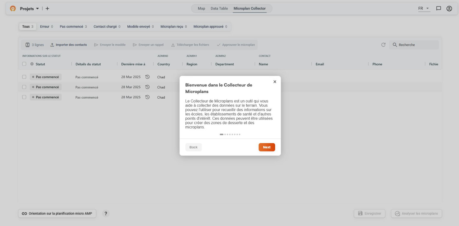
With 21 French-speaking countries in Africa where health programs operate, language shouldn't be a barrier to better planning. The Microplan Collector tutorial is now available in French, opening up the tool to Francophone teams who've been managing complex campaigns in their second language. This is just the first addition for non-English speaking users worldwide.
Users speak, we listen
Each improvement traces back to feedback from those surveys and interviews. Our goal is simple through each new sprint: build the easiest possible GIS mapping and planning tool by listening to how people actually work, not top-down assumptions. Whether that's easy boundary editing without QGIS expertise or reliable data collection, your input shapes every feature.
What's up next
We just wrapped up another hack week, where the entire team spent five days focused on advancing some of our more ambitious features. Another intensive sprint is coming next month. I'm excited to share the results in next month's recap, particularly the supervisory area work that should be valuable for teams working on equity-focused campaign planning.
Until then, all these July features are live and available for free in the Crosscut App. And if you're managing field data collection, we'd love to hear what you need next.
Related Posts
How the Crosscut App helps plan health campaigns in Nigeria

An independent evaluation of the Crosscut App
.JPG)

How to set up a Microplan Collector project in the Crosscut App
