
December 2025: App updates and WHO workshop in Brazzaville
December was about optimizing the app and ongoing country projects. Emmanuel and Sam updated the UI based on what we’re hearing from users. Brianna sped up our country processing pipeline while Sam also gathered the raw geographic data we'll need to load new countries in 2026. James continues supporting teams in Nigeria, Guinea-Bissau, and Liberia.
Coite was invited to present what we’re learning from that work at WHO AFRO's workshop in Brazzaville with planning teams and ministries of health from 13 countries.
Using feedback to improve performance
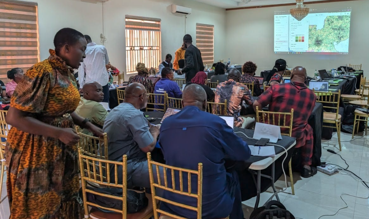
Emmanuel worked on several updates that came directly from watching teams use the app during training sessions in Nigeria and Guinea-Bissau.
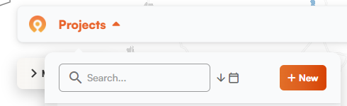
Clearer project creation. The create project button now appears in the project list dropdown with text explaining what it does. Previously it was just a plus (+) sign next to the projects list. There were times new users weren't sure how to start a project, so we made it easier to find and more explicit.
Search and sort. We also added a search bar to the projects list. If you have dozens of projects from multiple campaigns, you can quickly search them. You can also sort projects by date now.
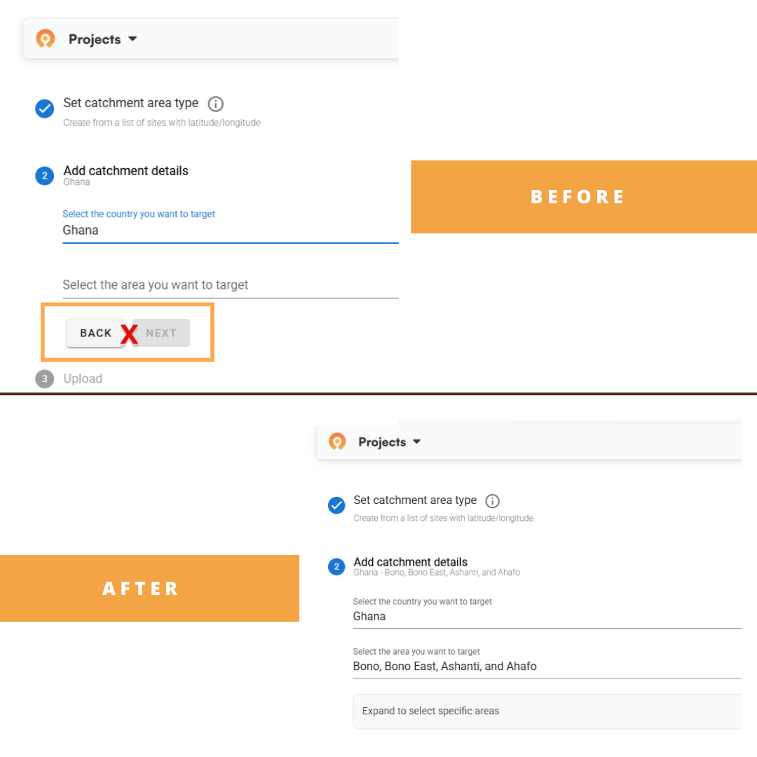
Hidden admin selector. The admin selector button doesn't appear until after you've selected the country and administrative area you want to work in. It used to show up earlier, which confused users who thought they needed to interact with it or take an action before moving on.
Action button tooltips. In the Microplan Collector, some action buttons grey out when they don't apply to your selected rows. This prevents errors if you try something that doesn't make sense. People weren't sure why buttons were greyed out, so we added simple tooltips that explain what you need to do to unlock each action.
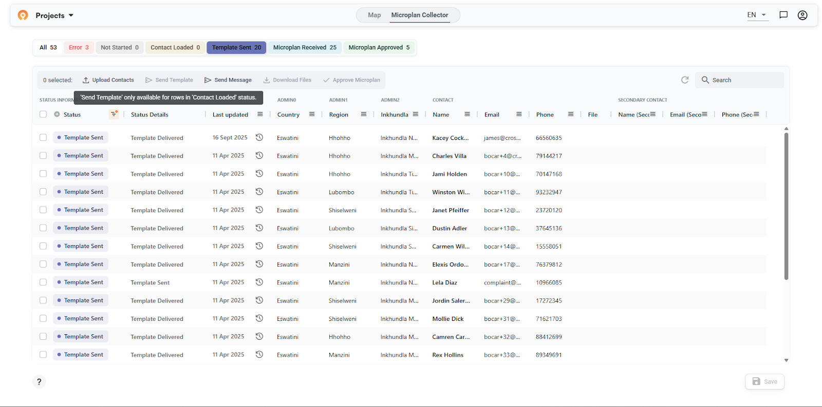
What we updated
Faster project switching. On top of being hard to search, the projects list was getting laggy for users with long lists. Emmanuel also optimized the code to make it snappier.
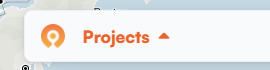
Map loading bug. Sometimes the map would get stuck in a loading state when switching between projects. Grey overlay, spinning circle, never finishing. You had to refresh and start over. We fixed the bugs causing this so maps are smoother to load and interact with.
New visualization options
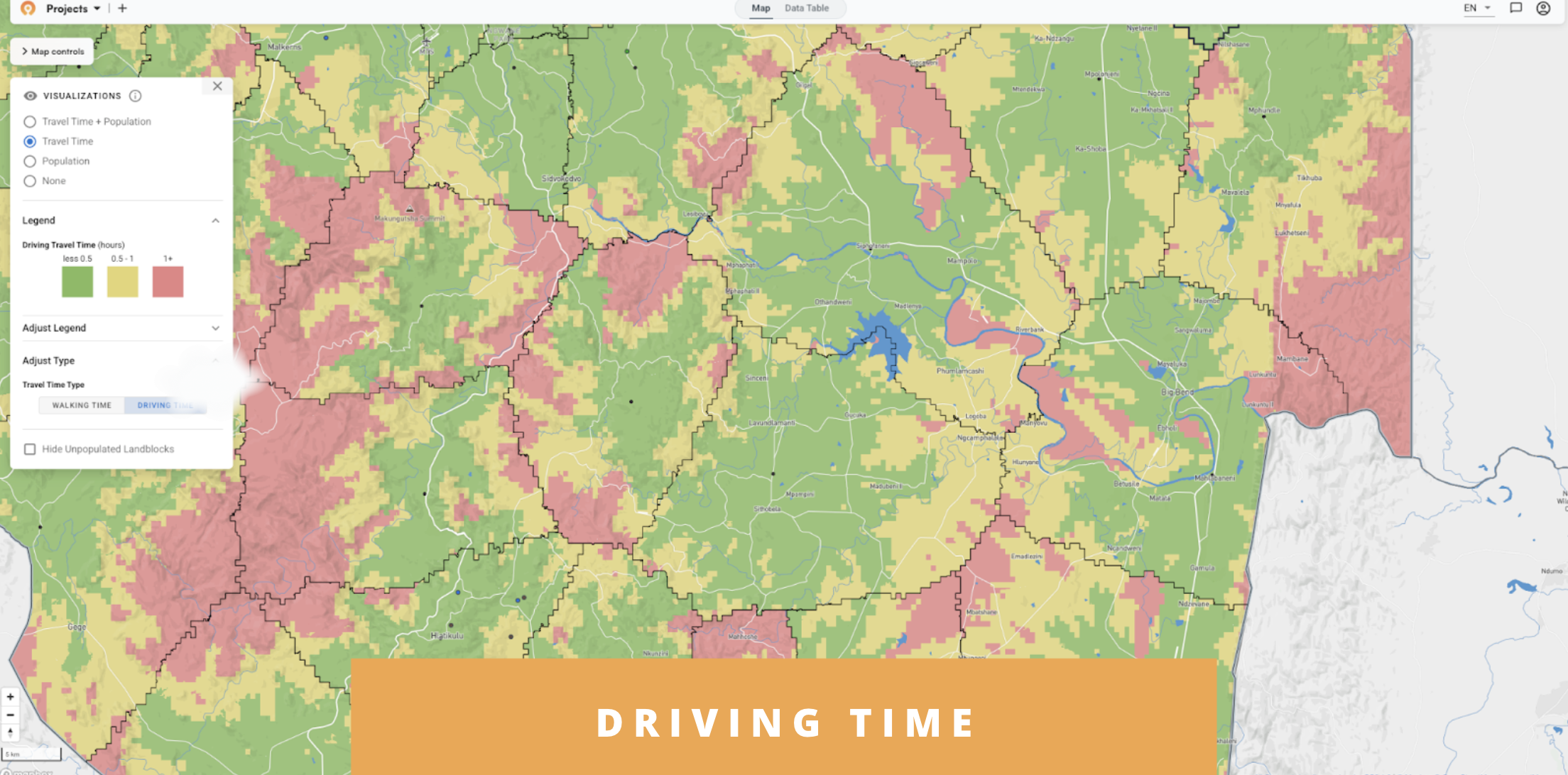
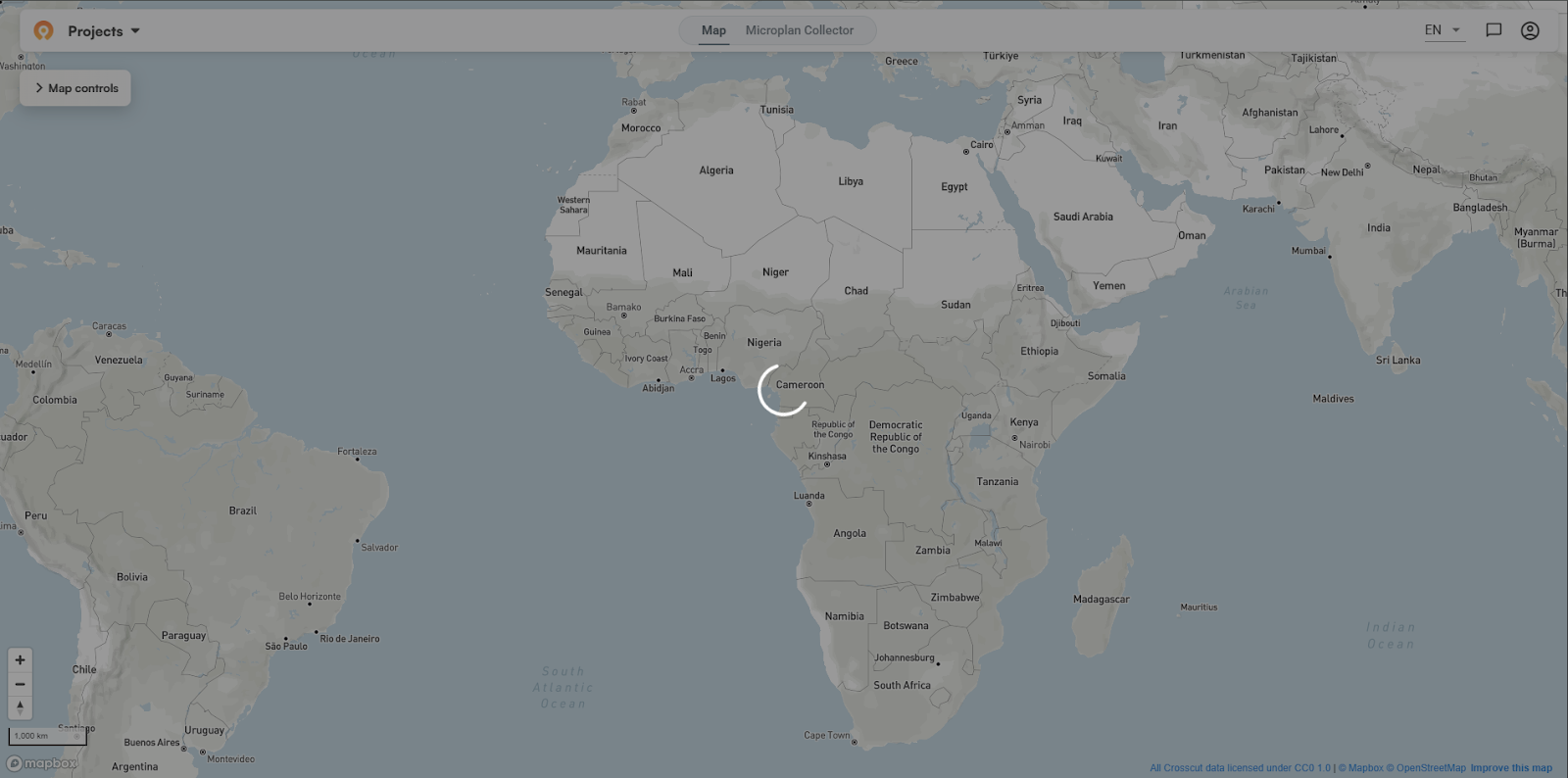
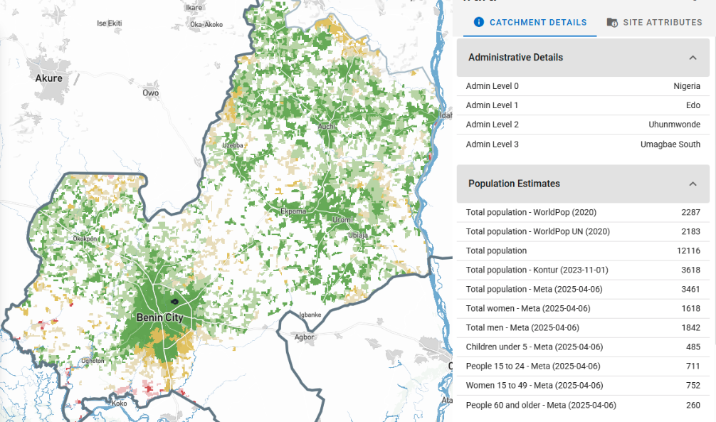
Driving time heat maps. As we refresh countries across ESPEN's coverage area, users will start seeing the option to view travel time accessibility maps based on driving instead of just walking. This helps for scenarios where personnel are using motorbikes or other vehicles to visit communities.
The new visualization breaks down population by driving time bands, and shows how many people live within different travel times from the service points users select.
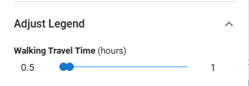
Custom travel time bands for punchout links. We can now adjust the color thresholds when creating punchout links. These are the URLs that automatically show the latest supervision visits with the map already configured (like what we built for Nigeria's supervision gap work). The Carter Center partner team asked for communities to be colored yellow if they're 0.5 to 1 hour from the nearest supervision site and red if they're over 1 hour. This customization creates more of a binary view where green means covered and red means not covered.
Faster performance, more efficient processing
Brianna worked on speeding up our country processing pipeline, which happens behind the scenes when we add new countries or refresh existing data. We run all these preprocessing jobs on AWS cloud infrastructure. Faster processing means users get access to new countries quicker and we can support more teams without needing proportional engineering time.
We started by building tooling to understand where time and money were being spent:
- Breaking down costs by storage, compute, and memory showed us which parts of the pipeline were expensive
- Tracking both successful and failed jobs revealed patterns in what was breaking
- Identifying bottlenecks pointed to where we'd get the biggest gains
That analysis showed our AWS jobs were sitting idle while waiting to download the software packages needed to run the algorithms. These packages (called Docker images) can be quite large. We made two main changes:
SOCI indexing. Instead of waiting for the entire software package to download before starting work, we can now begin processing while it's still downloading in the background.
ARM64 processors. We also switched our cloud infrastructure from x86 to ARM64 architecture, which runs the same algorithms faster and uses less power.
Combined impact. One algorithm that took 43 minutes now finishes in 11 minutes. For Ghana's complete country processing, total cost dropped about 67%. Shorter processing times also reduce the risk of AWS terminating long-running jobs before they finish, which used to require manual restarts.
Preprocessing data for new countries
While Brianna worked on speeding up how we process countries, Sam gathered the raw data we'll feed into that faster pipeline.
Before any country becomes available in the app, we need administrative boundaries, road networks, population data, and building footprints. Sam organized this foundational data for over 15 countries so far. Once that groundwork is done, we can run the freshly optimized algorithms that generate land blocks and travel time estimates.
Looking at 2026
Most of these updates came from watching teams use the app in Nigeria, Guinea-Bissau, Liberia, and other in-country work across Africa. James's training sessions showed exactly where the interface confused people or where performance mattered.
At the WHO workshop in Brazzaville, Coite presented this work to teams from 13 countries facing tighter budgets and smaller staff next year. Watching these teams pool resources and share knowledge gives us measured optimism for the year ahead.
As always, everything we ship goes into the free version of the Crosscut App. If you're working on similar challenges, reach out through our Advisory Services.
Related Posts
How the Crosscut App helps plan health campaigns in Nigeria

An independent evaluation of the Crosscut App
.JPG)

How to set up a Microplan Collector project in the Crosscut App
