
Catchment mapping for disease campaigns: Insights from WHO AFRO's Brazzaville workshop
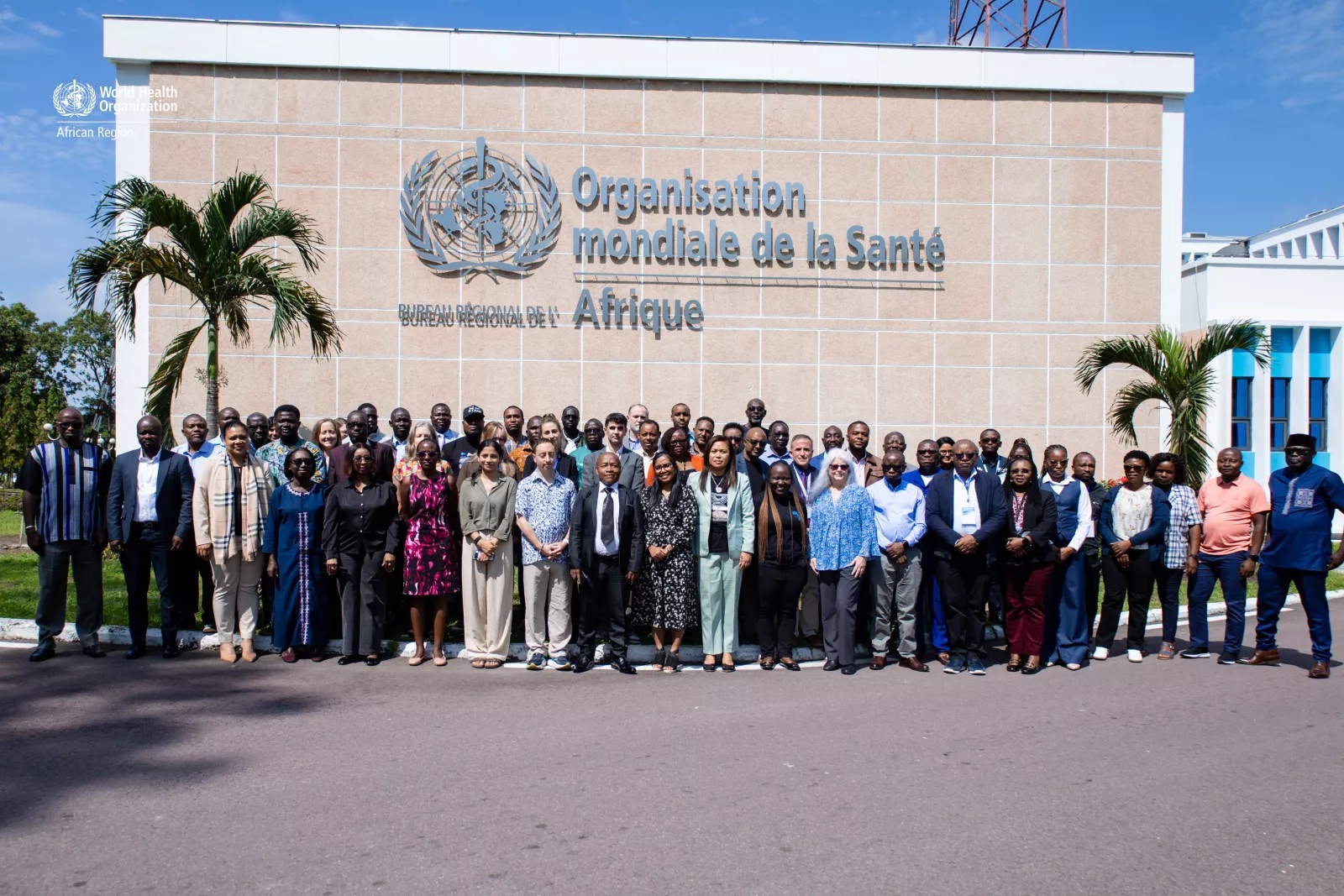
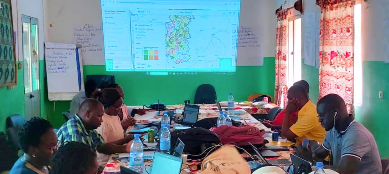
Last week I was in Brazzaville for WHO AFRO's regional workshop on data systems and tools for neglected tropical disease programs.
The four-day workshop focused on strengthening data systems for preventive chemotherapy neglected tropical diseases (PC-NTDs) across Africa, and how to harmonize monitoring and evaluation in such a constrained financing environment. Participants included Ministry of Health teams, partners like Sightsavers, The Carter Center, and JSI, plus tool developers like us.
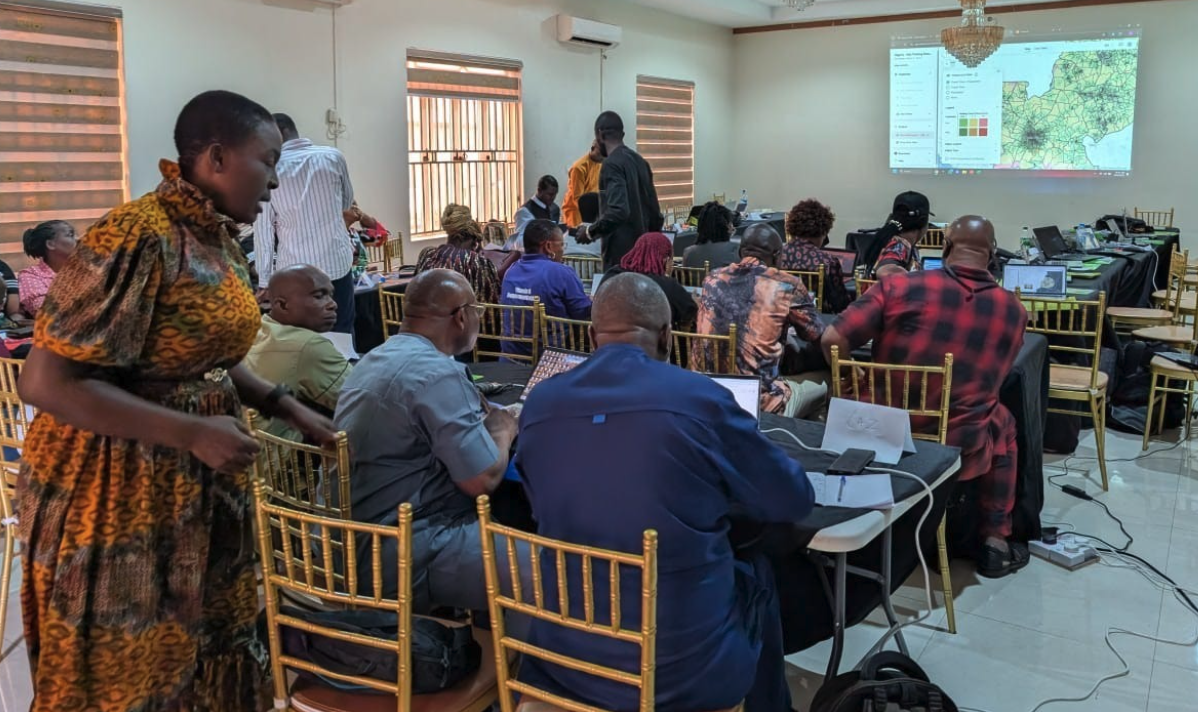
More than 70 participants from 13 ministries of health joined the workshop. We spent each day tackling data collection, campaign planning, and coverage tracking where resources are limited and tradeoffs are unavoidable.
A meeting of the minds for NTD data systems
The workshop was for those on the ground managing NTD programs in Africa, and whose programs mobilize tens of thousands of volunteers to deliver preventive medicines each year.
The sessions were simultaneously translated across Portuguese, French, and English. It felt like a UN setting, which I guess it kind of is. WHO staff sat alongside implementing partners and ministries of health, creating the kind of cross-country dialogue that rarely happens outside events like this.
The main theme was stopping transmission of disease but that means reaching enough people, in enough places, for enough years. The challenge is defining what “enough” actually means:
- How many villages need coverage?
- Where are they actually located?
- How many people live there now?
- How long does it take to reach them – or vice versa?
The broad focus was coordinating regional M&E initiatives, improving data flows from field to national systems, and addressing the ongoing funding constraints everyone's operating under.
Day 4: Digital tools for strengthening health campaigns
My presentation on Day 4 was part of an afternoon showcase alongside other digital tools. The day started with breakout groups where country teams mapped their current digitization landscape. We identified where there were tools, where there were gaps, and where multiple tools weren't talking to each other. That interoperability issue came up repeatedly.
The afternoon showcase included:
- CHIP v2.0 Platform (Sightsavers) for longitudinal program data
- ESPEN Geospatial Microplanner (my focus)
- ESPEN GenAI Assistant (Dimagi) for data support
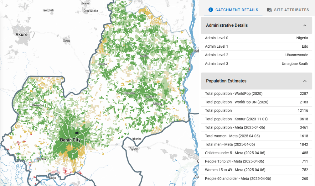
Each tool addresses different parts of campaign planning and monitoring. The ESPEN Geospatial Microplanner (a white-label version of the Crosscut App) focuses on the catchment mapping foundation that helps programs know which communities to reach.
What catchment mapping solves in disease campaigns
My session focused specifically on the operational challenges campaign planning teams face that directly impact coverage. Issues like inaccurate population estimates, no real-time monitoring of treatment and stock data, and siloed implementation outside routine health systems.
The slides covered our in-country work from 2025 and the specific problems digitizing catchment mapping and geospatial microplanning is solving within the broader NTD data ecosystem.
Crosscut’s Day 4 presentation
We walked through several examples of these country projects and their results:
Identifying supervision gaps during MDA campaigns.
During MDAs, Community drug distributors (CDDs) go door-to-door delivering treatments. Supervisors verify that work by visiting communities, checking in with CDDs, and sometimes interviewing households directly. There's typically about eight CDDs per supervisor, though that shifts with population, terrain, and team structure.
In Nigeria with The Carter Center, James trained their team how to analyze last year's supervision data using accessibility heat maps. The maps showed which communities received supervisor visits and which didn't. Teams used that analysis to prioritize areas that had been missed for this year's campaign.
We also created a way to track real-time supervision visits during active campaigns. As supervisors report which communities they've visited in field data collection tools like ODK and CommCare, the heat maps update automatically each morning. Teams can then spot coverage gaps, drop a point of interest, and redirect resources while campaigns are still running.
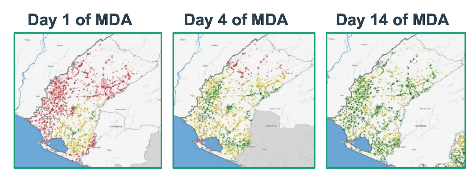
Liberia's Grand Cape Mount County also used this supervisory approach during their Oncho/LF MDA campaign. Last year, only 31% of the population lived within an hour walk of a supervision visit. This year, teams used Crosscut to plan supervisory visits based on realistic travel zones and population distribution. By day 14 of the campaign, that coverage reached 82%.
Creating balanced territories.
Urban areas with high population density need more supervisors than rural zones with difficult terrain. I covered how the new fair supervisory areas feature automatically generates service maps accounting for both scenarios. One urban supervisor might cover ten CDDs while a rural supervisor manages six, with boundaries adapting to what teams can realistically cover.
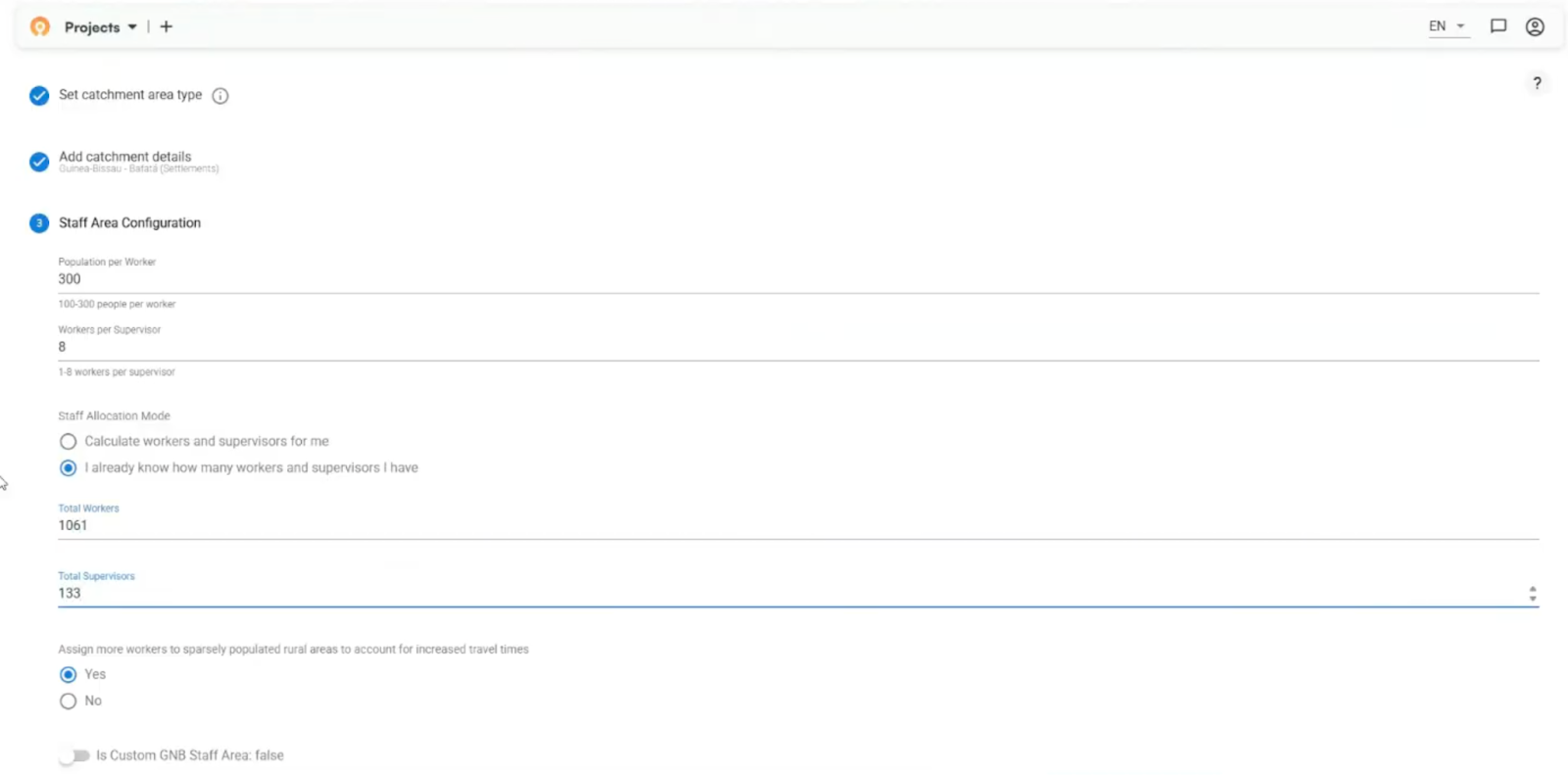
There is no universal planning process, and supervisory areas are different from one country to another. During their country project, Guinea-Bissau took a slightly different approach to divide large health facility catchments into manageable supervisory zones. The key for us is that we are able to customize the Crosscut App to meet the demands of these individual planning teams.
Collecting microplans at scale.
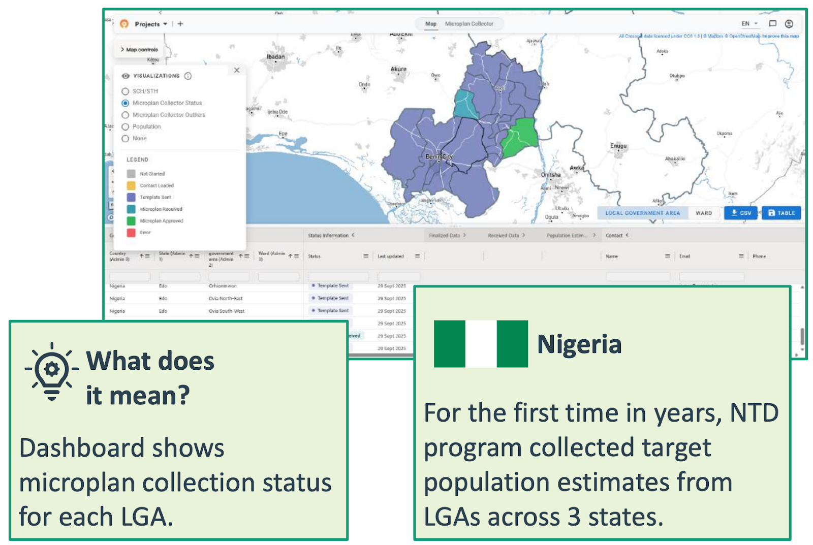
I also walked through Nigeria's 2025 microplan collection work. For the first time in years, their NTD program collected target population estimates from local government areas across three states, and all managed through one dashboard. The app distributes Excel templates, tracks who's submitted, and flags unusual estimates against satellite population data. Teams still use Excel and email so we built around their existing workflow instead of forcing them into something new.
The workshop covered the full toolkit
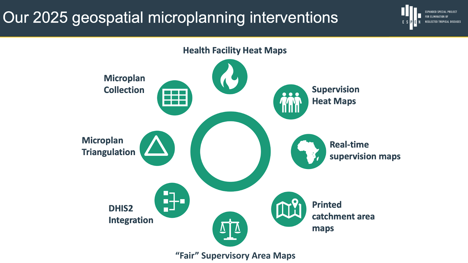
Those three examples represent a portion of what the Crosscut App can do. I also covered these features and how they work together to support the catchment mapping workflow:
- Health facility heat maps - Visual maps showing travel time and population density around facilities
- Microplan collection - Central dashboard managing Excel spreadsheets from all districts
- Microplan triangulation - Comparing submitted estimates against WorldPop, GRID3, and other satellite sources
- Supervision heat maps - Real-time maps tracking which areas received supervision visits during active campaigns
- DHIS2 integration - Connecting catchment boundaries directly into national health information systems
- Fair supervisory areas - Automated territory boundaries balancing population and travel time across supervisor zones
- Printed catchment maps (in beta testing) - Paper maps with QR codes field teams can use without devices – I explain below
These tools don’t exist in a vacuum. The heat maps help identify gaps, the fair supervisory areas help plan coverage, the microplan collection helps coordinate across districts, and the DHIS2 integration connects everything back into national reporting systems.
What the workshop confirmed
The workshop reinforced where we've been headed. Every session kept circling back to the same problem: teams don't need more tools, they need tools and people that work together.
We’ve been focused on the existing DHIS2 partnership that lets catchment boundaries flow into national reporting systems. And integrating with CommCare and ODK so supervision data automatically generates coverage maps daily during campaigns. Recent work with Unlimit Health was all about schistosomiasis control in DRC where we helped teams build boundaries from hand-drawn maps. We’ve also found ways to do more with PowerBI dashboard maps.
The approaches work equally well beyond NTDs because the core challenge doesn't change. You map service coverage, estimate populations, and allocate resources. We've previously used the same foundation for malaria control, UNICEF immunization campaigns, and more.
Building toward this integrated work
This presentation came after nearly a year spent getting ready for it. James was in Nigeria working directly with Ministry of Health teams during actual campaigns, making sure the tools work without GIS specialists. He also led training elsewhere. Teams were creating and editing catchment maps in their regular planning meetings using workflows they already knew.

Back home, we ran hack week to focus on improving performance in preparation for the year ahead. We rebuilt land blocks, the base layer underlying every catchment map, to drastically reduce load times for large countries. From 20+ seconds to under 1 second load time. Another focus was on smarter data aggregation so maps render smoothly regardless of zoom level.
We also continue testing new features. An exciting one is printed catchment maps with QR codes that let supervisors and CDDs mark which communities they visited, scan the code, and send photos back. We're building auto-extraction to calculate coverage from those markups. Testing in Nigeria and Guinea-Bissau pilots already show this can work for real campaigns.

And we documented all of this through July, August, September, October, and November. Each update fed into what we could demonstrate at the workshop.
Looking ahead to 2026
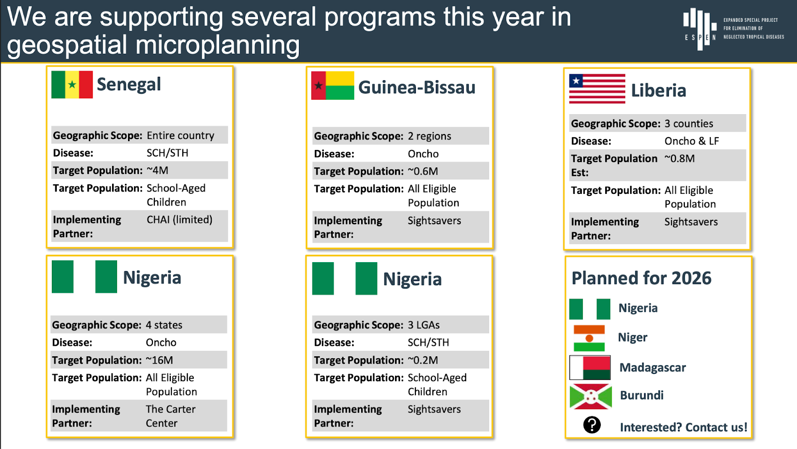
Members of Ghana’s and Tanzania’s MOH teams both attended the workshop, and expressed interest in deeper engagement next year. We are planning expansion to Niger, Madagascar, and Burundi. Work will continue in Nigeria, Guinea-Bissau, Liberia, and Senegal.
The goal is sustainable adoption. WHO continues expanding access to the ESPEN Geospatial Microplanner across the Africa region. Ministry of Health teams use the tools independently, with remote support when needed. We build around existing workflows. If better catchment maps help more people get preventive care, we’re meeting our goal.
A special thanks to Jorge Cano from WHO ESPEN for hosting this unique workshop – and for being a key stakeholder in Crosscut's operations over the last year. That partnership helped shape how we've approached integration challenges
Want to discuss how catchment mapping could support your program? Connect with me on LinkedIn or reach out through our contact page.
Frequently asked questions
What is catchment mapping for health campaigns?
Catchment mapping creates geographic service territories showing which communities connect to which facilities or teams. It helps estimate target populations using satellite data, identify hard-to-reach areas, and allocate resources based on actual access patterns.
How does the ESPEN Geospatial Microplanner work?
The ESPEN Geospatial Microplanner is a white-label version of the Crosscut App built for WHO's ESPEN program. It provides site-based and settlement-based catchment mapping across 43 WHO Africa region countries without requiring GIS training.
Do teams need GIS training to use these tools?
No. Ministry of Health staff create and edit catchment maps during planning meetings. The platform works with existing Excel and email workflows rather than replacing them.
Which health programs use catchment area mapping?
Catchment mapping supports campaigns for neglected tropical diseases (onchocerciasis, schistosomiasis, lymphatic filariasis), malaria control, and immunization programs. The approach applies wherever programs need to know which communities to reach and how to allocate resources.
How can countries access these catchment mapping tools?
All 43 WHO Africa region countries can access the ESPEN Geospatial Microplanner through the ESPEN portal at no cost. Countries typically work with implementing partners like Sightsavers or The Carter Center for initial setup. Remote technical assistance is available from the Crosscut team.
Related Posts
How the Crosscut App helps plan health campaigns in Nigeria

An independent evaluation of the Crosscut App
.JPG)

How to set up a Microplan Collector project in the Crosscut App
