GIS Terminology Explained: A Practical Guide for Non-Technical Teams
GIS analysis can feel a bit like magic when you first come across it. You upload some data, click a few buttons, and get catchment maps showing who can reach services and where gaps exist. But the magic of GIS is actually just thousands (if not millions) of very basic calculations happening very quickly.
This article introduces the building blocks of GIS analysis. I'll also show how free tools like the Crosscut App simplify the workflow for non-technical planning teams.
Rasters and vectors: The two ways to represent geography
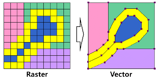
GIS data falls into one of two categories: raster or vector files. Think of them as two different languages for describing the world. Each works better for different types of geographic information.
Rasters: The grid approach
A raster dataset overlays a grid of cells on a geographic area, then assigns a value to each cell. Each cell value might be a number (like population count) or a color code (like in satellite images).
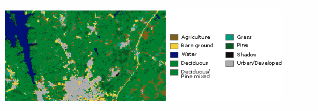
Satellite imagery is the most common example of raster images. Images on a screen are just grids anyways where each pixel stores a color, so rasters are a natural fit. But what about storing numeric values like elevation or population density?
Organizations like WorldPop and GRID3 both provide population estimates in raster format. Instead of saying "this village has 500 people," they say "this 100-meter square has an estimated population density of X." Census data might be as accurate, but the raster format breaks it down by location with more granularity.
Precision is important for planning teams because people don't spread out evenly across space and rasters account for that. The census data tells you how many people live in a district, but not where they cluster within it. Being able to see those groupings at 100-meter resolution makes it much easier to plan services, distribute teams, and allocate resources.
Vectors: Points, lines, and polygons
Where rasters divide an area into squares, vectors connect dots. They use coordinates to pin exact locations, then connect those points to create shapes like roads, lakes, or boundaries. There are a few main types of vectors you'll encounter:
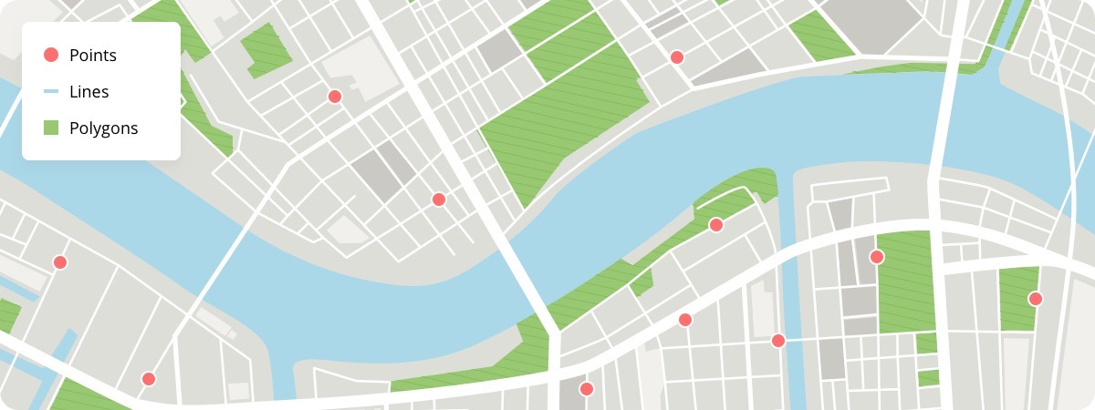
Points are the simplest geometry. Two numbers (X and Y coordinates) define a location. Facilities, service centers, or points of interest typically get represented as points. Points do not have any dimensions associated with them. You know where something is located, but not its size or footprint.
Lines are collections of connected points. Road networks usually get expressed as lines. We’re now up to one-dimensional data–you know where the center of the road goes, but not specifics like its width.
Polygons are line segments that connect to form closed shapes. These represent administrative boundaries, lakes, buildings, land cover like patches of forest. We have arrived at 2 dimensional data!
Multipolygons work just like polygons but allow one feature (a state, country, health facility, river, pond, etc.) to have multiple disconnected polygons. The United States needs a multipolygon because the continental US, Alaska, and Hawaii are geographically separate on a map.
Keep in mind these vectors are just numbers. They need context. A coordinate reference system (CRS) anchors those numbers on the map. If a hospital is at (-15, 62), the CRS tells you where the map’s starting point is (0,0), whether the hospital numbers represent degrees of latitude and longitude or actual distances like meters, and which direction is north, south, east, or west.
Without that information, you can’t place the hospital. If you use the wrong CRS, the same coordinates could actually land the hospital in the wrong country or the middle of the ocean.
Beyond establishing the origin point and units, the CRS is doing a lot of additional heavy lifting making it possible to represent the curved surface of the Earth on a flat map, but those are some of the fundamental factors that the CRS gives you.
From different data layers to realistic catchment maps
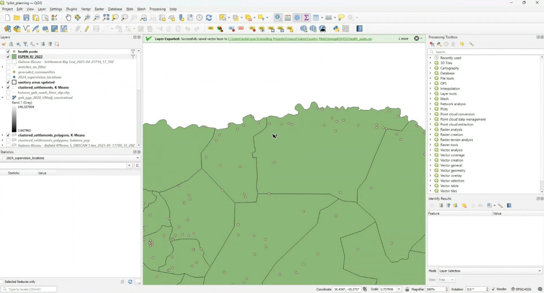
GIS software works by layering rasters and vectors together in a map that includes all of these details. Population rasters show where people live. Road networks as line vectors show how people move. Administrative boundaries and other polygons define the area of interest. This is where all the millions of calculations are happening at once.
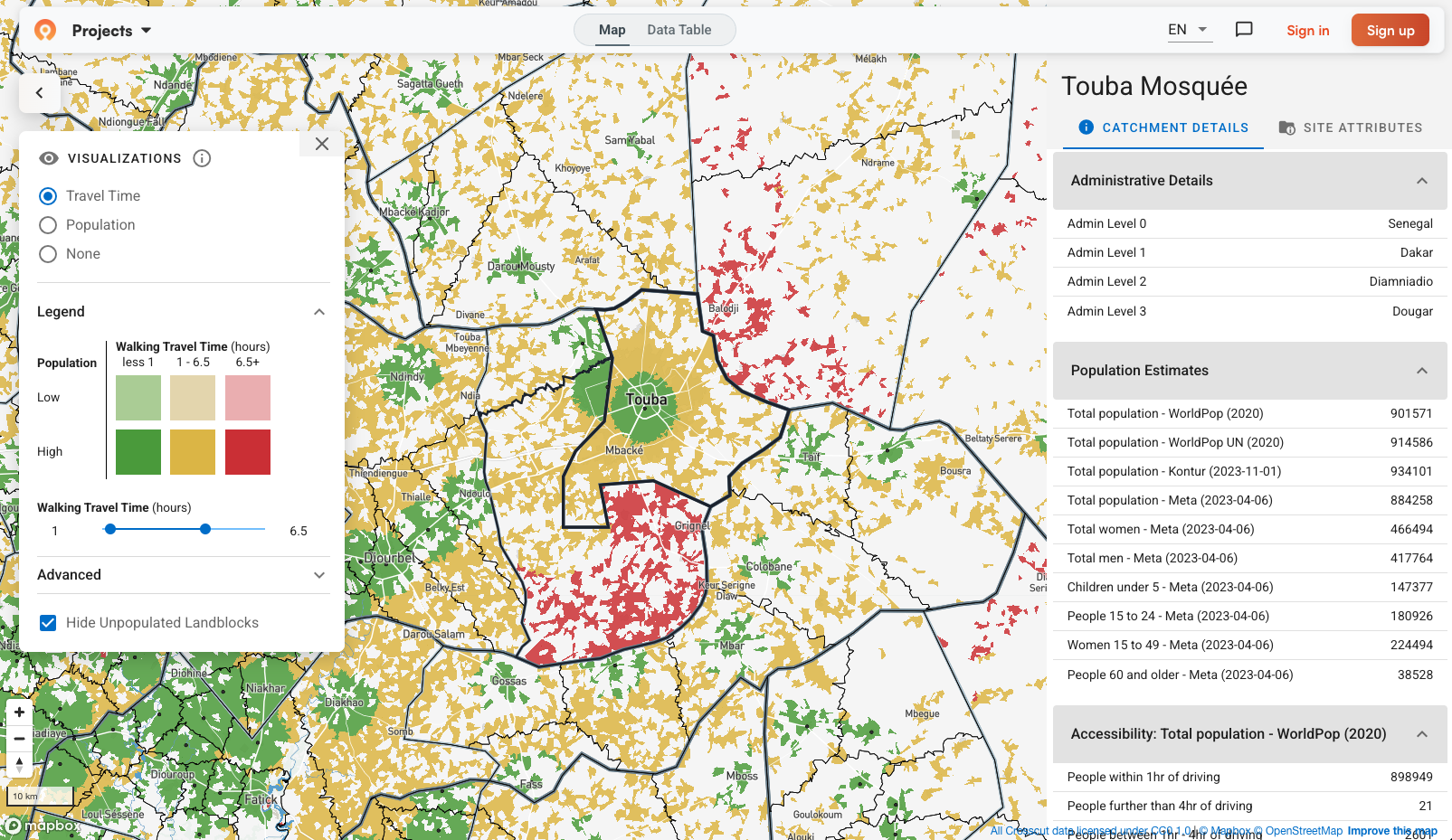
Once these layers are stacked, the software runs lots of these simple calculations at scale. Those result in isochrones and catchment maps to help teams solve for accessibility and responsibility. They answer: "How far can our services reach?" and "Which specific area are we responsible for serving?"
- An isochrone looks outward from a single point. It shows how far someone can realistically travel within a given time – maybe 30 minutes, an hour, two hours – following roads and terrain instead of straight lines. Isochrones are about reach. They make it easy to see where access drops off and which areas are effectively cut off.
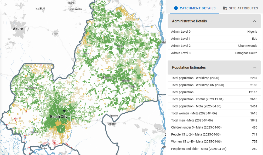
- A catchment map uses the same travel-time logic, but runs it across every facility at once. For each location on the map, the software calculates which hospital or service point is fastest to reach, then assigns that location accordingly. Catchments are about coverage – who serves which area when real travel conditions are taken into account.
All the building blocks come together. Catchment maps rely on vectors for facility locations and roads, rasters for population and movement costs, and a shared coordinate system so everything lines up.
The math is fairly simple actually. The challenge is running it all correctly, at scale and on a budget, without GIS expertise.
The challenge with traditional GIS software
Professional tools like QGIS and ArcGIS can do all of this. But the workflow involves downloading population rasters for your country, loading road network files, importing administrative boundaries, making sure all the coordinate systems align, configuring travel time parameters, and running the analysis. Each step requires knowing which datasets to use, which settings to apply, and how to troubleshoot when layers don't line up.
Most planning teams, particularly in global health, don't have GIS specialists on staff. Assembling the data into usable maps takes training and time that teams also don’t have. That's why organizations typically hire consultants or invest heavily in GIS training in order to unlock these analyses.
Try GIS software built for non-technical teams
The Crosscut App was built to make GIS analysis accessible to anyone. Population data from sources like WorldPop and GRID3, road networks, and administrative boundaries are already pre-loaded for fast access. You don't need to download, convert, or configure anything. Unlike QGIS, you don't need a GIS expert to edit your catchment maps. Editing your maps is as easy as using MS Paint.
The underlying algorithms turn rasters and vectors into something easier to work with by breaking geography into small pieces called land blocks. You can upload your facility locations and the app calculates which land blocks belong to which facility based on travel time. You then get catchment boundaries that follow real geographic features with accessibility heat maps that show exactly where travel times are highest.
Ready to see your own data on the map? You can launch the Crosscut App and set up a project for free in less than five minutes. No GIS expert or special training required.
FAQs about basic GIS analysis
1. What's the difference between raster and vector data in GIS?
Raster data divides geography into a grid of cells, with each cell storing a value like population density or elevation. Vector data uses coordinates to represent specific locations (points), roads (lines), or boundaries (polygons). Rasters work well for continuous data like satellite imagery. Vectors work well for discrete features like facilities or administrative boundaries. Tools like the Crosscut App combine both - using population rasters with road/boundary vectors to create catchment maps.
2. Do I need to learn QGIS or ArcGIS to create catchment maps?
Not necessarily. QGIS and ArcGIS are powerful but require technical expertise. They're designed for GIS specialists who need complete control. If you need catchment maps for health campaigns, school territories, or service planning, specialized tools like the Crosscut App automate the workflow without requiring GIS training. Most users create their first catchment map within 15 minutes.
3. What is a catchment area map and why does it matter?
A catchment area shows which geographic region a facility serves based on actual travel time. Unlike simple radius buffers, catchment maps account for roads, rivers, terrain, and population distribution. They help you understand who can actually reach services, identify coverage gaps, and allocate resources efficiently. Health programs use them for vaccination campaigns. Schools use them for enrollment zones. Retailers use them for market coverage.
4. Where can I get free population data for mapping?
WorldPop, GRID3, Meta's Data for Good, and Kontur all provide free population rasters at 100-meter resolution. Each source uses different methods, so estimates vary. The Crosscut App loads all major sources side-by-side so you can compare estimates rather than guessing which to trust.
5. Can I create catchment area maps without GIS training?
Yes. Web-based tools like the Crosscut App automate the technical work. You upload facility coordinates, and the tool handles population data, road networks, coordinate systems, and travel time calculations automatically. Most users create their first catchment map in under 15 minutes. For more control and custom analysis, you'd need to learn QGIS or ArcGIS, which requires weeks of training.
6. How do I map which communities can reach my service locations?
Layer population data (rasters) with road networks (vectors) and calculate travel time to each facility. This creates accessibility heat maps showing which communities are within reasonable walking/driving distance. Red zones indicate hard-to-reach areas needing mobile outreach. Green zones have good access. Tools like the Crosscut App generate these automatically.
7. Can I use Google Maps to create catchment area maps?
Google Maps shows points and directions but doesn't create service area polygons or calculate which facility serves which population. You'd need Google Maps Platform API (paid) combined with GIS software to build catchment maps. For most use cases, specialized tools designed for catchment mapping work better. The Crosscut App is free and purpose-built for this workflow.
Related Posts
An independent evaluation of the Crosscut App
.JPG)

How to set up a Microplan Collector project in the Crosscut App

May 2026 updates: Shared microplan projects and easier supervision analysis