
What is a catchment area map? A GIS guide for non-technical teams
When you operate clinics, schools, or retail stores, you need to know which areas each location serves. When you're planning new facilities, you need to know where they should go to reach the most people. Catchment areas answer both questions.
The simplest mapping approach is to draw radius buffers – circles around each facility at a fixed distance. Five miles, ten miles, whatever makes sense for you. But radius circles assume people travel in straight lines. They ignore rivers that force detours, mountains that slow travel, and roads that speed it up.
Catchment areas work differently. They use real travel time instead of straight-line distance to create service boundaries shaped by how people actually navigate the world.
What is a catchment area map?
Creating a catchment area starts with locations marked on a map. Those can be existing facilities you're analyzing or population centers where you're planning services. From those starting points, you determine which surrounding areas connect to each location.
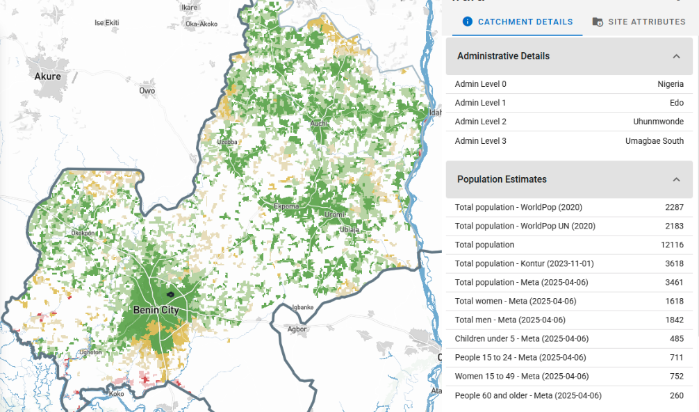
Your facility coordinates are points on the map. Population information comes as grids showing where people cluster at different resolutions. Roads show up as lines. Administrative boundaries appear as shapes dividing the region. Catchment mapping layers all of this together – the calculation assigns each small piece of geography based on travel time along those roads, respecting those boundaries.
The result shows up as service territories drawn on the map. Each territory represents the area connected to one point – whether that's a facility or population center. The boundaries follow roads, rivers, and administrative divisions. A territory might stretch farther along a highway where travel is fast. It might stop at a river with no bridge.
Unlike radius buffers, which ignore geography completely, catchment areas use travel-time boundaries called isochrones. An isochrone shows everywhere people can reach within a given time by following actual roads and terrain - not straight lines.
Divvying up: How catchment assignments work
Catchment mapping answers straightforward questions: which areas does each facility serve? Where should new facilities go to serve populations efficiently? You divide a region into pieces, then assign each one based on travel time.
The GIS tool you use determines how this is calculated. The Crosscut App divides an area into land blocks – flexible polygons that snap to roads and boundaries where people live or grid squares in empty regions. Upload your facility location and it assigns each land block based on travel time. Traditional GIS tools like ArcGIS and QGIS require downloading geographic data, setting up road networks, and configuring calculations yourself.
The catchment boundaries you get follow the natural edges built into those land blocks. Roads and rivers become dividing lines. Administrative district boundaries stay intact unless geography demands otherwise.
Why field teams need realistic maps with real-world boundaries
When field teams receive their assigned territories, they need boundaries they can navigate without GPS coordinates. A line cutting straight through a densely populated neighborhood doesn't help anyone implement a vaccination campaign or school enrollment drive.
Teams naturally describe territories using landmarks:
- "We cover everything west of the main highway"
- "Our area goes up to the river"
- "We're responsible for the district south of the market road"
Catchment maps built with natural boundaries match how teams plan and communicate. The health supervisor doesn't need coordinates to figure out if a community falls in their zone. The retail manager can explain the territory using landmarks customers know.
Catchments can also respect administrative divisions when reporting structures require it. A facility near a district border might naturally serve communities on both sides, but if your reporting system operates by district, you'd constrain the catchment to stay within district lines.
But where and how do you actually start when creating catchments? Your approach depends on what you already have.
Three ways to define catchment boundaries
If you have existing facilities, calculate coverage from those locations. If your team is planning new facilities or mobile services, you start with population clusters. Required to work within specific districts? Constrain catchments to those boundaries.
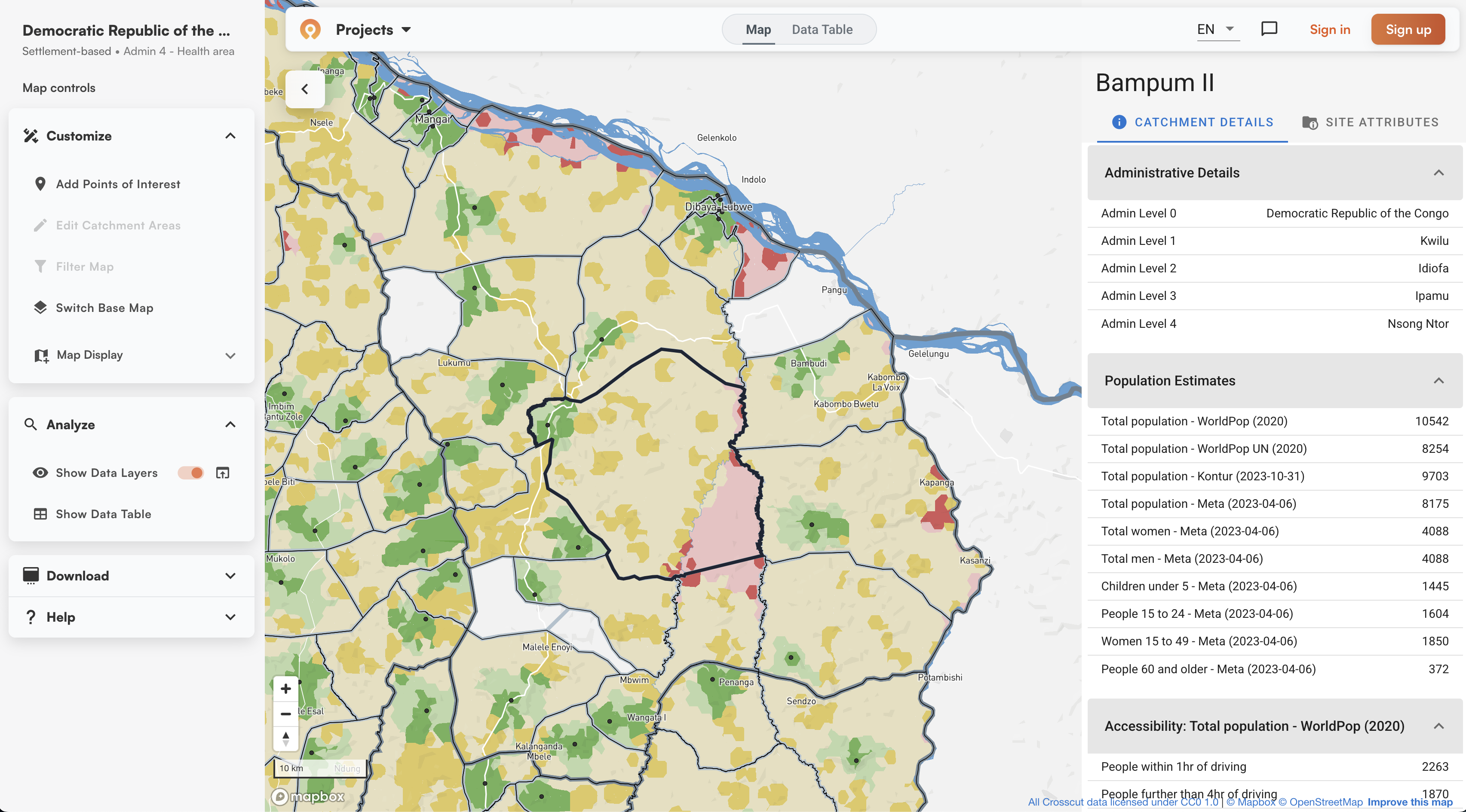
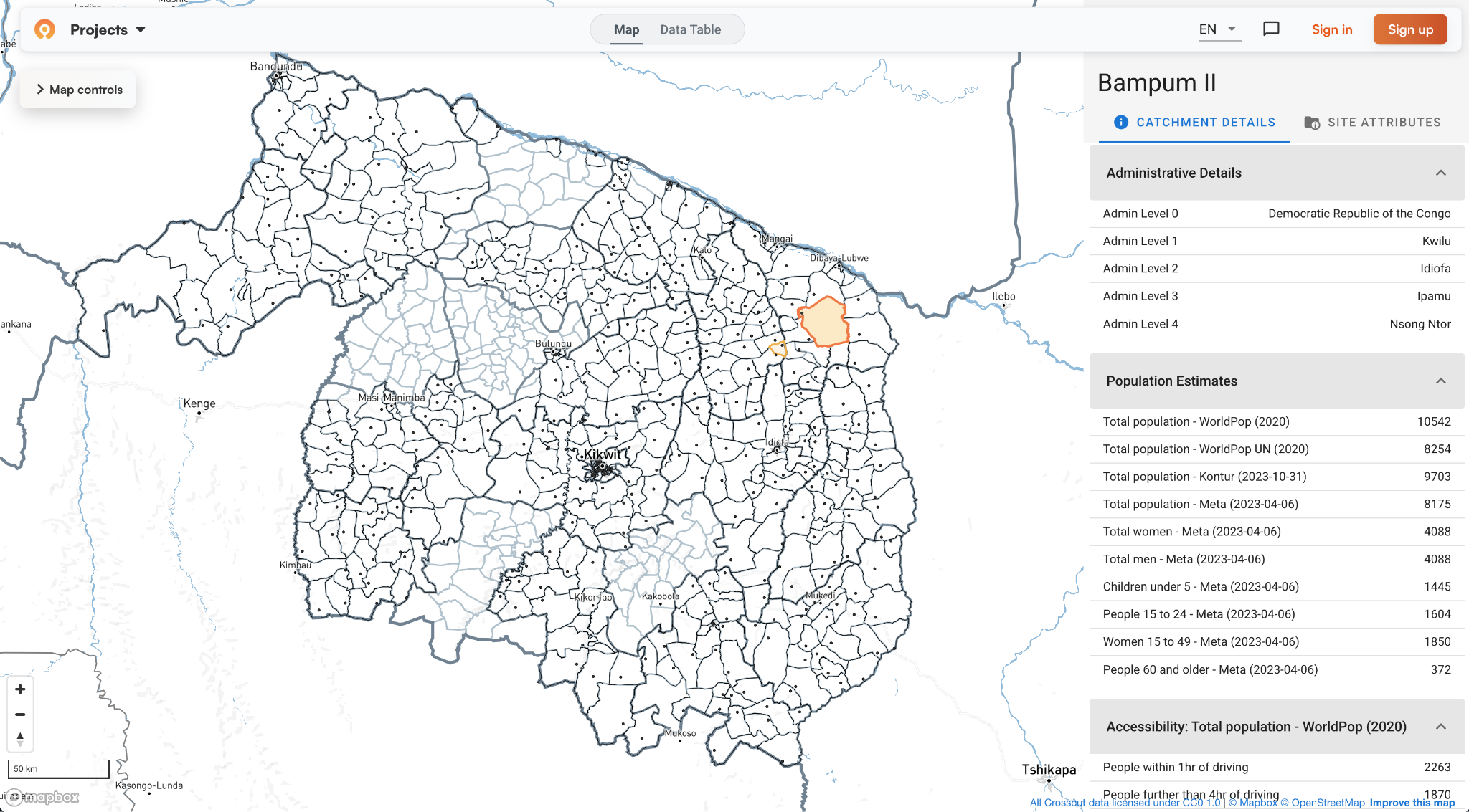
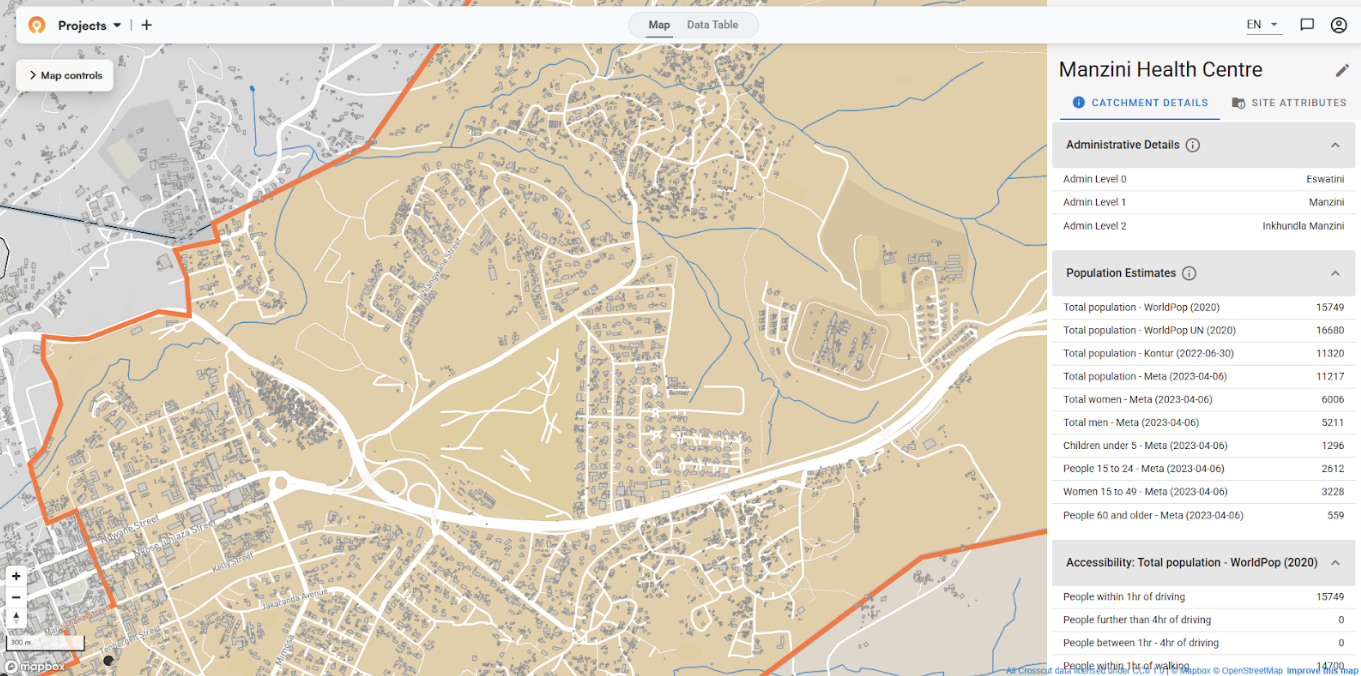
Site-based catchments start with existing facility locations. Upload coordinates for health centers or retail stores, and the tool assigns locations to the nearest facility based on travel time. Crosscut generates these site-based boundaries in minutes.
Settlement-based catchments start with population centers. The tool identifies settlement clusters and groups them into service territories. This helps when planning new facilities or routing mobile teams – you can see how communities connect to nearby towns, then plan around those patterns.
Boundary-constrained catchments respect administrative divisions. You contain catchments within district lines or health zones, keeping facilities from pulling communities across boundaries even when those communities could reach the facility faster. This works when reporting structures require strict adherence to jurisdictions.
These options aren’t mutually exclusive. You can calculate coverage from existing facilities but stay within administrative boundaries, or map population clusters to plan new facilities. Traditional GIS software can do this but requires training and licenses. Simpler catchment mapping tools offer the same capabilities without the cost or complexity.
Layering population data onto catchment boundaries
Once you have catchment boundaries, you layer on population data to understand who lives where (mostly for site-based catchments, since settlement-based maps start with population data). A small catchment might contain 15,000 people in dense neighborhoods. A large catchment might have 3,000 people spread across scattered rural communities.
Crosscut pre-loads population estimates from multiple sources: WorldPop provides modeled density, GRID3 combines survey data with settlement mapping, Meta Data for Good uses building footprints and satellite imagery, and Kontur aggregates multiple sources. Seeing where they agree and diverge helps you decide which numbers to trust. You can also upload your own survey data to compare against these estimates.
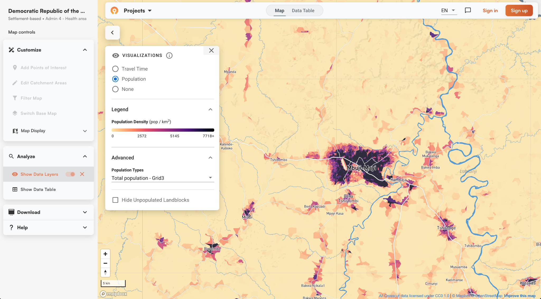
Catchment maps also work at different scales. You can look at coverage across a region, zoom into a district, then focus on individual neighborhoods. Urban areas might serve dense populations in compact areas while rural facilities cover larger territories with scattered settlements.
Accessibility heat maps add another layer of data. They use the same travel-time principle as isochrones but show it as a continuous gradient. Red zones indicate populations far from service points. Green zones show good access. These visualizations make it easier to spot coverage gaps.

Professional GIS software versus catchment mapping tools
Professional GIS software like QGIS or ArcGIS can create catchment areas, but requires making technical decisions at every step. Should catchments overlap or stay separate? How do boundaries snap to roads and rivers? What travel speeds apply to different terrain? You install software, download data, align geodata, clean topology, configure these parameters, then run complex network analysis. It does work, but takes expertise most planning teams don't have.
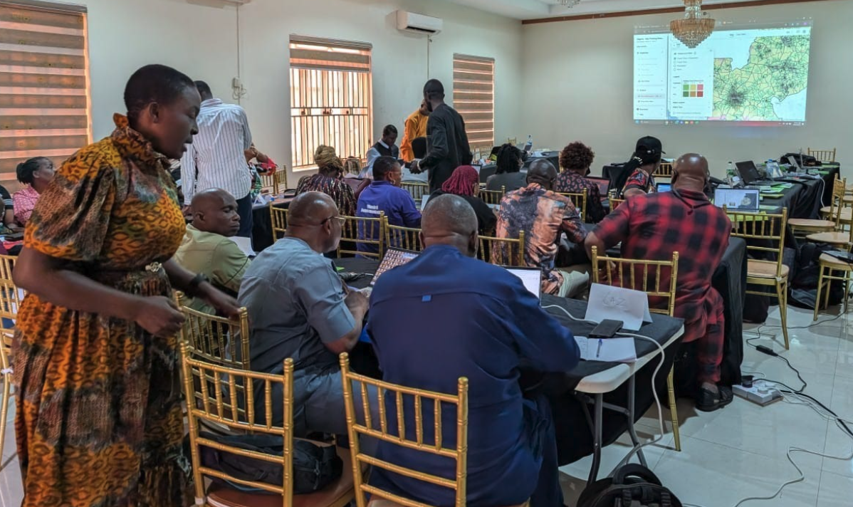
Web-based catchment mapping tools like the Crosscut App use custom algorithms to handle these decisions automatically. The free tool pre-loads population data, road networks, and administrative boundaries for over 43 countries. Behind the simple interface, algorithms determine non-overlapping service territories, snap boundaries to natural features, and calculate realistic travel times.
Editing boundaries is as simple as using MS Paint. You paint areas from one catchment to another. If the algorithm assigns a community to Facility A but local teams know everyone goes to Facility B, you can redraw the boundary. Unlike professional GIS tools, you just point and click. No GIS training required.
 a
aCatchment mapping for non-technical teams
You started with questions about planning services: understanding coverage from existing facilities or figuring out where new ones should go. Catchment mapping answers those questions by creating service territories shaped by real, navigable geography.
The best catchment maps are built with boundaries that follow features your team can follow, balance workloads by accounting for geography and population, and show coverage gaps when you layer on accessibility data.
The challenge has always been creating these maps without GIS expertise. Crosscut automates the process, it's free, and built for non-technical planning teams. Upload your locations, generate catchment maps in seconds, layer on population data, and edit boundaries just as easily.
The service territories on your map become the operational boundaries your teams actually use. Build your custom catchment maps in five minutes.
Related Posts
How the Crosscut App helps plan health campaigns in Nigeria

An independent evaluation of the Crosscut App
.JPG)

How to set up a Microplan Collector project in the Crosscut App
