Training teams to map supervision gaps in Nigeria

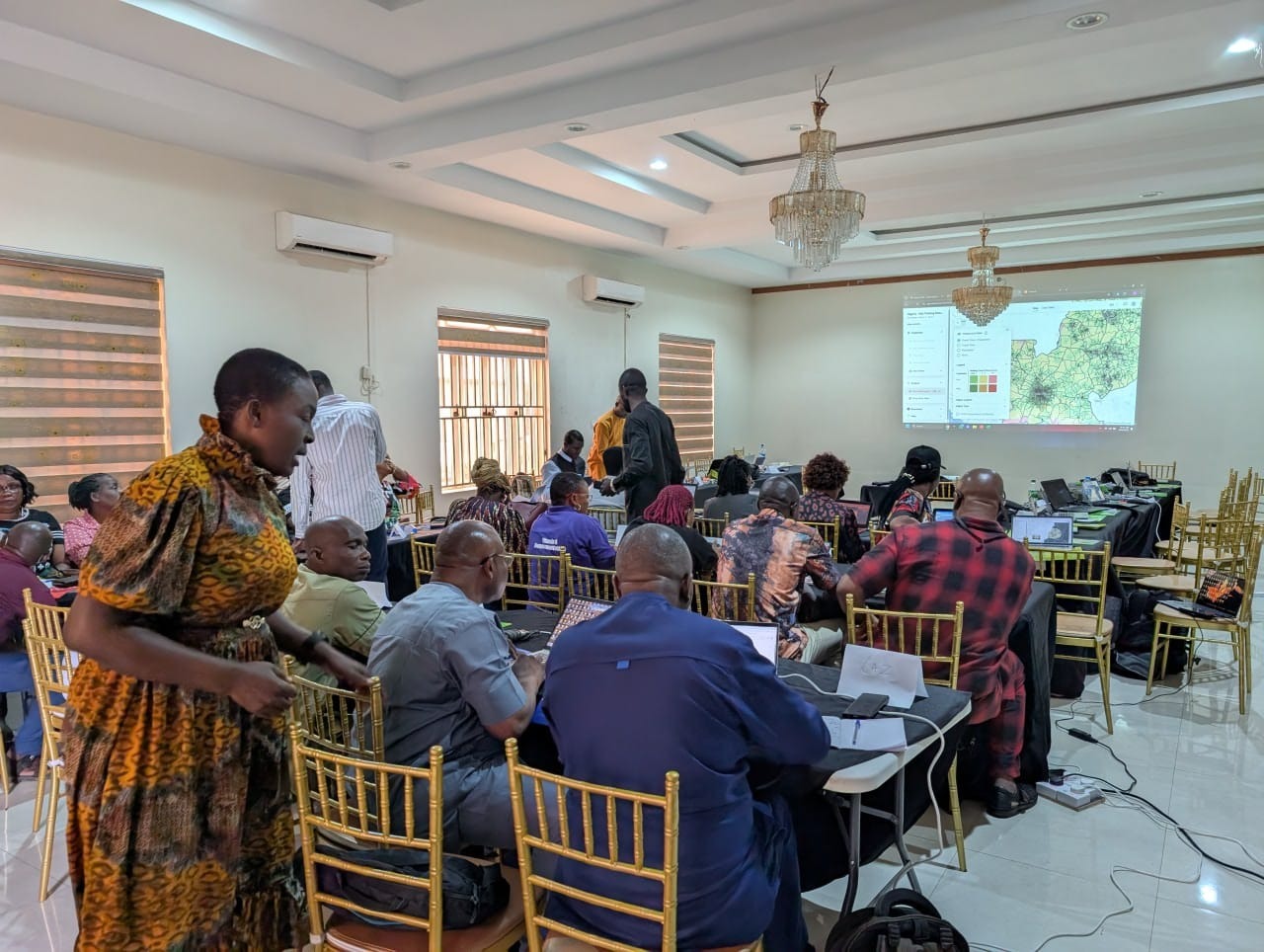
I recently got back from Nigeria where I ran a two-day training with about 50 people on geospatial microplanning. The training was part of a pilot project with Nigeria's Ministry of Health and the Carter Center across three states: Edo, Enugu, and Ebonyi.
For this country project pilot, participants are using the ESPEN Geospatial Microplanner, which is the version of the Crosscut App available in WHO's ESPEN portal. The training covered mapping techniques and data collection workflows for microplanning, with particular focus on a first-time application: analyzing supervision gaps with the app’s site-based settlement algorithm.
Finding supervision gaps in last year’s Onchocerciasis campaign
During health campaigns, community drug distributors (CDDs) deliver treatments while supervisors go into the same areas to verify that distribution. A supervision gap is just an area where no supervisor went to verify services were delivered.
A major focus of this training was addressing a specific challenge: health officials needed a way to visualize where supervisors actually went during last year's campaign. Without that analysis, they couldn't tell which communities received follow-up verification and which didn't. Our sessions focused on three questions:
- Where did supervisors actually visit during the last campaign?
- Which populated areas had limited or no supervision coverage?
- How can we monitor supervision progress during upcoming campaigns?
Where supervision data comes from
For last year's campaign in Edo State, frontline health workers supervised the CDDs who go into local communities and deliver treatments to households. These supervisors used CommCare, a mobile survey and data collection tool installed on their phones.
The workflow is straightforward. A supervisor visits a community and CommCare captures their GPS coordinates. They select which community they're visiting and record whether they spoke with the CDD, how many households in that community they interviewed, and whether those households reported receiving drugs.
Each of these supervision visits generates a record with GPS coordinates. By the end of last year's campaign, Edo had thousands of these data points. Those coordinates are the foundation for mapping where supervisors actually went in the Crosscut App.
Tracking supervision coverage using our accessibility heat maps
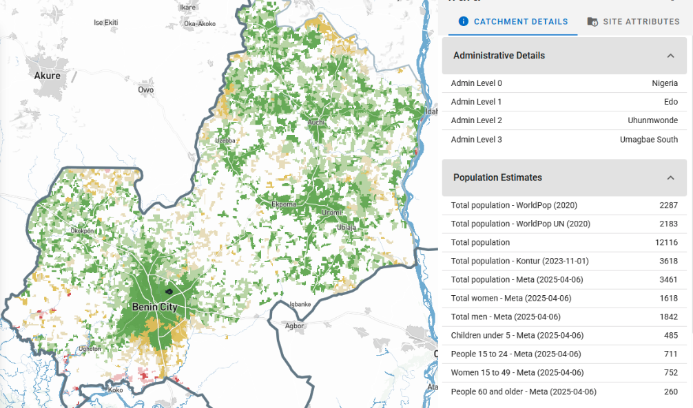
Planning teams usually use our site-based catchment algorithm to create service areas around health facilities. You upload geocoded facilities, and the app draws catchment areas that show which populations each facility can reach while respecting real-world barriers.
What program managers needed was to see where supervisors actually went versus where they didn't. To turn Edo's supervision data into a usable map, program staff export the supervision visits from CommCare as a CSV file containing visit name, latitude, and longitude. They upload the file to the Crosscut App, select the state, and click create.
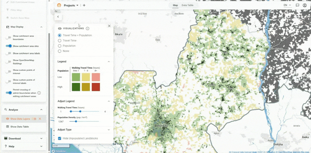
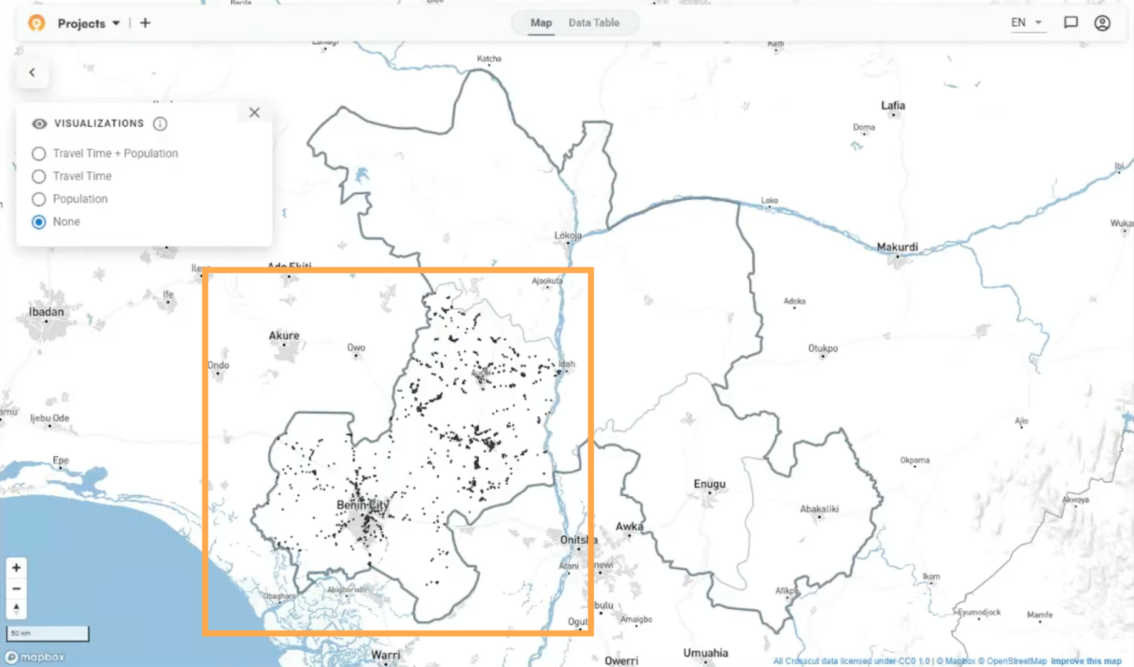
The algorithm processes the data and generates a supervision coverage map in about five minutes. Each black dot on the map represents a location where a supervisor conducted a visit.
Accessibility shows the real story
To understand which communities supervisors reached, we combined the visit coordinates with population data from sources like WorldPop and GRID3. This integration shows the distribution of people across the state.
But distance alone doesn't tell the full story. This is where Crosscut's accessibility heat maps factor in travel time to get services. A community might be 10 kilometers away as the crow flies, but if there's a river with no bridge, actual travel time could be several hours.

When you turn on the accessibility visualization, green areas show populations within reasonable travel time of a supervisory visit. Yellow and red areas show communities that are further away. The darker the green, the denser the population in that accessible zone.
What we found in Edo's data
Looking at Edo's supervision data from last year, larger towns within the state showed dense supervisory activity. That resulted in black dots clustered together, mostly surrounded by yellow and green zones.
However, other parts of the state showed large red areas, meaning those populated areas received far less (if any) supervisory visits.
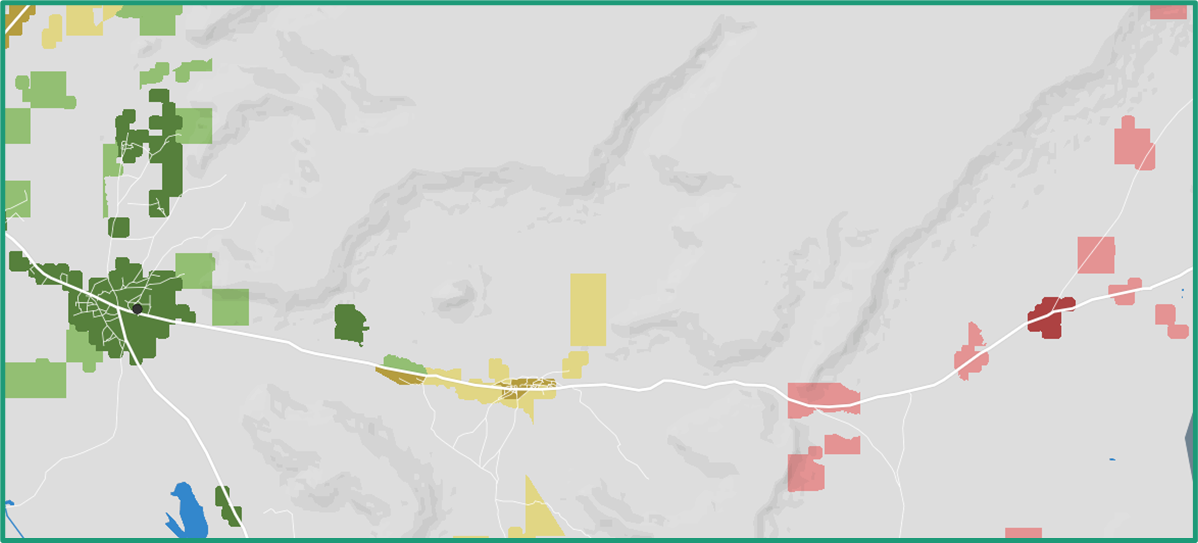
Keep in mind these red zones don't necessarily mean those communities went untreated or did not receive care. The CDDs might have reached them. But there was no record of a supervision visit to verify that a follow up had occurred.
Finding these gaps in last year's data helps teams target supervision efforts for this year's campaign. But we also discussed how this same process could work for daily monitoring during active campaigns.
Tracking daily progress during campaigns
This kind of analysis does not have to be fully retrospective. Instead of uploading last year's completed data, in the middle of a campaign program staff could upload yesterday's supervision visits each morning to track coverage as it happens.
On day one, everything might look red. By day two, some red converts to yellow and green as supervisors reach new areas. If a populated zone stays red throughout the campaign, teams know they need to redirect supervisors or resources there.
The MOH team mentioned plans to test this approach during the upcoming campaign. We will share progress updates as they’re available.
In-person training improves everything
Seeing how first-time users interact with the tool in person gives us insights we don’t get from support tickets or video calls. These details help us understand how the Crosscut App performs when program staff are under legitimate pressure to produce maps quickly.
Enugu and Ebonyi didn't have historical supervision data like Edo did. But watching the Edo analysis during training sessions showed them what was possible. Both states are now working to roll out CommCare before their campaigns start so they can track supervision the same way.
Ongoing monitoring and evaluation
This pilot is focused on whether areas without supervision visits also missed drug distribution. If we can help identify gaps before the campaign starts, teams can direct supervision efforts more strategically. If supervisors actually reach those previously unvisited communities, coverage should improve. That’s what we’re testing.
This fits into our broader monitoring and evaluation framework, which maps how our tools lead to measurable outcomes. The specific pathway here: supervision gap maps help teams identify which communities need attention → teams redirect supervision efforts → previously unvisited communities get verified → treatment coverage improves.

We won't know if that holds true until the campaign runs and the data comes in. Once we have results, we'll compare coverage figures between areas flagged as supervision gaps and areas that weren't. We'll report back with quantitative results as they come in.
The next steps
While this round of training is complete, this pilot continues over the coming months. We'll help create maps and analysis for the Ministry of Health as the campaign unfolds. Eventually, we'll have data to evaluate whether this approach improved coverage in targeted areas.
For now, the maps reveal supervision gaps that can inform this year's campaign strategy.
We're supporting several similar pilots across different countries right now. If you want to keep up with how these develop and what we're learning, you can sign up for our monthly newsletter.
Related Posts
An independent evaluation of the Crosscut App
.JPG)

How to set up a Microplan Collector project in the Crosscut App

May 2026 updates: Shared microplan projects and easier supervision analysis