
January 2026 updates: Updated visualizations for cleaner catchment maps
January built on country projects across Nigeria, Liberia, and Guinea-Bissau. As these planning teams used the Crosscut App in real planning sessions, we’re always paying close attention to how they use the tools or where we could improve the user experience.
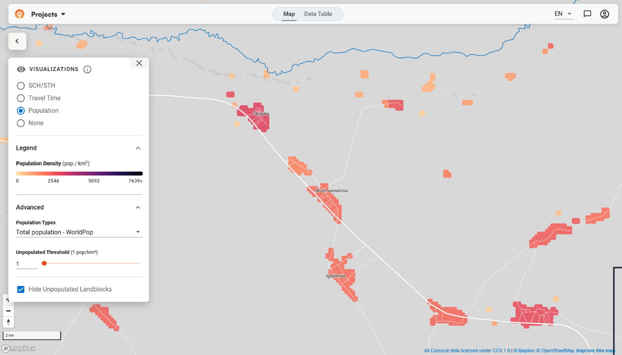
Better control over populated vs unpopulated areas
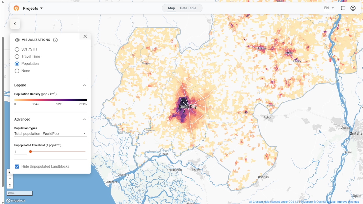
The Crosscut App uses land blocks as the underlying visualization units, like a base layer, for population and accessibility analysis. These blocks pull together population, distance, and travel time data and are what the app relies on when adjusting what you see as you zoom in or out.
Most online mapping tools adjust what you see as you zoom. Tools like Mapbox and Google Maps will show individual hamlet boundaries up close, then switch to more generalized or aggregated views as you zoom out to reveal broader population patterns. Crosscut behaves similarly, using land blocks to summarize population at different scales.
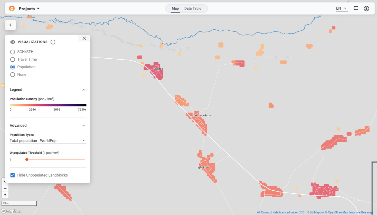
The challenge showed up when the map grouped populated and unpopulated areas as users zoomed out. In some cases, small settlements were absorbed into neighboring unpopulated blocks, making it harder to see where no one lives. In remote regions, that hides the distance teams actually have to travel, which directly affects accessibility planning.
To address this, Emmanuel updated how land blocks merge at broader zoom levels and added slider controls so teams can decide how unpopulated areas are treated. This prevents small settlements from being absorbed into empty space and keeps the map responsive.
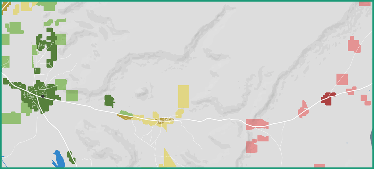
We also updated travel time colors to make the accessibility heat maps easier to read – and improved control labels to be more descriptive and more intuitive to use.
Unified accessibility view
Crosscut previously offered two separate visualization options: "Travel Time" and "Travel Time + Population". We realized the standalone travel time view was somewhat redundant. Teams always need to see population alongside accessibility, so we removed the option that was just taking up space.
Now there's one travel time view that always incorporates population data. The legend displays a matrix where color intensity indicates travel time bands (less than 1 hour, 1-4 hours, 4+ hours) and population density (low vs high) together.
You can use the same population density sliders to define what counts as low or high population density for your project. A threshold that works in urban Nigeria may need to change for rural Madagascar. This gives you and your team control over how population differences appear for your specific planning process.
Keeping accessibility settings in place
Once teams are working in an accessibility context, they shouldn’t have to keep re-creating the visualizations they want to apply to their maps.
Before this new update, certain actions would reset the map visualizations and force you to set everything up again. The most frustrating case involved our Points of Interest feature. If you were dropping POI on hard-to-reach areas (shown in red on the accessibility view), saving your work would clear the visualization. You’d have to reopen the controls, toggle the accessibility view back on, readjust travel time thresholds, and then get back to work.
The workflow didn't break, but it slowed things down. Now, saving POI leaves the visual intact with all your adjustments. Under the hood, Emmanuel implemented a state persistence system that saves current visualization settings and intelligently restores them after these actions.
Here are the actions that were disrupting the visualizations, but now function as intended:
- Saving POI
- Closing visualization control card
- Switching admin levels
- Opening/closing the data table
Continuing work on land blocks
Brianna and Sam continue optimizing our preprocessing pipeline, which handles how new countries are loaded into our backend. Last month, they reduced processing times by two-thirds through a set of creative AWS optimizations. This month, they focused on edge cases that surface when adding countries with unique geography.
Small island chains are one example. In some cases, population raster data doesn’t fully cover outlying islands, which can create missing or incomplete land blocks. Unusual or fragmented administrative boundaries can introduce similar issues by breaking assumptions the algorithm relies on when constructing land blocks. Each new country we add introduces its own quirks, which we address as they come up.
Alongside those fixes, the performance improvements to the preprocessing pipeline mean countries can now be refreshed more quickly as population data updates. That matters as coverage expands based on team needs and as integrated data sources like WorldPop or GRID3 release new estimates.
Pulling it together
These updates came directly from how teams were using the app in the field. Better control over population merging makes it easier to reason about isolation. A unified accessibility view reduces friction when comparing travel time and population. Keeping accessibility settings in place removes unnecessary interruptions during real planning work.
Together, these changes make it faster to answer the core question teams are asking every day: where are people, and how hard is it to reach them?
As always, everything we build goes into the free version of the Crosscut App. If you're working on similar challenges, reach out through our Advisory Services.
Frequently asked questions
How do accessibility heat maps help with health campaign planning?
Accessibility heat maps show travel time from service points using color-coded zones. Red areas indicate communities more than 4 hours away, yellow shows 1-4 hours, and green represents areas within 1 hour. Read our guide on accessibility heat maps.
What's the difference between site-based and settlement-based catchment areas?
Site-based catchments build territories around specific facility points. Settlement-based catchments group communities based on where people naturally cluster and travel. Use site-based when you know facility locations, settlement-based when understanding natural service patterns.
Can I create catchment maps without GIS experience?
Yes. The Crosscut App is designed for planning teams without GIS expertise. You can generate maps, adjust controls, and edit boundaries using familiar tools like sliders. Try the free app.
What industries use catchment mapping besides healthcare?
Catchment mapping works for any service territory planning. Schools use it for enrollment boundaries, retailers for market coverage analysis, logistics companies for delivery route optimization, and local governments for public service planning. The same approach applies wherever you need to understand which communities connect to which service points.
What population data sources does the Crosscut App use?
Crosscut integrates multiple population data sources including WorldPop, Meta, and GRID3. The app displays population estimates from each source so you can compare modeled data against your own field data. This helps teams verify estimates and make informed decisions about resource allocation.
Related Posts

How to set up a Microplan Collector project in the Crosscut App

May 2026 updates: Shared microplan projects and easier supervision analysis

How to find the communities your health campaign is missing
.JPG)
