
How to create catchment area maps from GPS locations

Most health programs we work with have a list of facilities with GPS coordinates without a clear picture of the geographic area being served by each facility. This guide walks through how to turn that data into practical catchment area maps using the Crosscut App.
If you want to know what site-based catchment areas are before starting, please read the site-based catchment areas overview. This guide focuses on the how-to.
What you need before you start
Facility name, latitude, and longitude. That is the minimum data required to generate a map. You can include additional columns like facility type or capacity, but they are not required.
Your coordinates should be in decimal degrees format. If you need to collect them, the most reliable method is GPS capture in the field. You can also drop a pin in Google Maps or zoom into satellite imagery until the facility is visible, then click to get the coordinates.
Guide: Create site-based catchment area maps
This workflow is the same whether for 20 facilities or 200. The scale does not change the steps.
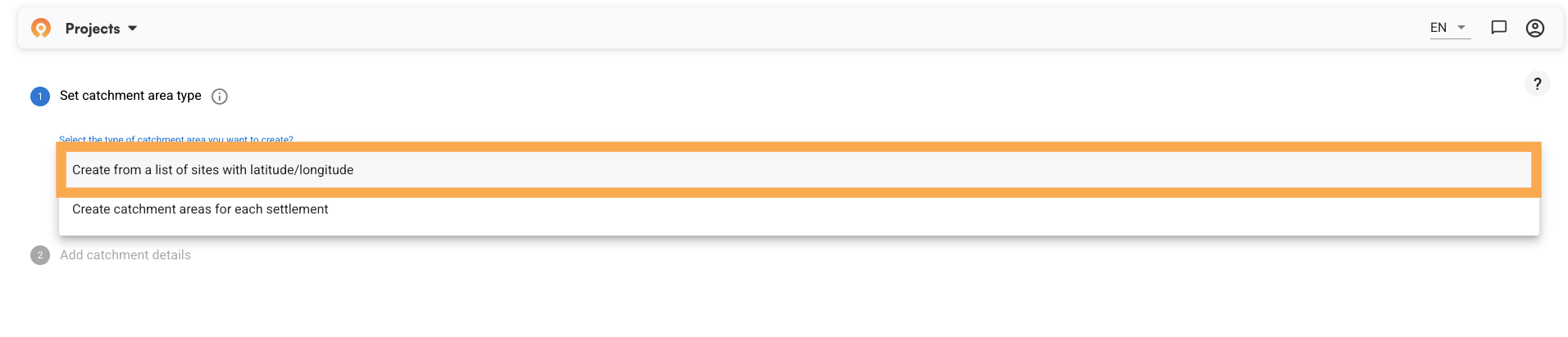
Step 1: Set your catchment area type
Log into the Crosscut app and click "+ New" to start a project. The first screen asks you to set your catchment area type.
Select "Create from a list of sites with latitude/longitude." This is the site-based method, and it is what this guide covers.
Below the catchment type, you will see: "Do you want to limit the maximum size of the catchment areas?"
Two options appear:
- No limit (all areas will be assigned to their nearest site) – Every piece of land gets assigned to the facility it can most easily reach. The full area is covered. This works well when you need to know who is responsible for every community, including remote ones.
- Limit (some areas may not be included in a catchment area) – You set a maximum threshold, and communities beyond it fall outside any catchment. This better reflects realistic service reach when the goal is coverage people can access.

If you choose Limit, you set that threshold: walking travel time from the site (in hours) or straight-line distance (in kilometers). Walking travel time is the more common choice for evaluating accessibility to services, since it accounts for factors like roads and bodies of water that impact how people really travel.

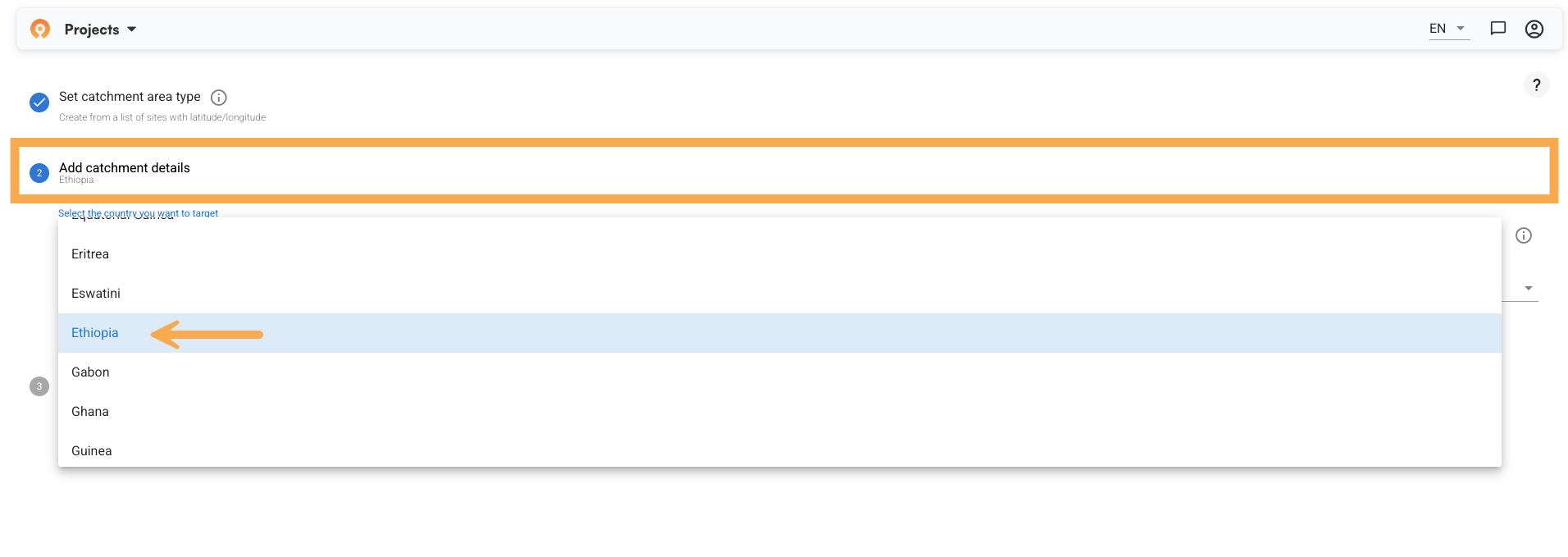
Step 2: Add catchment details
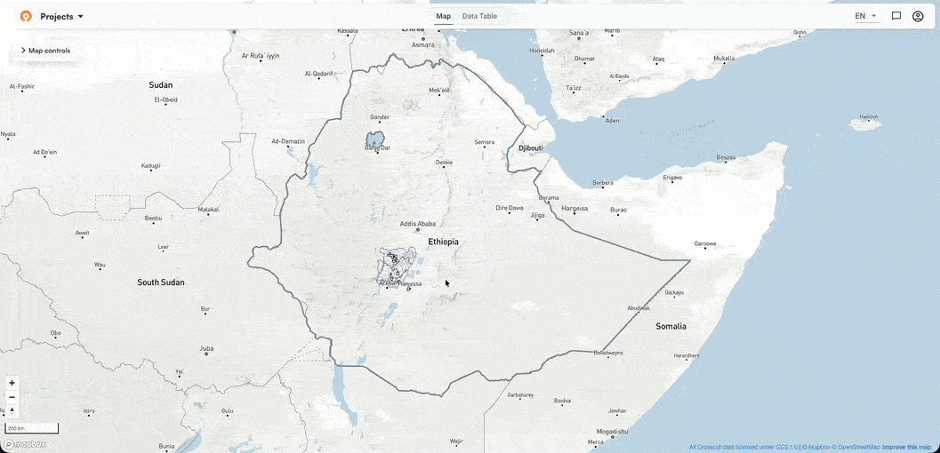
Next, select your country and the specific area you want to target. In this example, we are working with health facilities in Central Ethiopia.
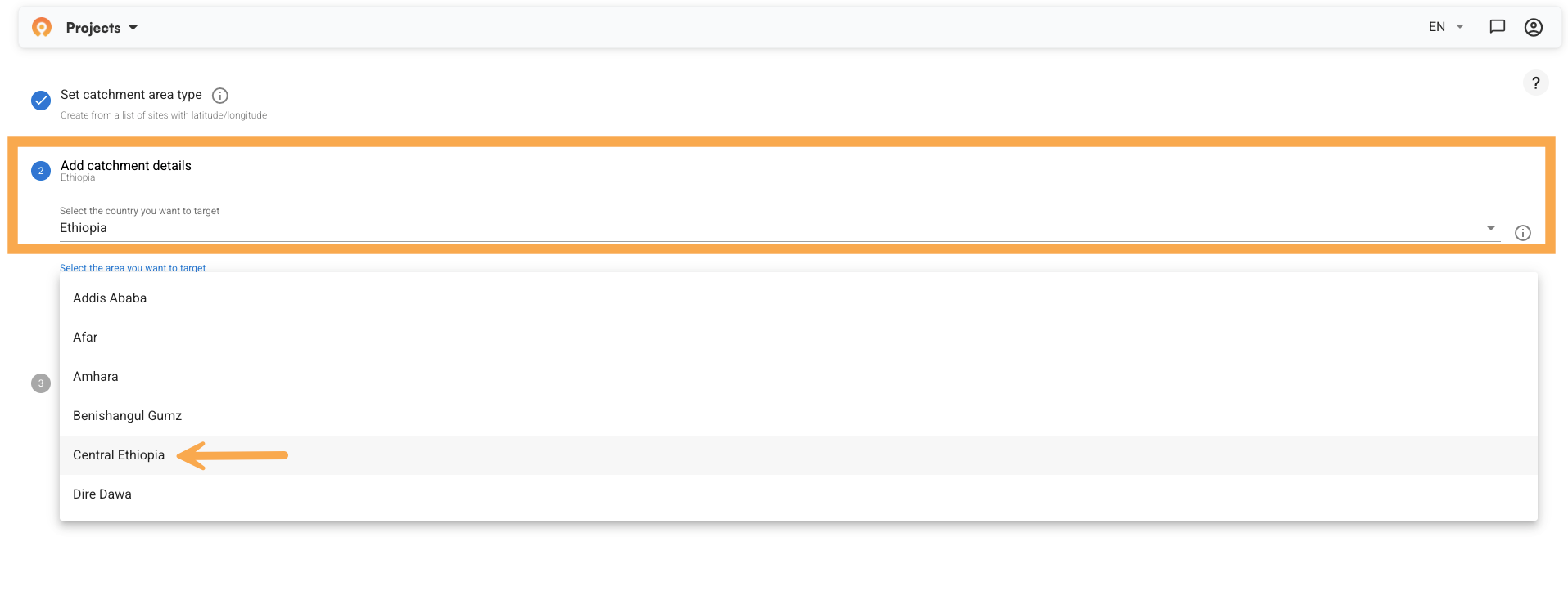
After selecting your region, the app asks what to call this set of catchment areas and at what administrative level to limit them.
The administrative level you choose here determines whether catchment areas can extend across the borders of states, districts, or any other admin level that is in place within the given country. For Ethiopia, the options are:
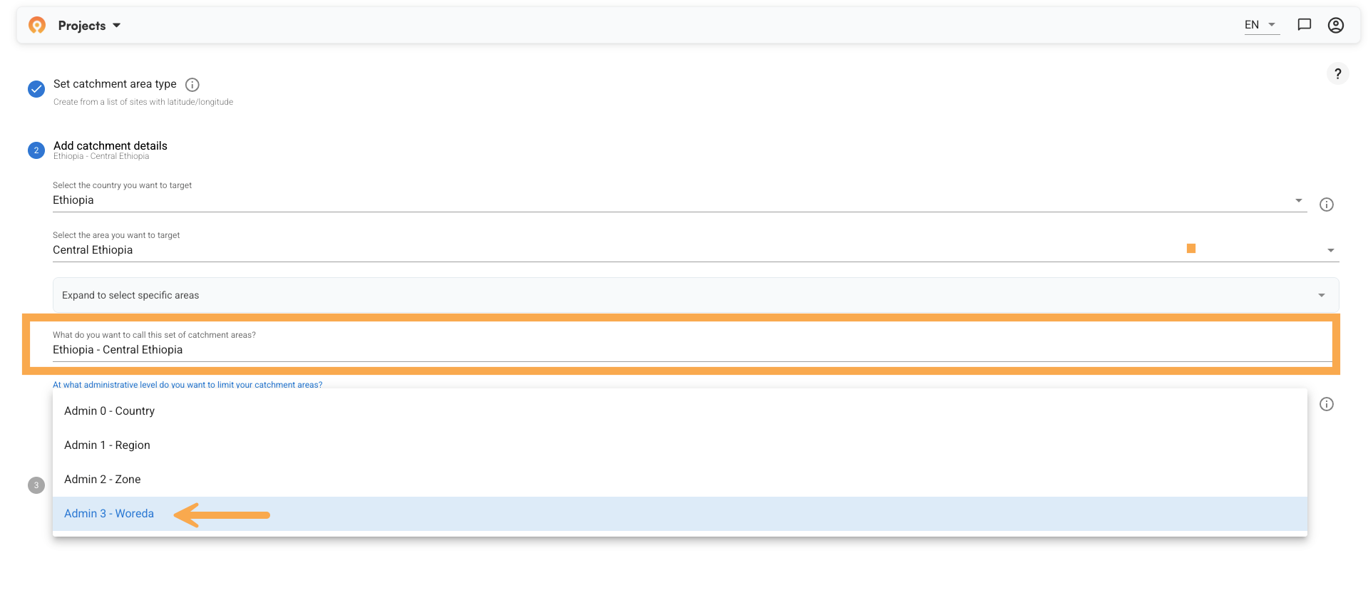
- Admin 0 – Country
- Admin 1 – Region (e.g., Central Ethiopia)
- Admin 2 – Zone
- Admin 3 – Sub-district (e.g., Woreda)
For this example, we chose Admin 3. That means each catchment area stays within its Woreda boundary, even if a facility's natural pull would extend further.
If your program needs facility zones that can cross administrative lines, choose a higher level. The choice depends on how your reporting is structured, not on geography alone.
Click Next when ready.
Step 3: Upload your data
Upload your GPS coordinates as a CSV file. The app displays your data and asks you to confirm which columns correspond to latitude, longitude, and site name. Use the dropdowns to map each column.
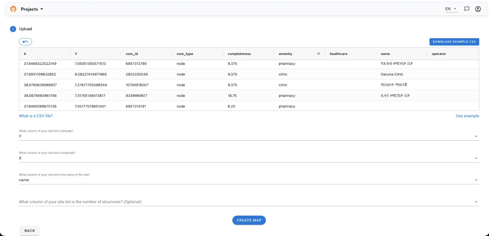
There’s also an optional field to specify You can also flag an optional column for the number of structures if that data is available. It is not required to generate the map.
Once your columns are confirmed, click "Create Map."
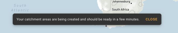
Step 4: Generating your catchment area map
The app will notify you that your catchment areas are being created and will be ready in a few minutes. You can see your new project in the Projects panel on the left.
If you haven’t yet, you can do the in-app tutorial when your map is ready. Go to Help in the left panel and select Tutorials. It takes you through the core steps at your own pace.
 a
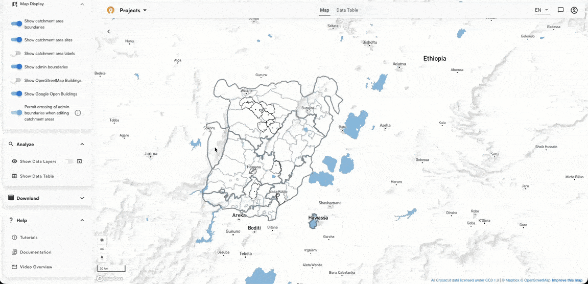
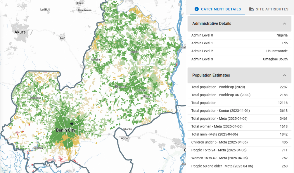
aStep 5: Read your map
When your map loads, each territory represents the area served by one facility. The boundaries follow real-world geographic features like roads, rivers, land cover, and terrain.
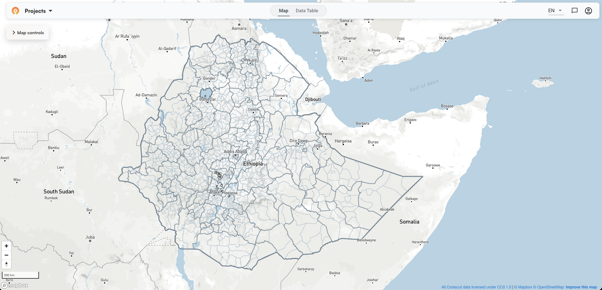
Catchment boundaries appear as black lines. Administrative boundaries show in lighter grey. Since in this example we chose to bound our catchments by Woreda, you can see how the black catchment borders follow the light grey Woreda boundaries. Click any catchment to open the details panel and see population figures for that territory. ⚠️
 a
aNow we’re ready to explore the data visualizations the tool provides to help us better understand the service coverage of these facilities. Under Analyze in the left panel, toggle on Show Data Layers to access the Visualizations panel.
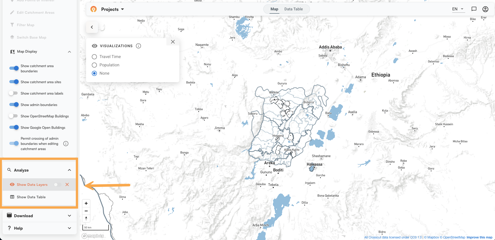
You have three visualization options:
- None – Your catchment boundaries with no overlay. Good for reviewing territory coverage at a glance.
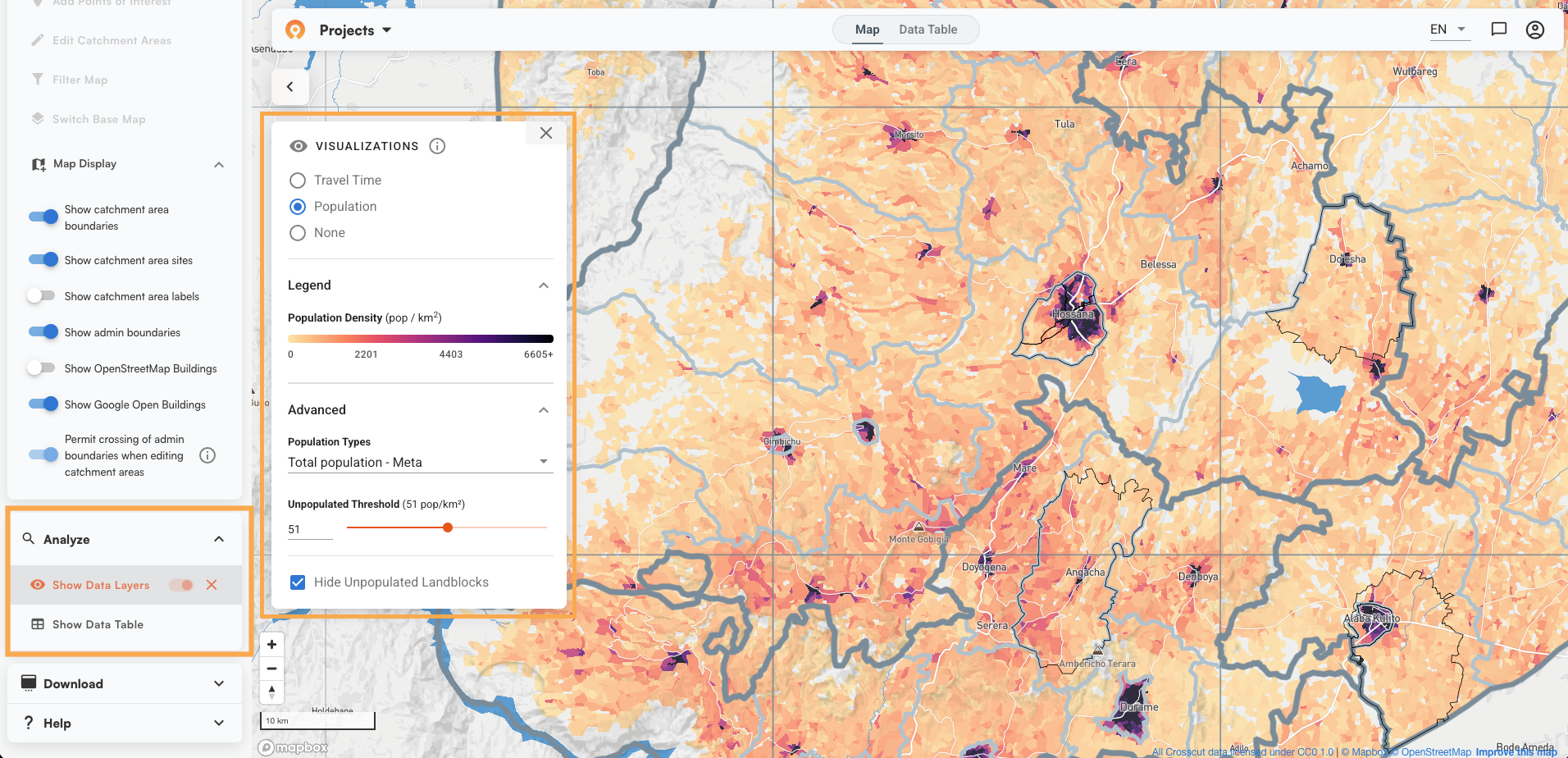
- Population – A density heat map across your catchments. Darker areas have more people. You can adjust the color threshold using the slider, choose your population source from the dropdown (the default is total population from Meta), and check "Hide Unpopulated Landblocks" to remove areas where no one is expected to live. Useful for quickly seeing where your facilities face the heaviest demand.
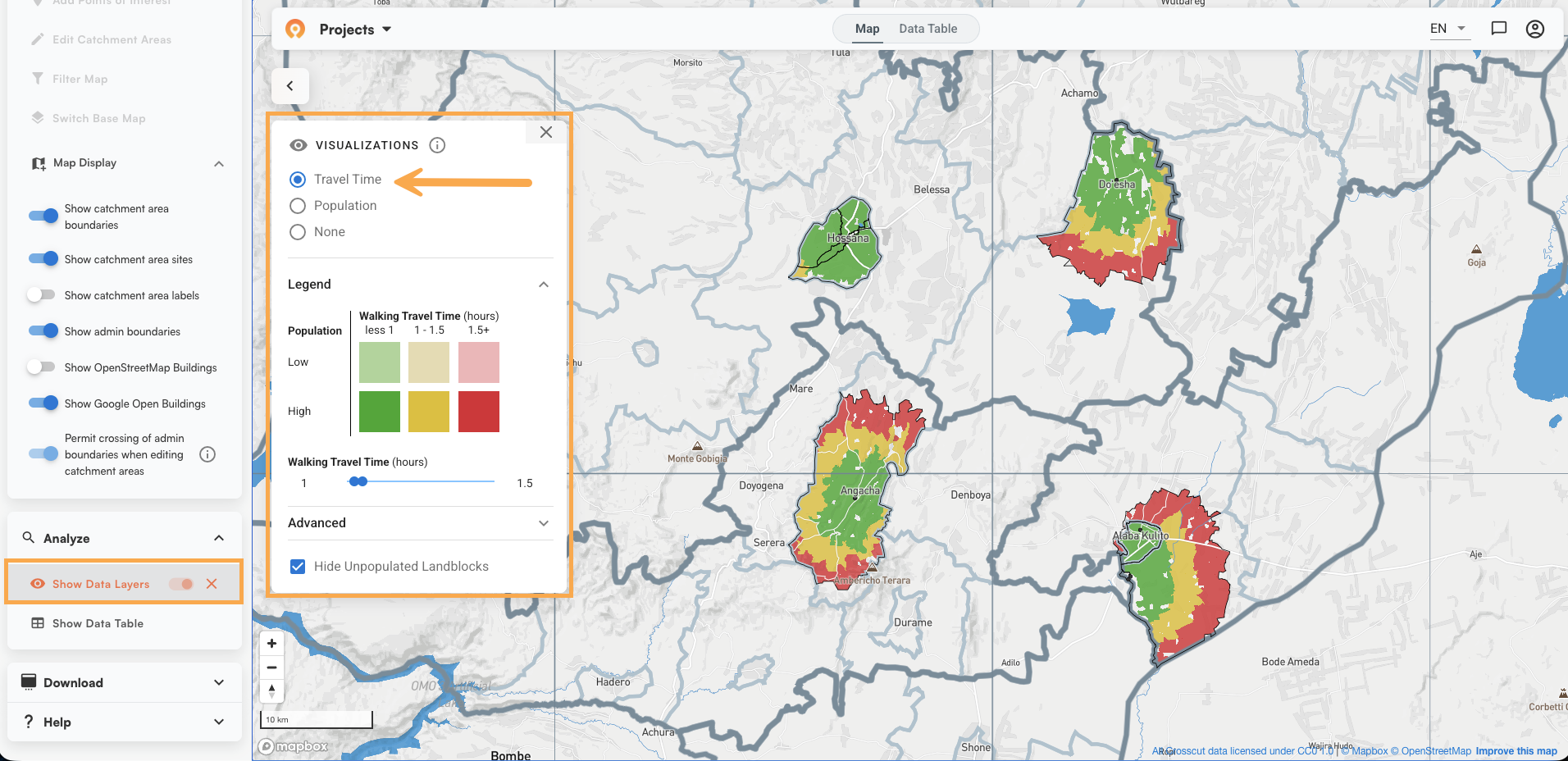
- Travel Time – Overlays both population density and walking travel time in a single view. Dark shading indicates high population. Color indicates travel time: green is under one hour, yellow is one to four hours, red is over four. This is the view most teams use to identify where mobile outreach is needed and where community health workers are stretched thin. The accessibility heat maps article goes deeper on how to use this layer.
The in-app tutorial also walks through these layers and the rest of the map controls in about a minute. Access it anytime from Help > Tutorials in the left panel.
Step 6: Easy editing where needed
Have a seasonal road, a river crossing that is only passable part of the year, a community that has always used a different facility? You can adjust any boundary directly in the app to reflect what your team knows on the ground.
Click "Edit Catchment Areas" in the left panel to enter edit mode. The base map switches to satellite view so you can see terrain while you work. A small toolbar appears with four tools:
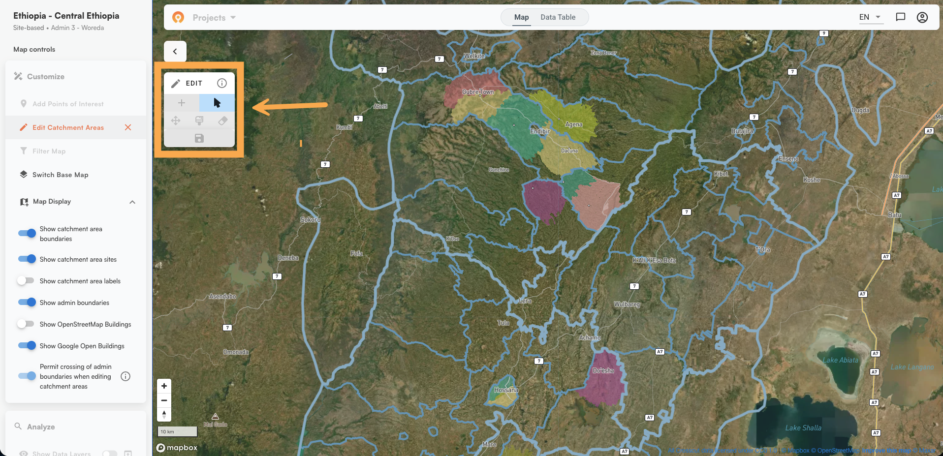
- Arrow - Select an existing catchment to edit. Click the catchment and it turns orange, signaling it is ready to modify.
- Plus - Create a new catchment from scratch. Click where you want to place it and it will turn orange and be ready to edit.
- Paint brush - Expand a catchment. Select the catchment you want to grow, activate the brush, then click and hold to paint land into that territory. See boundary editing guide
- Eraser - Reduce a catchment. It works just like the paint brush except clicking and holding removes land from a catchment area rather than adds to it. It’s important to know that areas you erase are not automatically reassigned to another catchment. To move erased land to a different catchment, use the paint brush tool to add the area you just erased to a different catchment.
The righthand information panel updates things like population and building counts in real time as you make changes. Population estimates and building counts draw from Meta and OpenStreetMap data.
⚠️ When you are done, click the save icon to make your changes permanent.
Step 7: Download your data
When you are ready, go to Map Controls and expand the Download section.
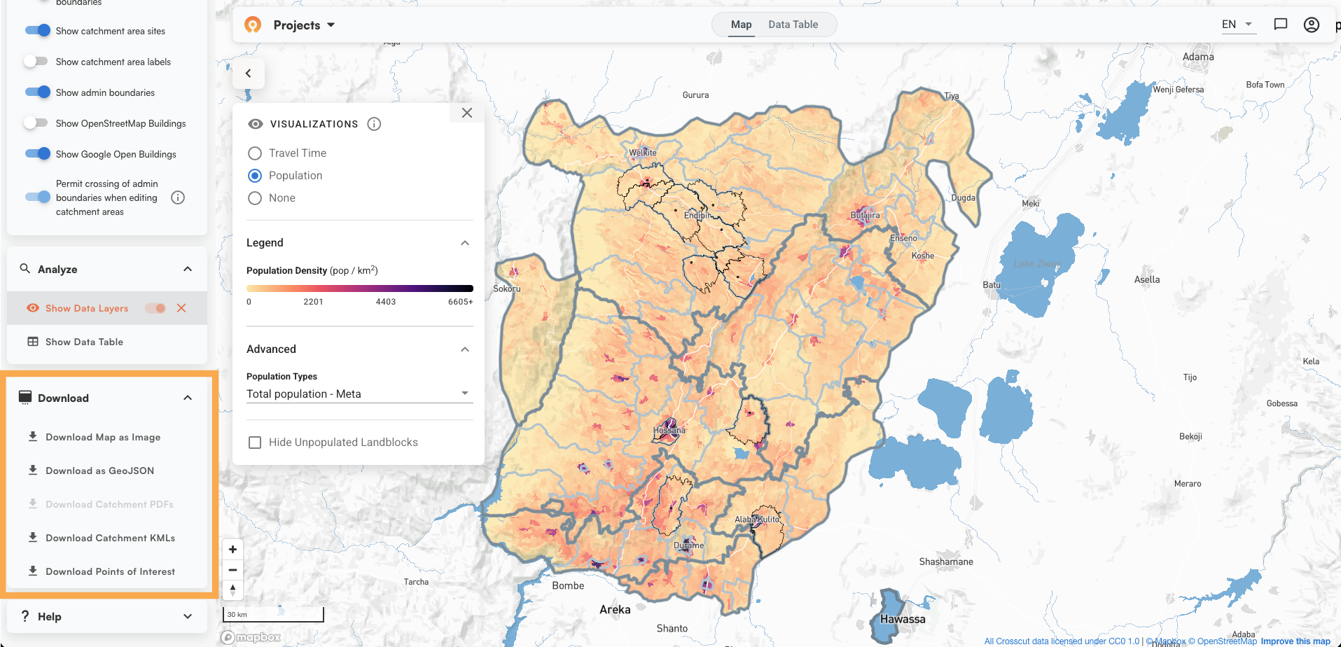
Your options:
- Download Map as Image - position the map where you want it and export a PNG you can print or share.
- Download as GeoJSON - exports catchment boundaries as a vector file to use in other GIS tools.
- Download Catchment KMLs - exports boundaries in KML format.
- Download Catchment PDFs - printable map sheets for each catchment.
- Download Points of Interest - any custom points you added to the map.
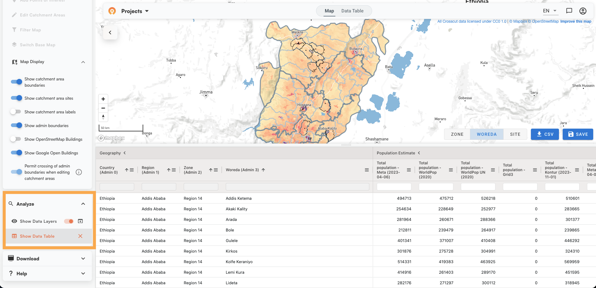
The Data Table (accessible from the top of the map view) lets you sort, filter, and view population and building data for all catchments before you export.
What happens next
- Collecting field data through Excel and email? The Microplan Collector connects that process directly to your catchment maps.
- Using CommCare or ODK for GPS data collection? We can automate daily catchment map updates from those survey submissions.
- Reporting through DHIS2? Catchment boundaries and population data can be pushed directly into your national health information system.
All outputs from the Crosscut app are licensed under CC0, meaning you can use and adapt them freely without attribution requirements.
Free catchment area mapping, no specialists required
You've now turned your GPS coordinates to catchment area maps. You upload your facilities, set parameters, generate the map, review and adjust, then export. What once required a GIS specialist and significant prep time now happens in a few minutes.
For programs that need catchments wired into a broader planning workflow, that is where we tend to get more involved. Learn more about our advisory services or reach out directly.
Related Posts

How to create catchment area maps in DHIS2 with the Crosscut App
.JPG)
How the Crosscut App helps plan health campaigns in Nigeria

An independent evaluation of the Crosscut App
