
Printable catchment area maps for more precise health campaign planning

Mass drug administration campaigns mean coordinating a lot of people across a large area, often with no or limited internet connectivity. Supervisors have the challenging task of traveling to remote areas to verify that community drug distributors (CDDs) are reaching their assigned communities. Getting a clear picture of who covers where down to that last mile means reaching people who may not have a smartphone, a data connection, or a reason to remember a login.
That's what pushed us toward printed catchment area maps for health campaign planning. You can print a stack and hand them out at a training session, they don’t require any digital technology, and what gets marked up on paper can feed back into the planning workflow.
What's on a printed catchment area map
The maps are black-and-white and designed to fit standard A5 paper. We test them at that final print quality on a regular printer, because what reads clearly on screen doesn't always survive the step down to monochrome. Key details like settlements (grey blobs on map below), road markings, and school symbols can get lost in that step, so we always run our own print test first.

These maps draw on multiple population and settlement datasets. Roads and waterways come from OpenStreetMap and related open road sources. Settled areas come from sources like Grid3, WorldPop, or Meta's High Resolution Settlement Layer, depending on what's most reliable for a given country. Schools, health facilities, and other reference points get added based on what's relevant to the campaign.
We work with each planning team to figure out what belongs on each map. Schools go on when they're treatment or distribution points. Health facilities go on when supervisors need them as reference points. What gets included depends on the campaign's broader goals and operational context.
Designed for no-device environments
Small technical problems are inevitable when you're coordinating fifty or more people across large swaths of rural geography. Someone can't log in during training, a CDD's phone dies before they reach their first community, or the network drops at the wrong moment. These delays accumulate across the whole operation. Printed maps avoid them entirely:
- No login or account required
- No internet access needed in the field
- Printable on any standard office printer
- Easy to hand out at training sessions
At their most basic, printed maps show supervisors and CDDs what area they need to cover. For many teams we've worked with, it's the first time their assigned area has existed as something they can hold in their hands. Most work from a community roster tied to a health facility, which gives a rough sense of geography but not much specific detail where exactly to go.
Being simple and reproducible is the important part. Teams can print them before training, hand them out as people leave the meeting, and update them year in and year out as the campaign data improves. The maps themselves get better over time as more is known about the area.
How the QR code anchors maps to real geography
You can also use the maps as a data collection tool. Anyone can pick up a pen and draw proposed territory lines, color in communities that have been visited, or flag areas that couldn't be reached. None of that requires being in the field with a device. The markups can happen during a planning session, in a training room, or out in the field, and the only step required to send that information back is a photograph of the map.
Each printed map includes a QR code and four corner markers. Those corners are what we call ground control points, a standard concept in GIS for anchoring images to real-world coordinates. We first announced this feature in late 2025 while it was still in early development. Since then we've had the chance to test it across a few country projects.
When we create a map, we record the GPS coordinates of each corner and their pixel positions on the printed image. When someone scans the QR code and photographs their marked-up map, the software detects those four anchor points and uses their pixel positions and GPS coordinates to place everything else in the image. That translation happens automatically.
Right now, there is an element of automated data retrieval but we review what comes back and interpret the markups manually. We look at where boundaries were drawn, which communities were named, which areas were flagged, and factor it back into the planning work going forward.
Automating the analog-to-digital data feedback loop
The print-mark-photograph-upload loop isn't something we came up with. Field Papers built something close for the OpenStreetMap community back in 2009. You go to their site, print a map with corner anchors, take it into the field, mark it up, photograph it, and upload it back into a system where it gets georeferenced. This is the foundation for our printed maps.
What we're working toward is the next step. Field Papers registers where the paper sits in the world. We want to automatically extract what was drawn on it. A field team can mark a washed out road or seasonal no-go zone. Supervisors can draw CDD territory lines between communities or circle areas settlements that were hard to reach last year. Instead of our team manually reading those marks and verifying them digitally, they come through as layers teams can toggle on and off within the Crosscut App. It sits alongside the rest of their campaign data.
The tricky part is that handwriting varies, ink bleeds, photographs come in at different angles, and the line between an intentional mark and a smudge isn't always obvious to an algorithm. Our team can verify one training session’s worth of data but it is not sustainable for entire campaigns. We're testing this automated approach against real maps from country projects. Using real data takes longer but is the only way to show the maps hold up in the field.
Printed map examples from country projects
In Guinea-Bissau, we worked with Sightsavers and the Ministry of Health to produce printed maps for supervisor training sessions. In past campaigns, supervisors would sketch boundaries by hand on paper during training. For these sessions, we drew in the boundaries, added landmarks, and marked priority supervision targets based on the previous campaign's data before the maps went out. During training, supervisors drew CDD territories, noted community names, and highlighted areas of concern, then photographed the maps and sent them back.
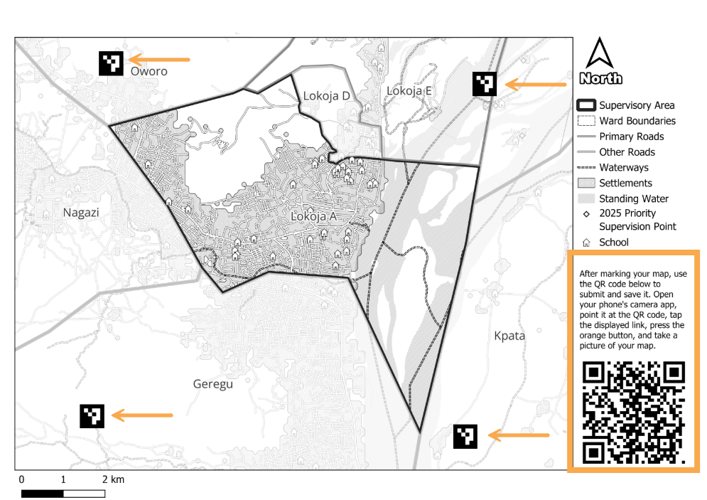
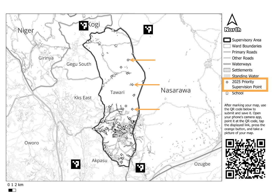
In Kogi State, Nigeria, we helped analyze last year's supervision data and identify communities that supervisors hadn't reached. We flagged those locations using points of interest and marked them as priority supervision targets on the printed maps before they went out. Field teams went in knowing exactly where coverage had been thin.
During a campaign in Edo State, Nigeria, the maps were a planning tool rather than a data collection one Each health facility had only a handful of supervisors and the team wanted staff to draw their own boundaries based on local knowledge rather than generate them in the Crosscut App. We produced maps to support that conversation. Supervisors sketched where they thought the divisions should go and that was the output they could use as a shared reference point.
Where printed maps fit in the planning workflow
Printed maps are usually the result of a planning process that starts in the Crosscut App. The catchment areas, administrative boundaries, and locations you see on the map all come out of that analysis. That map is how that work reaches people in the field without needing a device or steady internet connection to use it.
Each project teaches us something new about the best way to use these printable maps. We’re learning how to set expectations before training, what to ask teams to mark up, and how to automate the data submission process into campaigns that are often already in motion.
The Crosscut App is free to use, and takes just a few minutes to create your first catchment area map. If you want to discuss strategy for an upcoming campaign, let’s talk about how we can help.
Related Posts

How to set up a Microplan Collector project in the Crosscut App

May 2026 updates: Shared microplan projects and easier supervision analysis

How to find the communities your health campaign is missing
.JPG)
