
How to find the communities your health campaign is missing

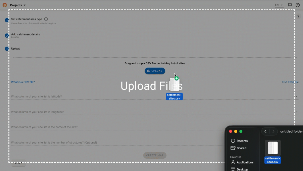
Health programs run on lists to track community coverage. There is usually a spreadsheet with settlement names, health facilities, districts, provinces, and population estimates. These lists determine who gets prioritized for treatment, how money gets allocated, how targets get set, and how campaigns get planned. A community that isn't on that list is effectively invisible to the program.
The problem is that no list is complete, and it is very hard to know which communities are missing. Community lists almost never have GPS coordinates attached to them. Without being able to visualize where these places are on a map, it’s much harder to find the gaps.

So how do you know which communities are missing in the first place?
Where program lists usually come from
These lists are built from the bottom up, over years, by hundreds of decentralized health workers. Data comes in from health facility workers who know the villages in their area. Someone higher up compiles those submissions and enters them into a system like DHIS2, the national health information system used across the world. By the time the list reaches the national level, it often reflects years-old data rather than current conditions on the ground.
Once a community is in the system, refreshing it is harder than it sounds. Updates require coordinating across program levels, take time, and often depend on someone at a local level flagging a change that nobody at the national level would otherwise know about.
These lists are roughly right but never fully current, not geocoded, and missing the IDs that would let it connect with data from other health programs. We've seen this across malaria, immunization, and NTD programs across sub-Saharan Africa. Planning teams tend to manage their microplanning through Excel and email workflows built around these same lists. Every program has their own processes for managing these lists, and the work rarely transfers.
Why a missing map is a missing community
You can run an entire program off a spreadsheet with no map, and it will be roughly accurate. Many programs do and have. But having a map everyone can see and contribute to show you what isn't there. A populated area with no corresponding community on the list shows up as a gap, so you can learn from and plan around what you don't know to fill in those gaps.
The implications also go beyond better coverage and more services provided. Programs that can't show where they're working and which communities they're reaching might struggle to secure continued support. The Ascende Programme is a well-documented example of schisto work that depends on community-level geographic data to decide where to allocate services.
As our colleagues at Unlimit Health found working in DRC, countries often can't request medicine from WHO without data showing which areas need treatment. Getting communities on a map is increasingly a prerequisite for getting funded and for getting medicines.
How to get communities from a list to a map
We help programs work through this in two steps.
1. The first is to take whatever geocoded data already exists, including public datasets, past supervision visits, census lists, and program surveys, and run fuzzy matching to connect community names to coordinates. Place names across different datasets almost never match exactly. Field teams spell names differently, use local variations, or abbreviate. Fuzzy matching finds probable connections automatically and flags uncertain ones for human review. This gets you most of the way there but not all the way.

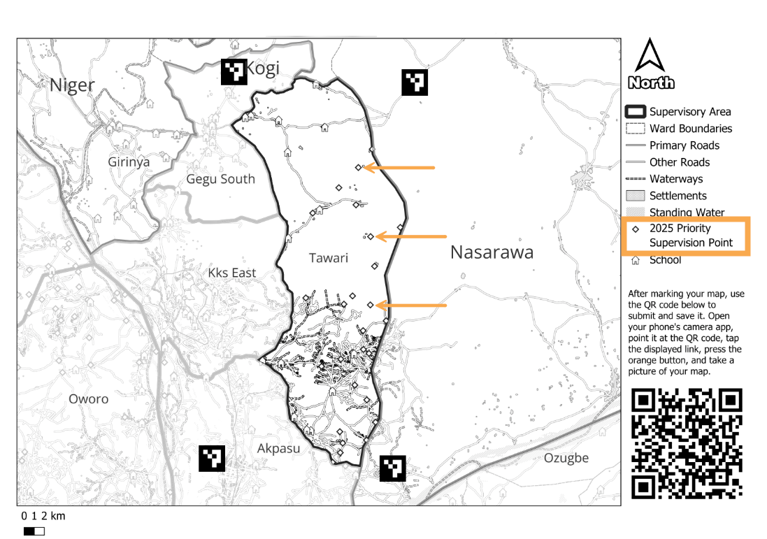
2. So how can teams finish filling in the remaining gaps? In Guinea-Bissau, we shared printed catchment area maps with health facility staff and asked them to mark where their communities were. The teams usually have this information but they haven't had a practical way to feed that knowledge into a planning system. The approach showed how local knowledge fills the gaps that automated matching can't.
What you can do once communities have coordinates
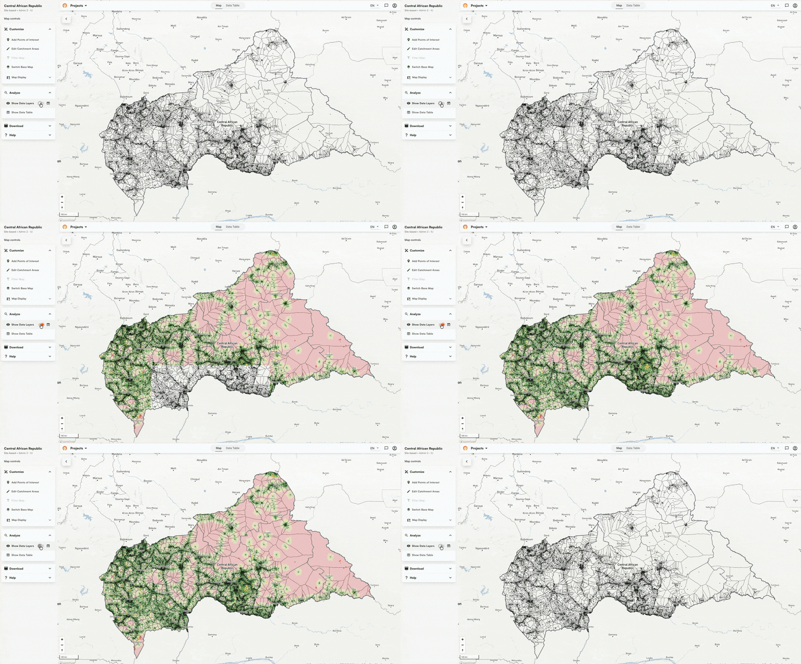
Once communities have coordinates, you can draw catchment areas around them and look for populated areas that fall outside every community's catchment.
Red zones on the map below from the Central African Republic show places where people live that nobody is currently planning for. We call this a community gap analysis, and it follows the same logic as the supervision gap work we've done with NTD programs in Nigeria.
Three health programs means three separate lists
Getting one program's communities on a map solves a huge piece of the planning puzzle for that team. The larger opportunity is what happens when you look across programs.
Malaria has its list. NTDs have theirs. Immunization programs have theirs. Each drifts separately over time. A community removed from one program's list might still be active in another. When programs try to coordinate, they end up reconciling conflicting versions of the same data, sometimes with the same community appearing under three different names across three different systems, with nobody certain which one is correct.
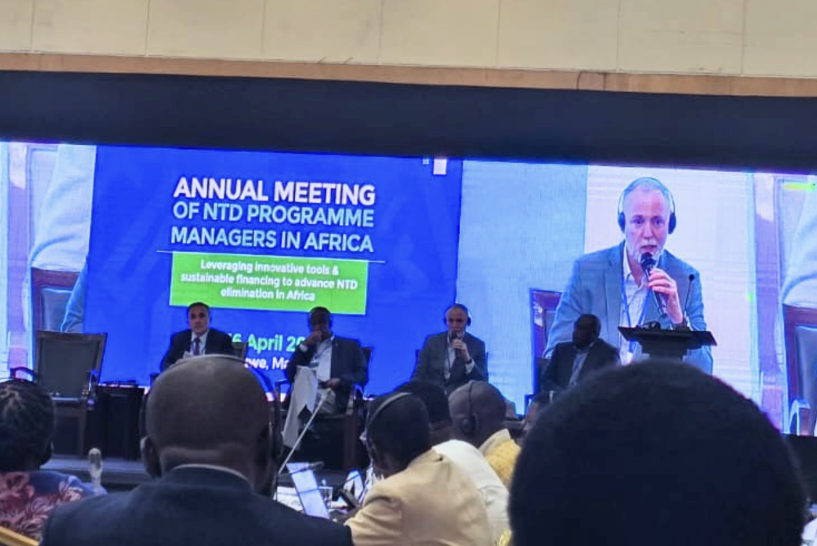
For example, immunization and polio programs usually have more recent community lists than NTD programs because they go door-to-door, and can't afford to miss anyone. That data often sits unused by neighboring programs operating in the same communities. It was a recurring conversation when I presented in Lilongwe earlier this year, and the appetite to change it is real. Getting any one program's communities on a map is what makes sharing that work possible.
Most MOHs already manage their community data in DHIS2. The missing piece is usually the geographic mapping layer. Generating catchment area maps has traditionally meant GIS specialists and long waits for updates. As a DHIS2 Strategic Technology Partner, we help teams do that in a few minutes, and publish the results directly into DHIS2.
An easy on-ramp, not a replacement
We're not trying to replace how health programs manage their data. Most programs have lists, spreadsheets, and workflows they've been using for years. What we're offering is a way to add a geographic layer to what already exists, starting with automated matching to get as many communities on a map as possible, and working through the gaps as you go.
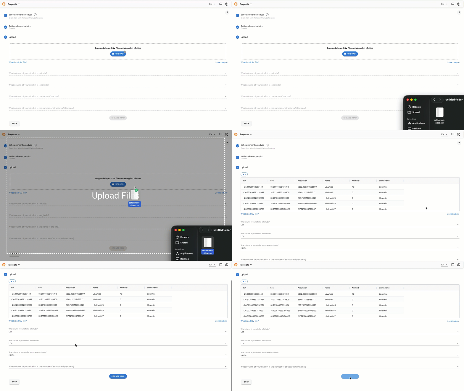
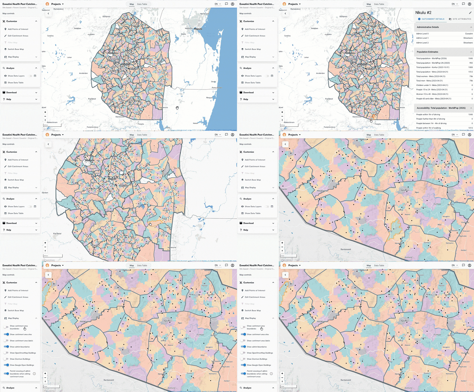
Coordinates unlock catchment areas, catchment areas show you where the gaps are, and visible gaps are something you can pin and monitor as field teams work through them. The field teams who know where the missing communities are have always had the answer. We're making it easier to leverage that data across 55 countries in Sub-Saharan Africa
If this is a challenge your program is working through, we'd be glad to talk.
Related Posts
What GPEI's polio outbreak guidance says about catchment area maps

What WHO's routine immunization guide says about catchment area maps
What the AMP toolkit says about catchment area maps for ITN distribution campaigns
