
Building health catchments from geocoded data in Liberia

Liberia had something most teams don't when we start a new country project. About 95% of communities already had geocoded coordinates attached to health facility assignments. That changed our approach for building catchment areas for their upcoming mass drug administration campaign, which we used to pilot the ESPEN Geospatial Microplanner across Maryland, Grand Cape Mount, and Montserrado counties.
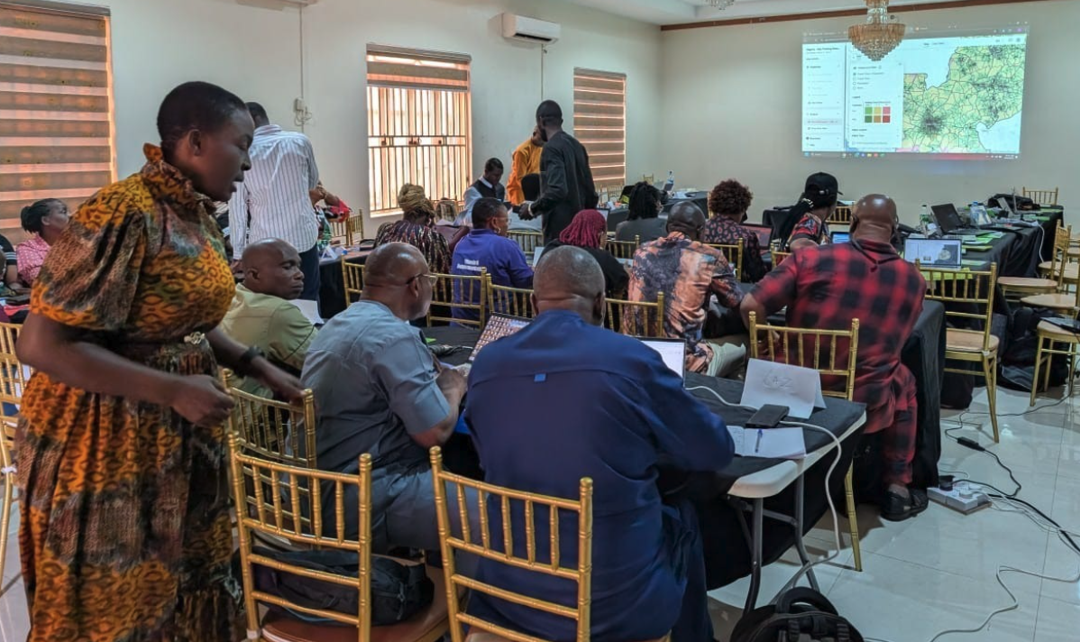
As in Kogi and Guinea-Bissau, we worked with Sightsavers and the Ministry of Health on how to create supervision gap analyses and fair supervisory areas. We used the ESPEN Geospatial Microplanner, which is the version of the Crosscut App available in WHO's ESPEN portal.
What made this pilot unique was having geocoded community data that already included health facility assignments. We could build catchments directly from this community data instead of using app-generated settlements or approximating from facility points alone.
Why most catchment maps miss communities
Countries typically bring us lists showing which communities belong to which health facilities. They know these relationships from years of program operations. The problem is those lists rarely include the actual geo-coded coordinates like we had in this case.
One of the classic use cases of our tool is to build health facility catchments using our site-based algorithm around facility points. As long as the facility points are accurate, the resulting catchment areas are reasonable approximations of what each site’s service area should be. But without the program's specific geocoded community data, there's no way to guarantee perfect alignment between the geographic areas produced by the app and the community to health facility assignments that the country program has been maintaining. .
Having Liberia's geocoded communities beforehand meant we now had a strategy for ensuring this alignment.
Building catchments from geocoded community points
Liberia's data let us flip the typical approach. Instead of building catchments around health facility points and assuming the borders encompassed the right communities, we built catchments around the community points themselves.
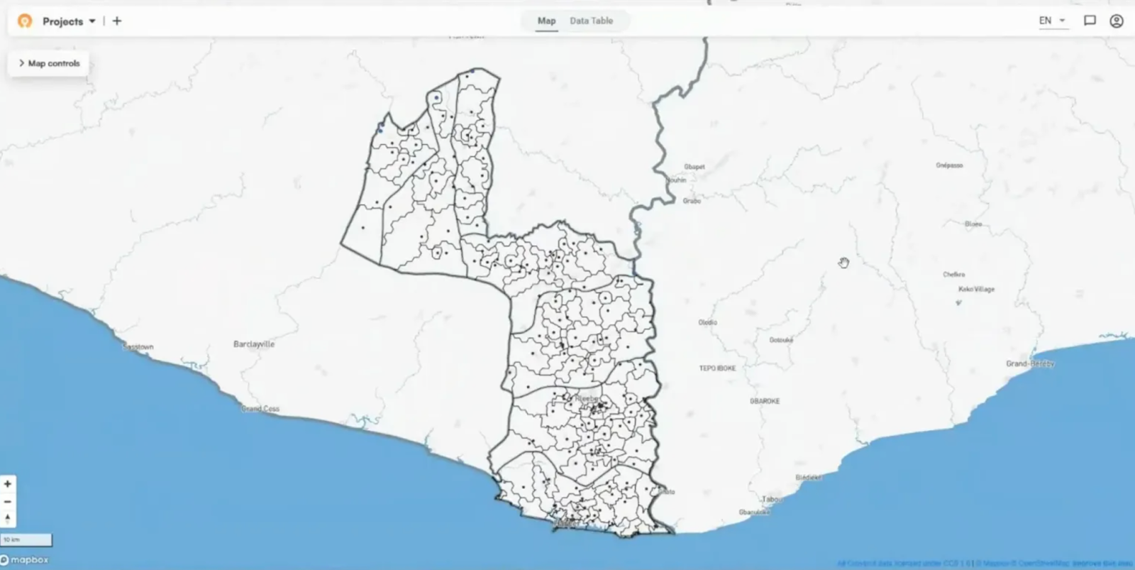
Here is what the results look like–each black dot represents a community from the Ministry's data and the black lines represent the borders of the catchment areas drawn around them.
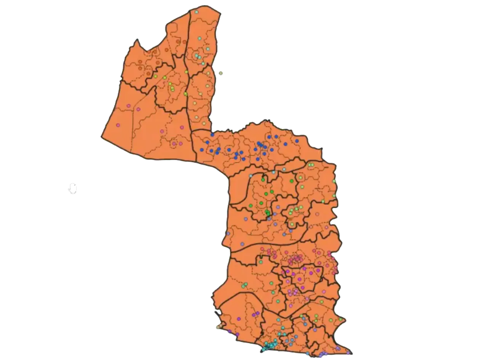
I then extracted those community catchment borders into Python and QGIS, colored the communities based on which health facility they're assigned to, and merged communities assigned to the same facility into a single catchment area.
Since we built the borders from the communities themselves, the resulting catchments match how the program defines them. You don't need 95% geocoding coverage to make this work. What matters is geocoding the communities that sit between neighboring facilities.
For example, if you geocode five communities all near the center of one facility's catchment area, the borders barely change. But if you geocode three communities sitting between two neighboring facilities, you could shift the entire boundary line between them. The edge communities determine where borders fall.
Dividing facilities into balanced supervisory areas
Once I had the health facility catchments from merging in Python and QGIS, I ran the fair supervisory areas algorithm to divide them further. Since those merged catchments only existed outside the app, I had to run the supervisory areas algorithm in Python.
The goal was creating balanced supervisory areas within each facility catchment. For instance, Maryland County had 21 facilities and 26 supervisors. That meant most facility catchments worked as single supervisory areas. Only the five facilities with concentrated populations needed further division to balance supervisor responsibilities.
The supervisory areas algorithm itself worked the same as other country projects where we’re balancing populations to create contiguous territories. The difference was executing it in Python rather than in the app, and using a foundation of health facility catchments built from actual program data rather than approximations.
When geographic reality doesn't match administrative assumptions
When we colored the community points by their facility assignments, it revealed some interesting patterns. Seeing all the communities belonging to the same facility marked in the same color quickly showed us where things don't align with administrative boundaries.
In several places, health facility catchments cross district boundaries. The program's lists show clean hierarchies: counties contain districts, districts contain health facilities. But mapping the actual communities revealed catchments that ignore district lines entirely. Communities of the same color (all belonging to one facility) spread across multiple districts.
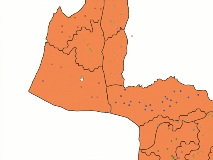
This isn't a problem with the data. The community assignments are based on years of program operations and how people actually access services. Creating catchments from the geocoded communities and color-coding by facility exposed the pattern. Building catchments this way makes it easy to see where facility service areas don't align with administrative boundaries.
These findings help refine how programs organize services and how we approach future country projects. The more we work with in-country data, the more we learn about what actually works on the ground.
What geospatial boundaries unlock
These spatially defined catchments unlock analyses that weren't possible before. Clearer boundaries reduce overlap between supervisors. When communities stretch beyond their center points, supervisors can struggle to know whether settled areas at the edges fall within their territory. Defined borders settle those disputes.
This Sightsavers team built a Metabase dashboard to track supervision during the campaign, similar to what was used in Guinea-Bissau and Nigeria. The health facility and supervisory area boundaries will feed into that dashboard. They'll see which areas got supervision visits, color-coded by the supervisor. Setting up similar dashboards across country projects helps us understand what actually improves coverage versus what just looks good on paper.
These insights feed into our monitoring and evaluation framework. We're tracking whether supervision coverage improves in targeted areas, whether clearer boundaries reduce confusion, and whether geospatial planning translates to better campaign execution. Each country project teaches us what works across different contexts and data quality levels.
Making this workflow accessible
Like Kogi, we provided entirely remote support for Liberia. I trained three people from the Ministry of Health and one from the Sightsavers country team on supervision gap analysis. The remote model lets us support more country projects simultaneously, which accelerates what we learn about effective planning approaches across different contexts.
The custom work building health facility catchments from community points currently requires Python, but we're adding it as an app feature. Teams will upload their geocoded lists with facility assignments, and the tool will generate catchments automatically. That should eliminate the manual work and make the approach accessible to any program with geocoded data.
If your team is planning health campaigns and could use support with geospatial analysis or catchment mapping, reach out through our Advisory Services.
Related Posts

How to create catchment area maps in DHIS2 with the Crosscut App
.JPG)
How the Crosscut App helps plan health campaigns in Nigeria

