
May 2026 updates: Shared microplan projects and easier supervision analysis
Having a way to share projects for the Microplan Collector has been at the top of our request list for a while. We pushed that live in May, along with a few other additions on the Schisto Mapper side, and some user experience improvements that came from feedback during campaigns.
Sharing Microplan Collector projects
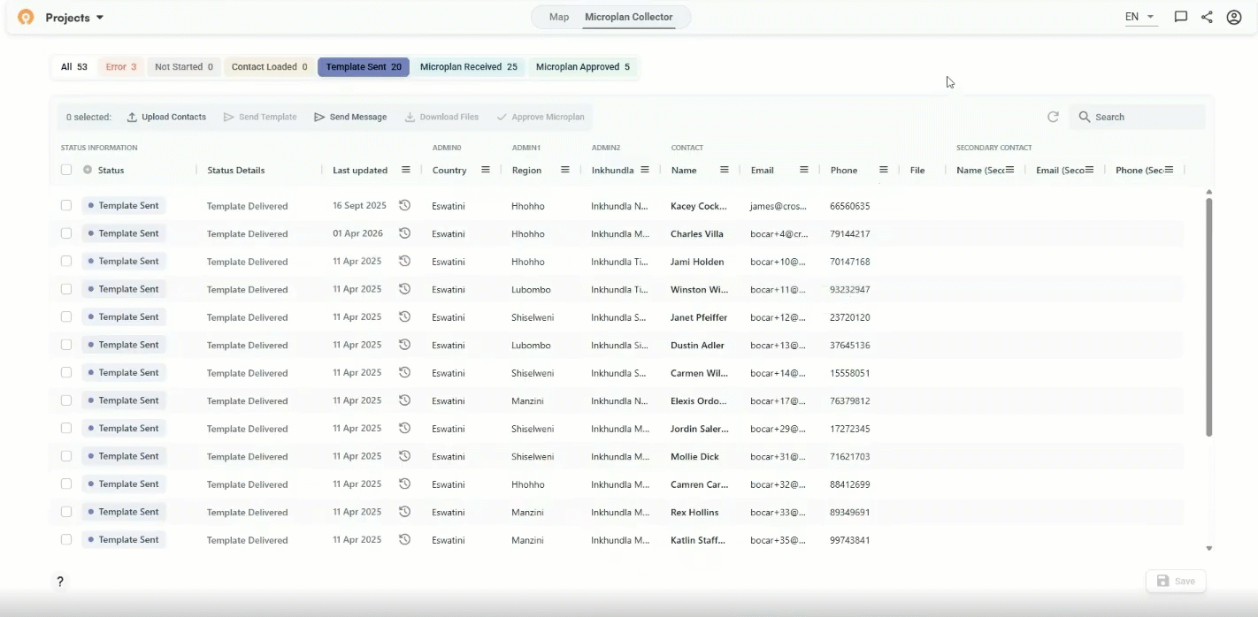
Before now, a Microplan Collector project lived in one account. For programs running the standard email and Excel workflow that's usually fine, but it got complicated for campaigns where multiple regions report into a single project and more than one person needs to manage it. Either one person handled everything centrally, or regional teams ran separate projects and you lost the ability to see the whole country in a single view. There was no clean middle option.
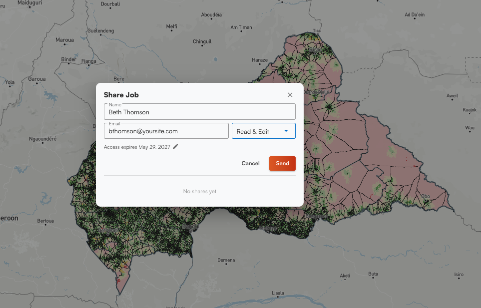
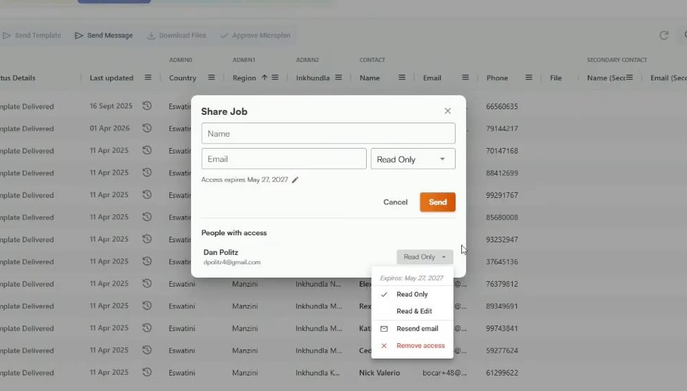
Now users can just click the Share button, enter the recipient's email, and set their access level. The link is tied to that address specifically, so it won't work if someone forwards it elsewhere. Which level you assign depends on how the program manages the effort:
- Read-only: The user can look over and review submission status across the microplan project without the ability to change anything.
- Read-and-edit: The user can adjust population estimates in finalized data, approve individual microplans, and send reminder messages to contacts who haven't submitted.
The project owner can update or revoke either at any time. Both access levels point to the same project. It's not real-time collaboration in the way Google Docs works, but changes one person saves are visible the next time the other logs in.
Expiring links for more organized data
You can also set an expiration date on the link when you share them. The default is one year. As one example of when you’d use an expiring link, we used this during a training in Madagascar recently and set it to expire after two days, so there was no risk of participants working in the demo instance after leaving the workshop. More broadly, campaigns may produce multiple shared links over time, and you don't want a 2025 link still looking active during a 2027 campaign. The underlying project stays in your account. Only the shared link expires.
Easier to use across devices
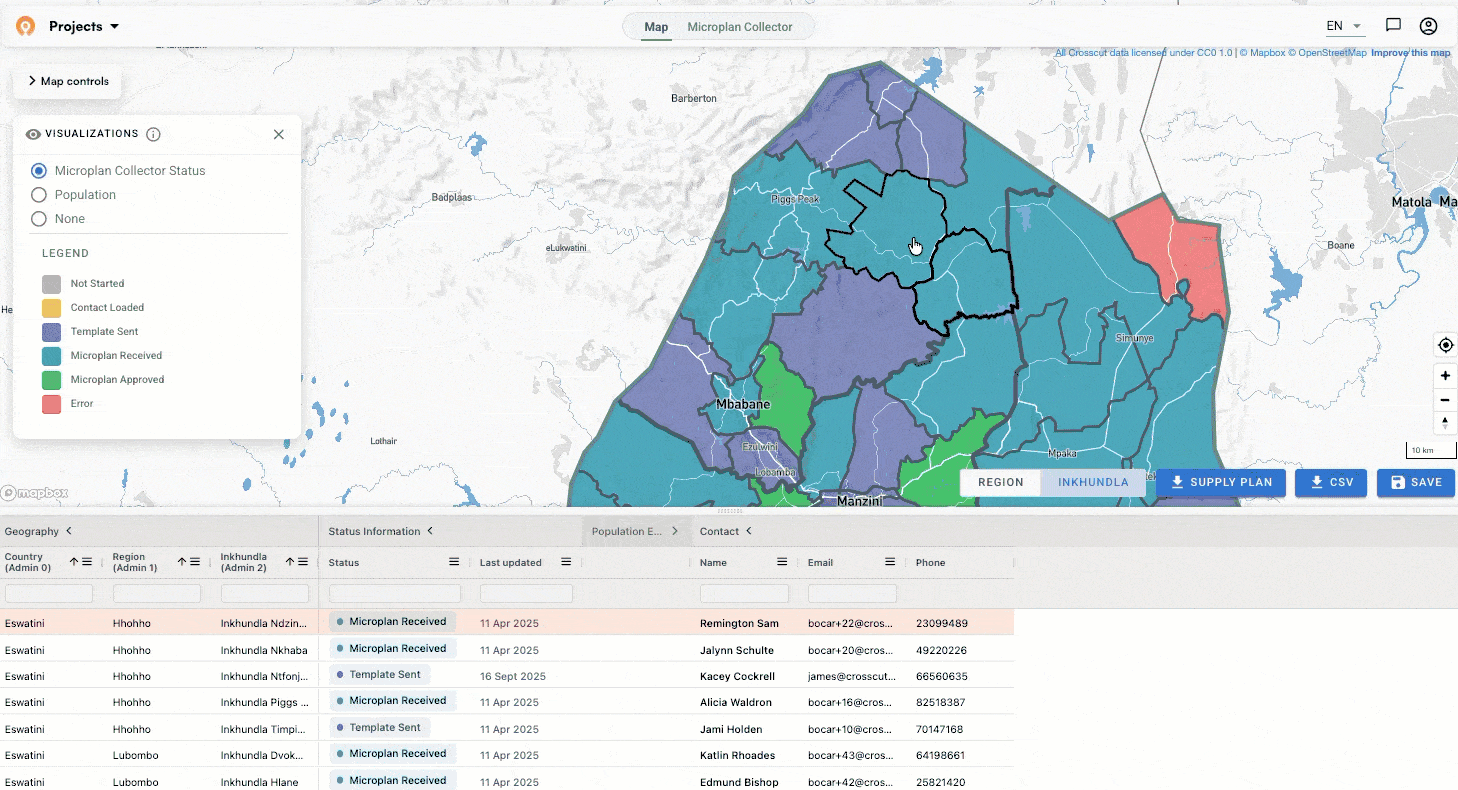
We added a recenter map button. If you've been panning around and want to return to your starting view, it's right there in the map controls.
We also made several improvements for smaller screens. Map controls were getting cut off on laptops with limited vertical space and no way to scroll to reach them, so we fixed that bug along with the other updates. A lot of the people using this tool are working on older hardware with unreliable connections, and these are the kinds of fixes that make the difference between something that works reliably in the field and something that doesn't.
Parent site attributes now visible in the data table
For anyone using two-tiered catchments, here's a small but useful addition. When you click on a child catchment in the data table, you can now see the parent site's attributes alongside it. Previously you had to navigate back up to get that context. If you haven't tried nested catchment mapping yet, this step-by-step guide walks through how to use an existing catchment map as the boundary for a new one.
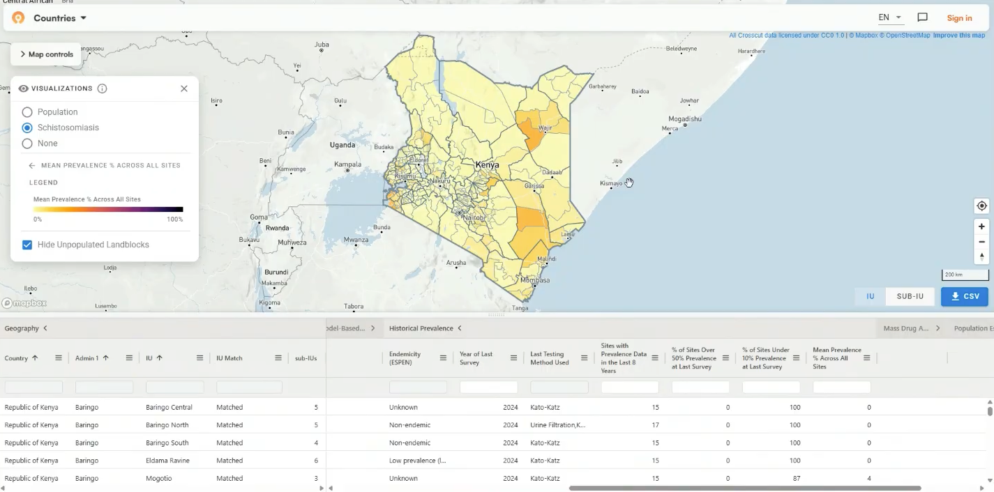
Mean prevalence and a new data layer in the Schisto Mapper
We wrote about building out the Schisto Mapper back in March, the application we maintain for ESPEN's schisto control programs. This month we made two additions. The first is the ability to calculate mean prevalence at the IU and subIU level and display results on the map. The goal is to give teams a quick read on where disease burden sits across a country without pulling numbers manually.
The second addition is different in nature. Kenya also now has a new data layer at the district level in the Schisto Mapper. Rather than aggregating survey results collected through the SPPA process, this layer draws on predictive modeling to estimate schisto conditions across the country and displays those estimates at the district level inside the tool. It is the first time we have deployed this kind of modeled layer in the Schisto Mapper, and more countries will follow.
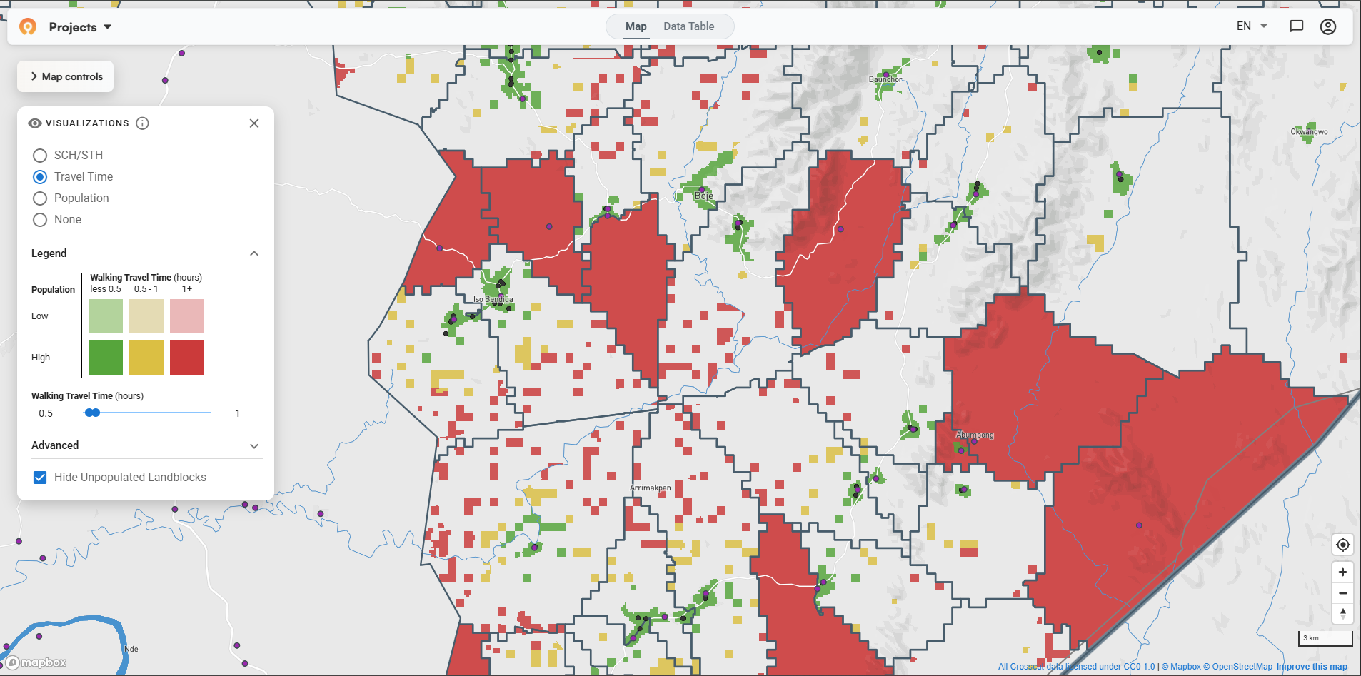
Empty catchments now show as red
During health campaigns, supervisors travel to communities to verify that drug distribution or other services are delivered as planned. The real-time maps we set up through CommCare and ODK track where those verification visits have occurred, so program coordinators can see which areas have been checked and which haven't.
Until now, catchments with no recorded visits appeared white. White is easy to misread as neutral when it really indicates that nobody has been there. Those catchments now show red so gaps are immediately visible rather than blending into the background.
The write up from our country project in Edo State, Nigeria has more on how teams use these maps to track supervision coverage during an active campaign.
More control over preset map links
Those daily supervision maps open through a preset link that already has the visualization configured, so program coordinators don't need to set anything up. We expanded what we can configure in those links this month, which means we can now fine-tune things like travel time color thresholds (or whatever can help the team plan better) more precisely than before.
For example, one program we worked with wanted a stricter travel-time analysis than the default set up provided. Instead of areas turning red if they were more than 4 hours away from the nearest point, they wanted red to kick in at 2 hours. That’s now much more straightforward to set up.
Raster data, aggregated and ready for analysis
A lot of useful disease data comes from predictive models that estimate conditions across an entire geographic area. These models often represent their geographic outputs as raster files, and they store data as a grid of values rather than points or boundaries. Think of a weather map that estimates conditions at every point across a country rather than just where someone placed a sensor. The problem is that health programs don't plan at that level of granularity. They plan by district, health zone, or catchment area, and a continuous grid doesn't translate directly into those units.
What we can do now is take a raster file and aggregate its values up to whichever administrative boundaries are relevant to a program, so each district or health zone gets a single value rather than thousands of individual pixels. That's different from simply overlaying a raster image on a map. The aggregated values display as a colored polygon layer and, more usefully, land in the data table alongside population and accessibility figures where teams can really dig in and analyze them.
All of these features are live and free in the Crosscut App. If you're working on campaign planning or data collection workflows and want to talk through how any of this fits your program, reach out through our Advisory Services or contact us directly.
Related Posts

How to create catchment area maps in DHIS2 with the Crosscut App
.JPG)
How the Crosscut App helps plan health campaigns in Nigeria

