
How to set up a Microplan Collector project in the Crosscut App

Global health programs tend to collect community-level population data by emailing Excel templates to district health officers and local supervisors. Program managers send the email, then tracks who has responded, follows up on incomplete submissions, and checks for errors or typos in the spreadsheets as they come back in.
The Microplan Collector was built to work with the email and Excel workflows most health programs already use. From one dashboard, the program manager can send templates, track responses, visualize progress on a catchment area map, and compare incoming estimates against satellite population data before you export. This guide walks through setting one up using one of the default templates.
What you need to start a microplan project
Before creating a microplan project, make sure you have:
- Email contacts for the person responsible for each administrative unit you're collecting data from.
- Knowing the admin level your program collects data at, such as region, district, or ward. If you start creating a project and your level isn't available, reach out and we can add it.
Have your own planning template? This guide uses the default neglected tropical disease (NTD) template. If your program has its own custom template, contact us before you start and we will set up your project.
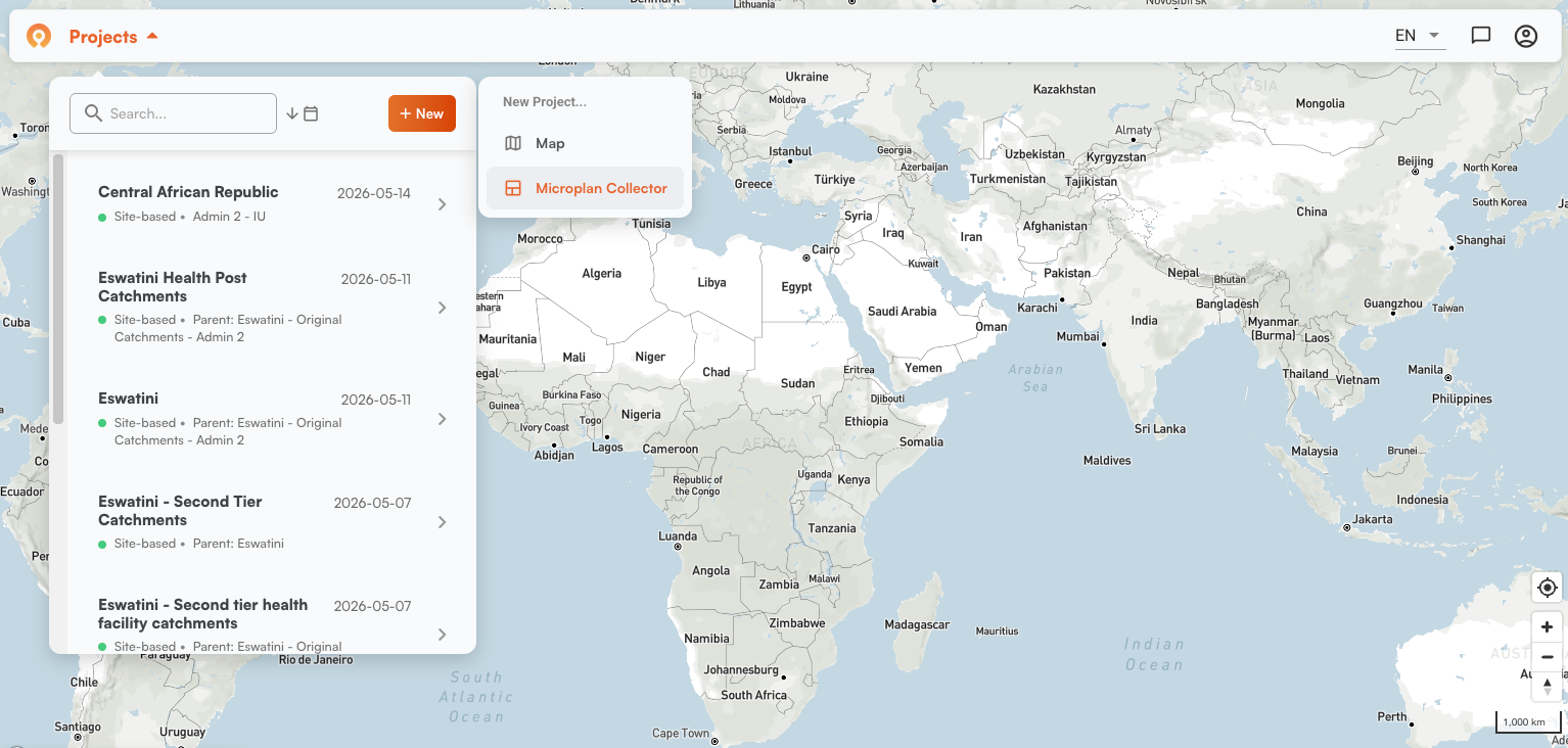
Step 1: Create a new project
Go to Projects, click New, and select Microplan Collector.
Step 2: Choose your data collection level
The next question asks which administrative level should receive the templates. Admin level names vary by country across the 55+ countries available in the Crosscut App. What’s referred to as an Inkhundla in Eswatini might be called a District or some other term elsewhere.
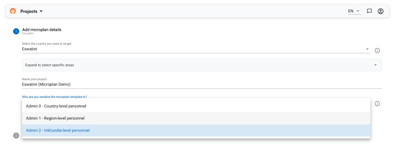
The level you choose determines who gets a template to complete and send back . Each contact receives one template to use to report the population estimates of the communities in their area:
- Select a lower level (district or ward) and you send more templates, one per unit.
- Select a higher level (region or country) and you send fewer templates.
Choose the level that reflects how your program plans to collect data.
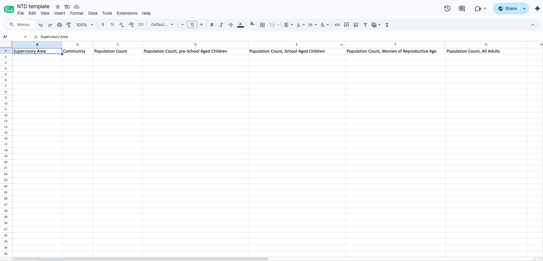
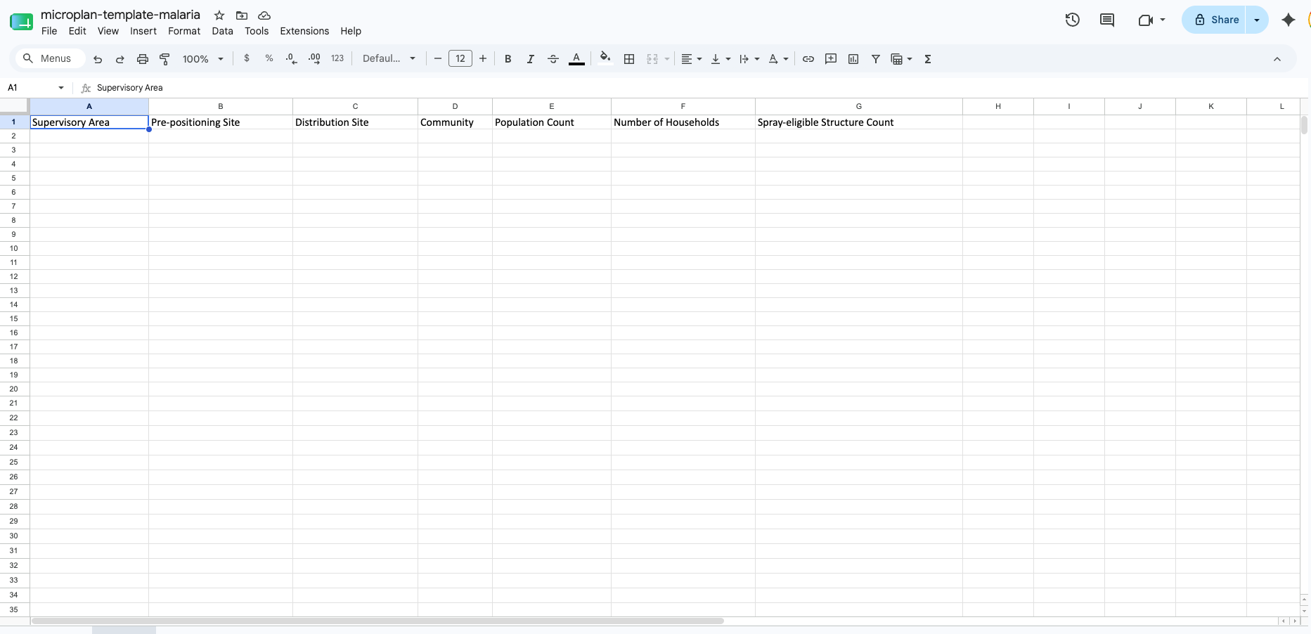
Step 3: Choose your template
Select NTD, malaria, or other. Click the template preview button to download and review the file before moving on.

The NTD template captures community names, supervisory areas, and disaggregated population columns: pre-school aged children, school-aged children, women of reproductive age, and total adults.
For malaria campaigns, the template adds distribution and pre-positioning site fields, reflecting the structure counts and site logistics those programs typically need for indoor residual spraying campaigns.
The app pre-fills country, region, and district for each contact regardless of which template you use. The person doing data collection fills in community names and population estimates for their area. If they need to add rows beyond the default 20, that's fine, but the region and district names in those rows must be an exact match for the pre-filled values.
The system uses those names to join the data correctly, so any mismatch will prevent the data from being aggregated to the correct admin unit.
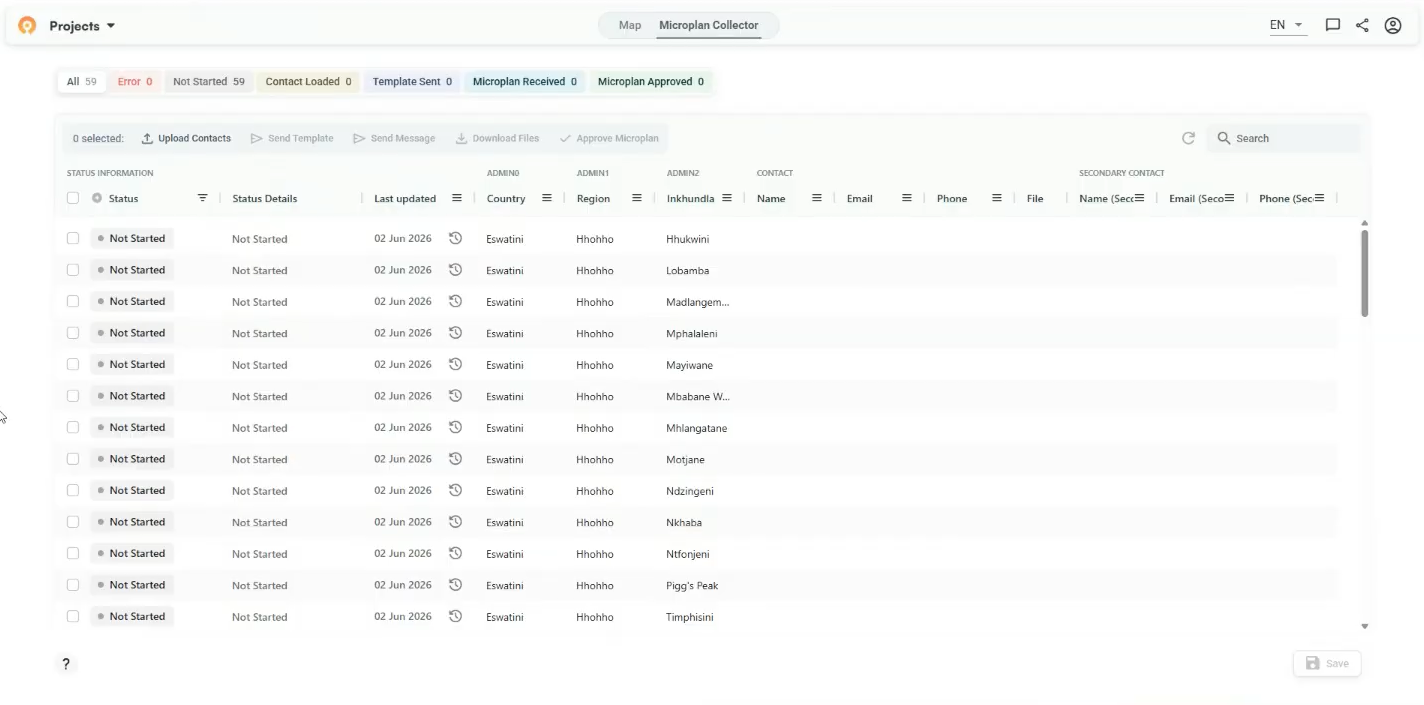
Step 4: Load your contacts
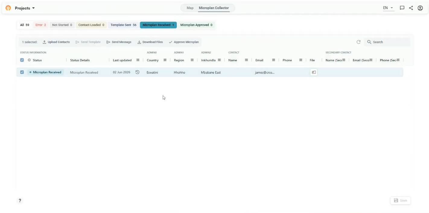
After you create the project, you land on the main dashboard with one row per administrative unit. Each row represents one administrative level, and you can specify up to 2 contacts (e.g., a district health officer or local supervisor) who will receive a template. The status column tracks where each one is in the process:
- Not Started: No contact loaded for this row yet.
- Contact Loaded: Email address added, template not yet sent.
- Template Sent: Template emailed to the contact.
- Microplan Received: Contact has submitted their completed template.
- Microplan Approved: Submission reviewed and approved.
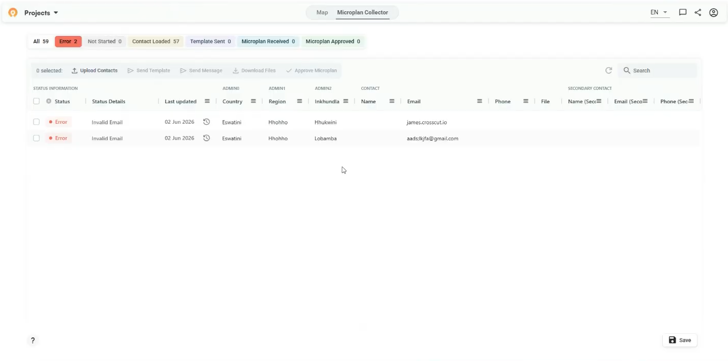
- Error: Something went wrong. Common causes are an invalid email address, a bounced message, or a validation failure in a returned file. More on this later.
You can add email addresses manually by clicking the edit icon on each row. For more than a few contacts, use bulk upload. Click Upload Contacts, download the contacts file, fill in the email column, then drag and drop the completed file back into the upload dialog.
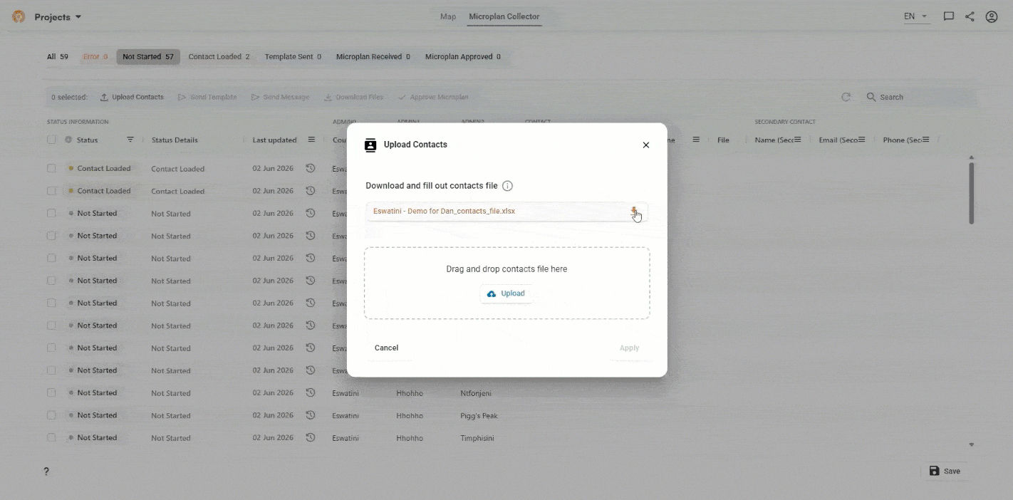
The tool validates email addresses after they’re uploaded. Rows with invalid addresses move to error status immediately so you can fix them before anything gets sent. The action buttons across the top of the table are context-sensitive: they update based on what you have selected, so only the actions that apply to your current selection stay active.
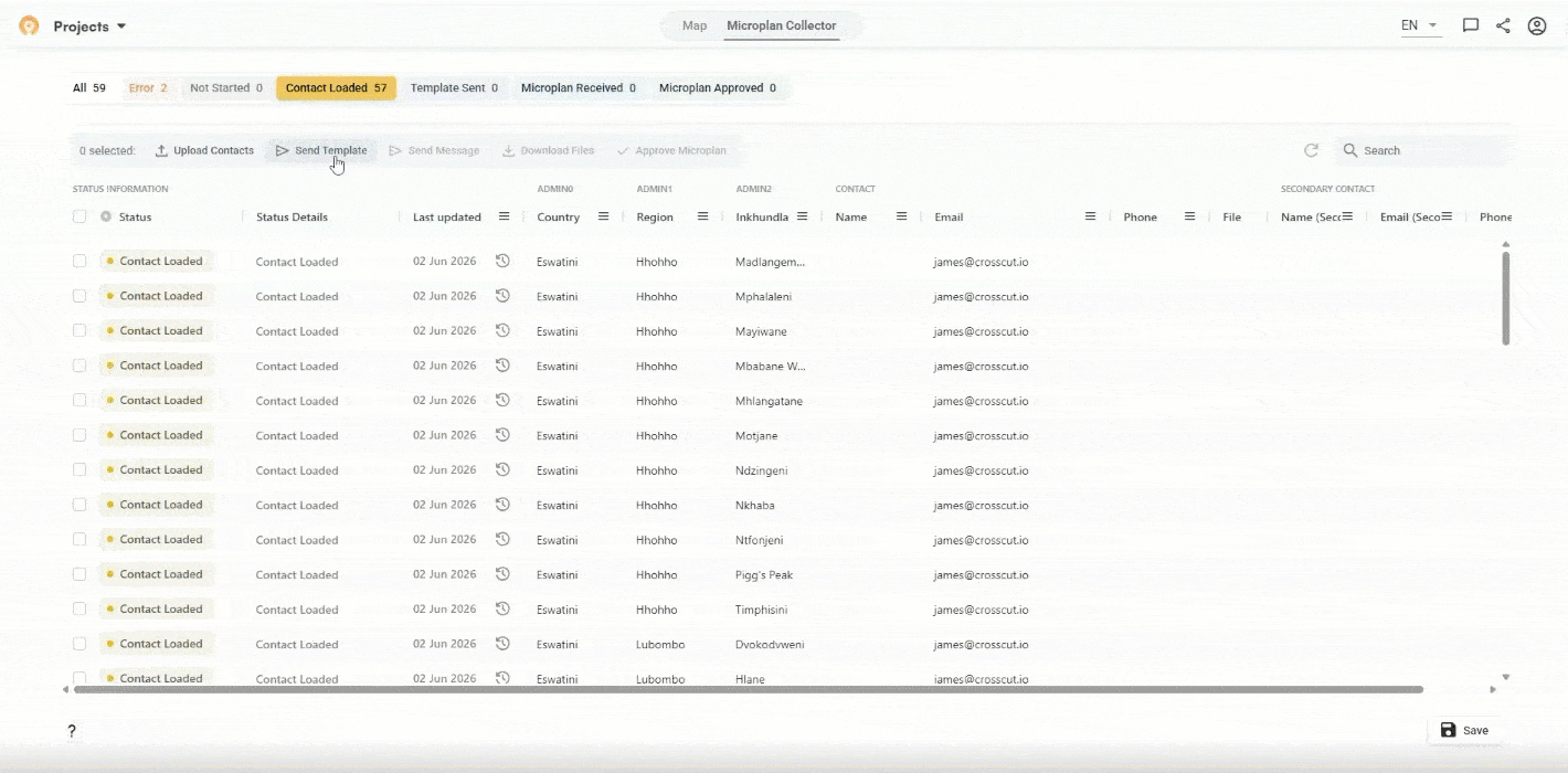
Step 5: Send the template
Use the yellow Contact Loaded filter to select all ready rows, then click Send Template.
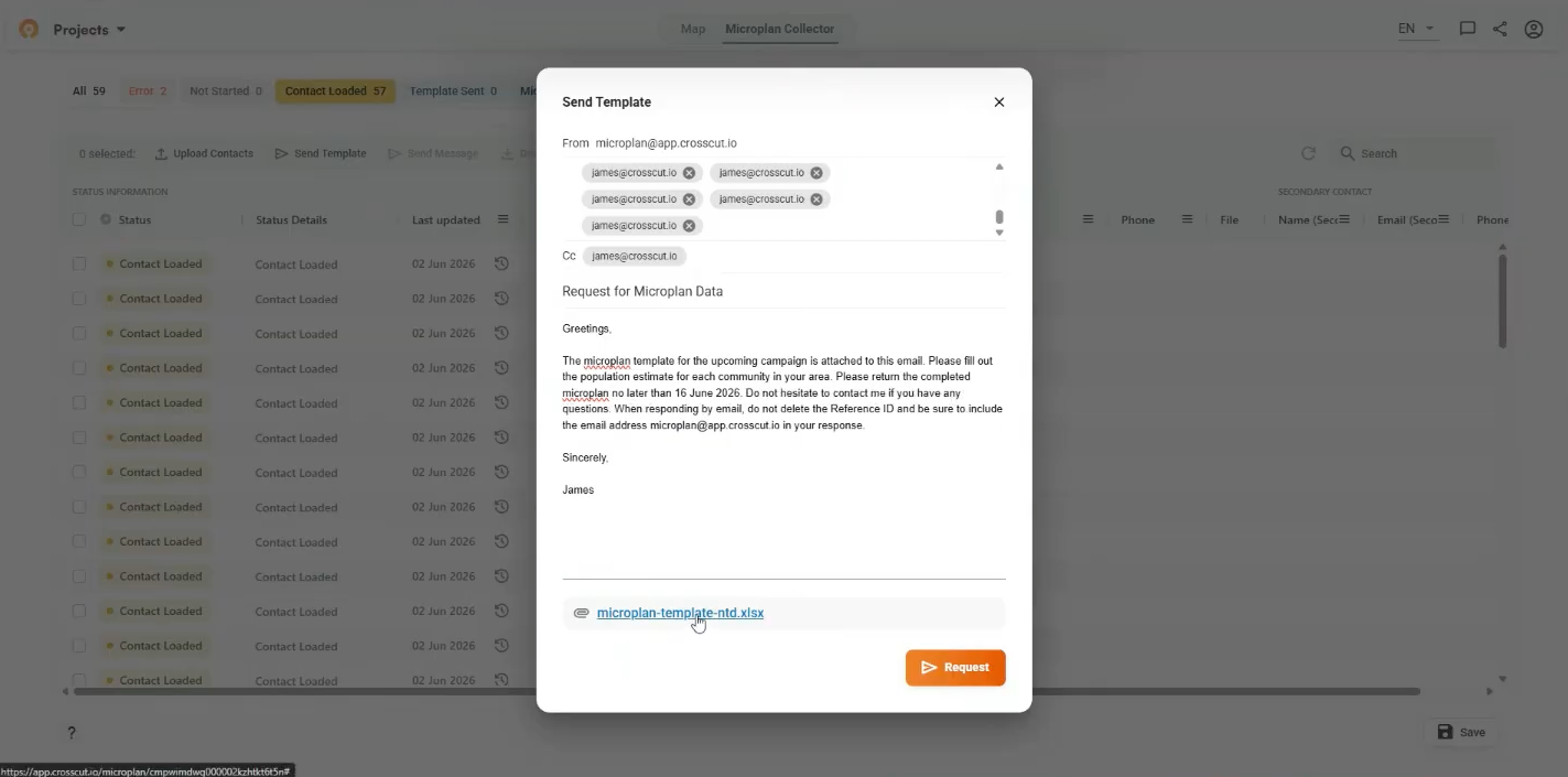
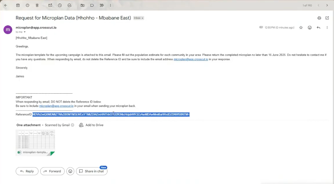
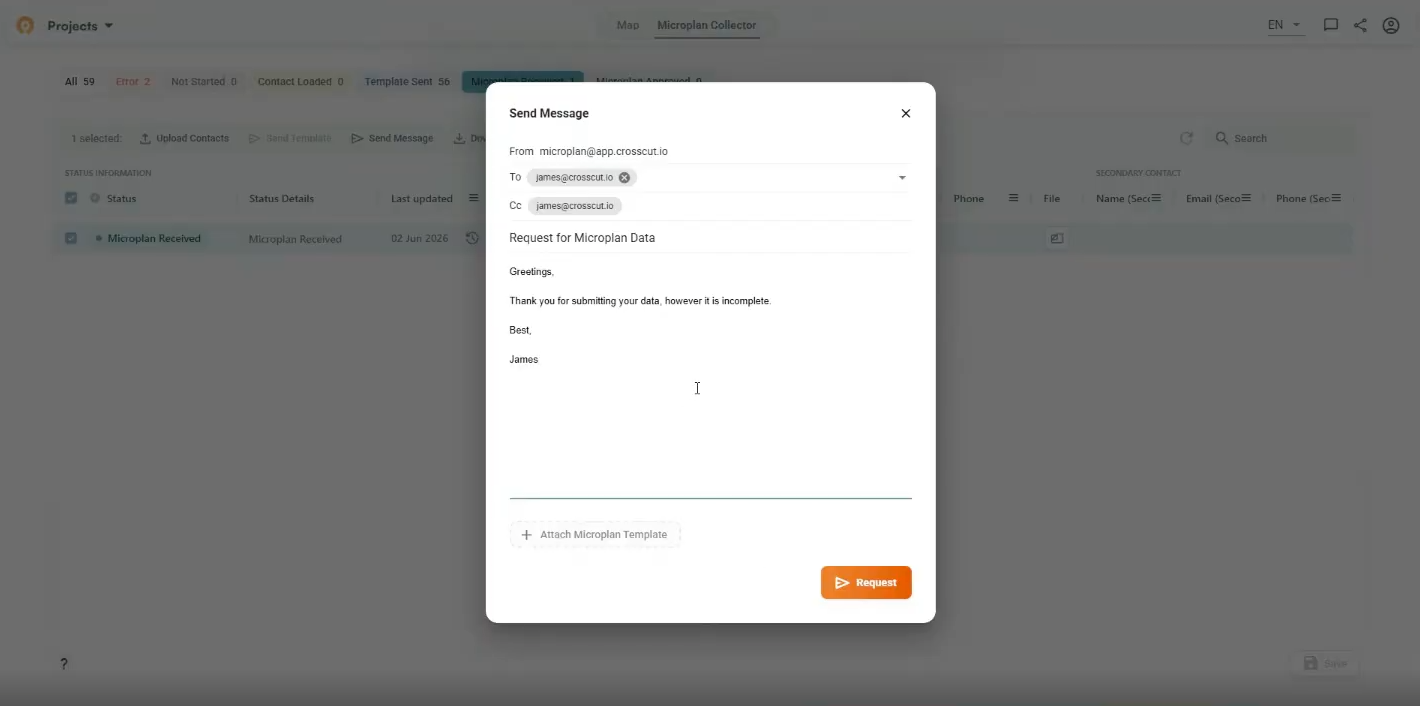
A preview shows the full email each contact will receive. You can edit the subject line and body, and add a submission deadline. The system automatically attaches the template file and includes a Reference ID in the email signature (pictured in the next section). ⚠️That Reference ID links each returned file to the right district. Ask your team not to delete it when they reply.
Click Request to send. The filter bar updates to show all rows in Template Sent status.

ℹ️ What the workflow looks like for data collectors
Each template recipient receives a separate email with their area's template attached. When the data collector opens the email, they see the custom instructions, the deadline if needed, and the Reference ID in the footer, as noted above. Remember, the Microplan Collector uses this unique ID to organize your workflow and should not be deleted.
From here, the data collector just has to open the attached Excel file, fills in community names and population estimates for their area, and replies to the email with the completed file attached when they are ready. There are no new logins, or new tools on their end.
Step 6: Manage incoming responses
As responses come in, rows move from Template Sent to Microplan Received. Use the refresh button next to the search bar to check for new submissions without reloading the page.
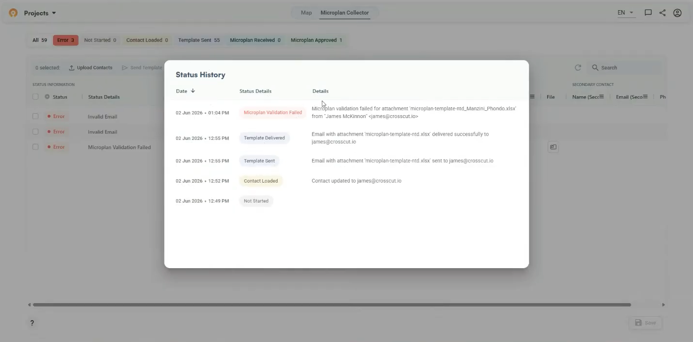
Rows can move into error status at different points in the process. Invalid (or mispelled) emails get flagged during contact upload. After sending, emails that bounce or get flagged as spam show up as errors. When files come back, a returned file fails validation if the Population Count column contains anything other than numbers.
You can also click the history icon on any row to see a timestamped log of every status change and the specific error description.
If a submission is incomplete or needs updating, select that row and click Send Message to follow up from the dashboard. You can attach a fresh template or leave the data collector to update the file they already have.
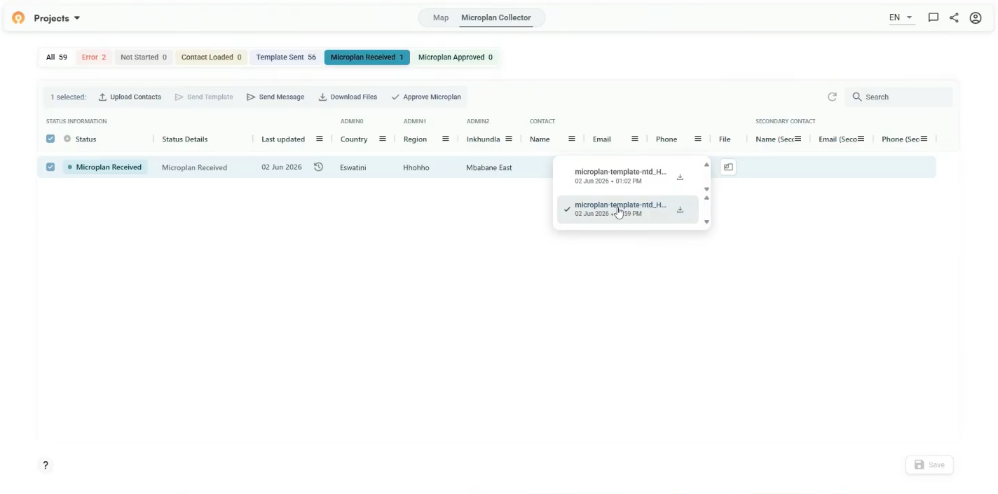
After the data provider has resubmitted the file, all versions appear in the file dropdown on that row. The app selects the latest submission by default and marks it with a checkmark. You can click an earlier version to use that file as the basis for your analysis instead.
Step 7: Approve and download
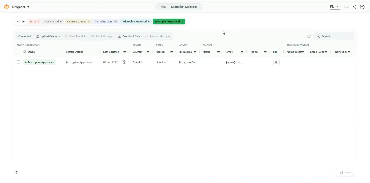
Once a submission has been reviewed and its estimates have been validated, select that row and click Approve Microplan. Approval moves the row to Microplan Approved status.
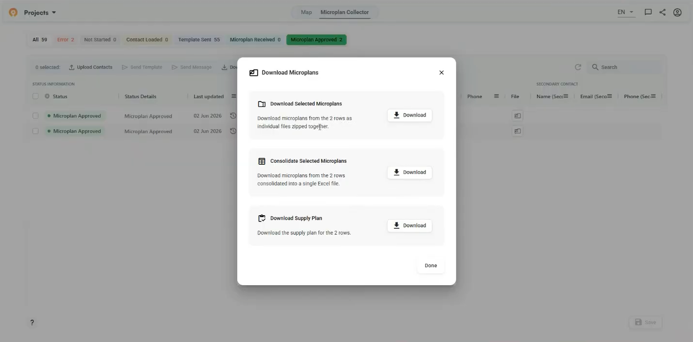
When you're ready to export, filter to Microplan Approved, select the rows you want, and click Download Files. Three options appear: download individual files zipped together, consolidate everything into a single Excel sheet, or download a supply plan. The consolidated file stacks all submissions into one sheet with country, region, and district columns intact.
Visualize your plan with a catchment area map
Once responses start coming in, the Map tab gives you a geographic view of collection status, population distribution, and how your incoming estimates compare to satellite data. You can access all of this information layered over your catchment geography.
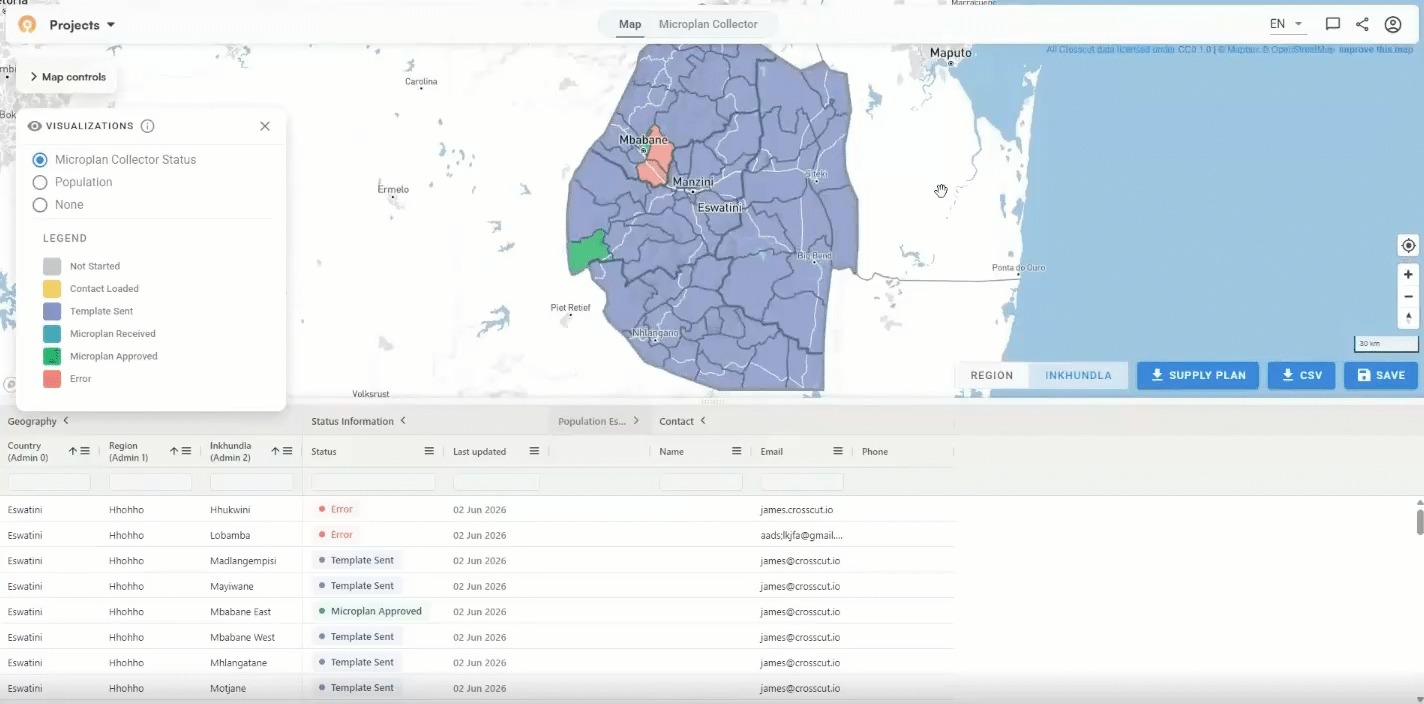
The Microplan Collector Status visualization colors (blue for sent, red for error) each area by its current stage within the project. It's a useful check when you're working across a large number of districts. Switch to Population to see satellite-derived population density across your working area, using the same data layers available across all Crosscut projects.
Checking results with Microplan Collector Outliers
When you have enough submissions in, the Microplan Collector Outliers layer becomes available. The map colors each area based on the gap between your submitted Population Count figures and a third-party reference source: WorldPop, Meta, Grid3, or Kontur.

Areas in blue represent estimates below the reference figure. Areas in red submitted estimates above it. You can switch between the reference source above to assist with the process of triangulating down to the most accurate estimate.
You can also toggle between administrative level views using the buttons at the bottom right of the map. The table below will reflect whatever data you select. Expand any row to see community-level figures. Click into the Finalized Data column to correct individual estimates before you export. You can also compare with the previous year’s figures to monitor coverage or track changes from one year to the ne
Simple geospatial microplanning with the Crosscut App
The Microplan Collector doesn't change how your field staff work. They still get an Excel template by email and reply with the completed version. What changes is everything on the receiving end: one dashboard, automatic validation, and consolidated population data ready for your team to use however works best for you.
The Crosscut App is free to use. If you're setting up a new project or want to expand what your team is doing in the field, these guides cover the rest of the workflow:
- What is a catchment area? A GIS guide for non-technical teams - A plain-language introduction to catchment mapping for anyone new to the concept.
- How to create catchment area maps from GPS locations - Start here to build the catchment project your Microplan Collector sits on top of.
- Printable catchment area maps for health campaign planning - Generate printed maps for field teams directly from your catchment project.
- How to create catchment areas within catchment areas - Create supervision territories within an existing catchment map.
- Pinning points of interest on catchment maps - Flag locations that need follow-up directly on your map.
For custom work, training, or program-level support, reach out to learn about our Advisory Services
Related Posts
DHIS2 Annual Conference 2026
.JPG)

How to create catchment area maps in DHIS2 with the Crosscut App
How the Crosscut App helps plan health campaigns in Nigeria

