
An independent evaluation of the Crosscut App
Last year we published a monitoring and evaluation framework to measure whether our tools improve coverage outcomes in the field rather than just assuming they do. This past April, an independent evaluator came back with some of the first results.
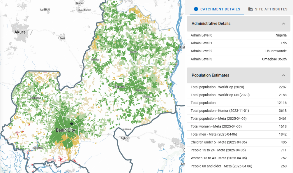
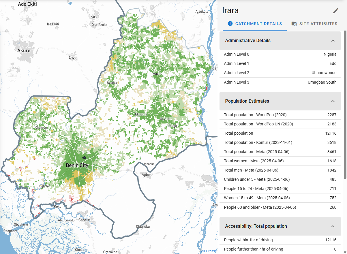
In April, Dr. Clara Burgert-Brucker completed an external evaluation of our 2025 country projects with WHO's Expanded Special Programme for the Elimination of Neglected Tropical Diseases (ESPEN). The projects, supported by the Ministry of Health in collaboration with The Carter Center in Edotate in Nigeria and Sightsavers in Liberia, Guinea-Bissau, and Kogi State in Nigeria, used the Crosscut App to support mass drug administration (MDA) campaigns against neglected tropical diseases.
Clara interviewed ten people across the four pilot projects for this evaluation, pulled together the available quantitative data, and wrote up the evaluation report. Here are some of the key findings we’d like to share.
What the evaluation measured
The projects in Liberia (onchocerciasis and lymphatic filariasis), Guinea-Bissau (onchocerciasis), Nigeria's Kogi State (schistosomiasis and soil-transmitted helminths), and Nigeria's Edo State (onchocerciasis) had a combined target population of around 5.7 million. The collective results of using the Crosscut App in 2025 was associated with:
- +61,930 additional persons treated during MDA compared to 2024
- +463 previously missed settlements received a supervision visit, communities identified during planning as historically uncovered or priorities for supervision (e.g hard to reach areas).
- Settled areas receiving supervision visits increased from 73% to 81% (+8 percentage points)
On that last point, a supervision visit is when a supervisor goes to a community to check that drug distribution or other tasks have taken place. Catchment area analysis helps measure what share of the populated area had one of those visits or were nearby (within a reasonable walking distance) to a community that had one. Supervisors extended their geographic reach even where headcount stayed flat or declined, speaking to the effectiveness of this type of tool.
Five factors that drove the coverage improvements
Clara's interviews and data pointed to five factors that drove the pilot results:
- Better data visibility. Teams can access population estimates, administrative boundaries, supervision history, and access constraints together on a single catchment area map. Problems that used to be absent from campaign planning were visible to teams before the campaign got underway.
- Clear coordination. During campaigns, supervisors check in using mobile data collection tools like CommCare and ODK. Those check-ins feed into near real-time dashboards that show where supervisors have and have not been. Teams could fill supervision gaps while the campaign was still running rather than discovering them after it ended.
- Improved equity targeting. Teams used catchment and supervisory area maps to find settlements known locally but missing from official program lists, including forest, riverine, and border communities, displaced populations, and areas previously written off as unreachable. Of 578 such settlements identified across the four country projects, 463 received a supervision visit in 2025.
- Flexible adoption. No two countries used the Crosscut App the same way. Each picked a combination of features they needed, from health facility heat maps to QR-anchored printed catchment maps, and fair supervisory areas. These solutions fit each into the existing workflows these teams used rather than forcing them into new ones.
- Scalable technology. The same underlying platform supported three countries, four diseases, two languages, and two implementing partners.
Each of these factors shows up in both the data and the interviews. What connects them points to something more useful than any single feature within the application itself.
Takeaway: Planning data existed, but it was scattered
We expected the evaluation to highlight benefits of specific features like heat maps. But the most important thing is that data is visible and accessible to the teams who need it. Most of the data was already there. What changed was that people from different parts of the program could look at it together, edit it on the spot in the web-based app, and make decisions together.
Phoebe Hindan, a Programme Officer with Sightsavers in Kogi, put it this way:
"It's not like we didn't know those issues existed, but we didn't have the evidence to engage with them and demand action. With the tool, it was so easy."
We're seeing that existing MDA planning for treating NTDs was not missing a new algorithm or a dataset. The data existed. What was missing was that the existing inputs weren't presented in a way that made conversations possible across program levels. The catchment area maps, accessibility surfaces, and supervision overlays keep everyone on the same page without needing GIS experts.
How we're applying what we learned
The most valuable thing the Crosscut App does is put existing data in front of more people at the same time. We are deliberately building toward that goal by prioritizing features that improve shared views, including multi-user access, shareable map states, and better performance on low-bandwidth connections, rather than adding yet another analytic layer. We continue to survey real users and push updates based on what teams using the app tell us they need most.
Hands-on support from our team came up repeatedly as part of why the country projects worked. That is flattering and requires us to consider how to ensure this support is provided in a sustainable manner. Better in-app guidance, video tutorials, and example projects are in development so country teams can do more of this independently between campaigns.
Several of Clara's findings point to the cost of having planning data and implementation data sitting in separate systems. The DHIS2 Strategic Technology Partnership we announced earlier this month is the natural path toward closing that gap.
Who made this work possible
None of these results would exist without the Ministries of Health and national NTD programmes who led the work. That includes the National NTD Program of Liberia, the Ministry of Health of Guinea-Bissau, and the Federal, State, and Local Government Area NTD programmes in Nigeria, along with their partners, The Carter Center and Sightsavers. They led the planning conversations, made the operational decisions, and brought the local knowledge that turned maps into action.
If you're working on an MDA, a vaccination campaign, or any other population-targeted health activity where the underlying data already exists but isn't currently in one place, we'd be glad to talk.
Related Posts

How to set up a Microplan Collector project in the Crosscut App

May 2026 updates: Shared microplan projects and easier supervision analysis

How to find the communities your health campaign is missing
.JPG)
