What WHO's routine immunization guide says about catchment area maps

Routine immunization runs year round as new groups of children age into the immunization schedule. In much ofsub-Saharan Africa, clinics hold weekly immunization sessions, and outreach teams go out every month for population counts. Much of this planning process relies on a catchment area map, and the map has to be accurate for services to be effective.
The World Health Organization's Immunization in Practice: A Guide for Health Workers (2025 edition) is the operational field manual for routine immunization services. The document focuses on how to use geospatial microplanning to reach every community for immunization, including how to build and update catchment area maps. The module builds on the Reaching Every District (RED) strategy WHO has promoted since the early 2000s.
This article goes deeper into the routine immunization section of our program-by-program microplanning guide. We’ll cover what district and facility catchment area maps need to show, how maps split each catchment area into fixed, outreach, and mobile services, and how the Crosscut App helps consolidate geospatial microplanning and catchment maps into one project.
Every district and health facility keeps a catchment area map
WHO asks every district and health facility to display a map of the population in its catchment area. This helps their staff see exactly who they are responsible for vaccinating. National authorities usually draw the administrative boundaries, but local staff map communities inside them and plan how to reach each one. If a community is left off the map, it throws off the denominator used to plan services, and children in those areas go unvaccinated.
The immunization guide's facility map shows a rural catchment area, with each community marked as fixed, outreach, or mobile and a count of the young children who live there.
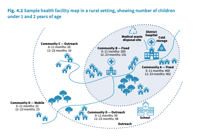
The guide advises focusing on two levels of catchment area maps for planning. The district map covers the whole district, showing each health facility's catchment boundary along with the features teams use to plan routine immunization across facilities:
- Schools, community centres, and landmarks where people gather
- Cold-storage and waste-disposal sites
- Rivers, flood zones during the rainy season, and the roads connecting facilities
Each health facility also keeps a map of its own catchment area, like the one above. This is the map marking every community that a health facility serves. And because one missed community can cause an outbreak to spread, WHO asks that the map include even more:
- Every village, street, and community in the catchment area, including new developments
- Informal, seasonal, and temporary settlements, including unauthorized dwellings
- Communities of migrant workers, pastoralists, and displaced persons
Planning teams confirm these boundaries with community leaders and administrative officials. WHO says to regularly update the map by drawing on microplans from supplementary immunization campaigns and local school enrollment lists.
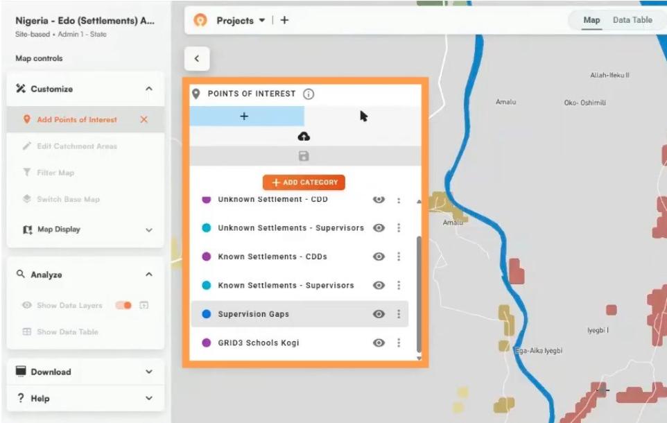
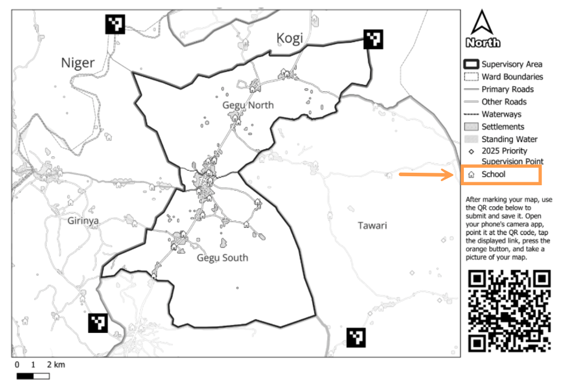
In the Crosscut App, teams add schools, vaccination posts, and other high-risk sites from those sources as points of interest inside each catchment area.
Adding population data and high-risk areas to catchment maps
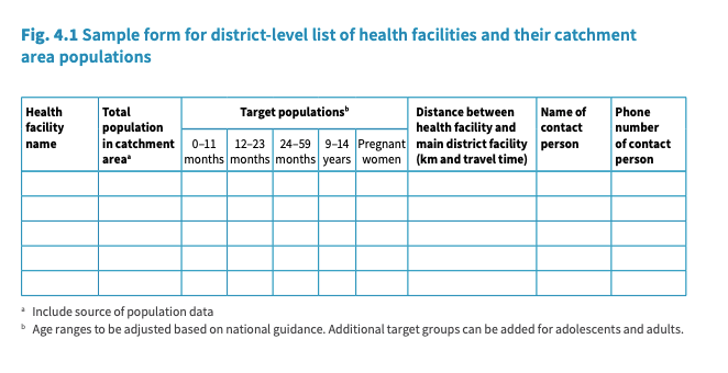
The guide asks for a table next to each map that lists the total population and target population by age group for every facility or community. The table should include distances, travel times, and a contact name. The facility map and the table together visualizes how many children each community has and how services will reach them on the map. Teams can also use data on zero-dose and under-immunized children to mark high-risk areas on the map.
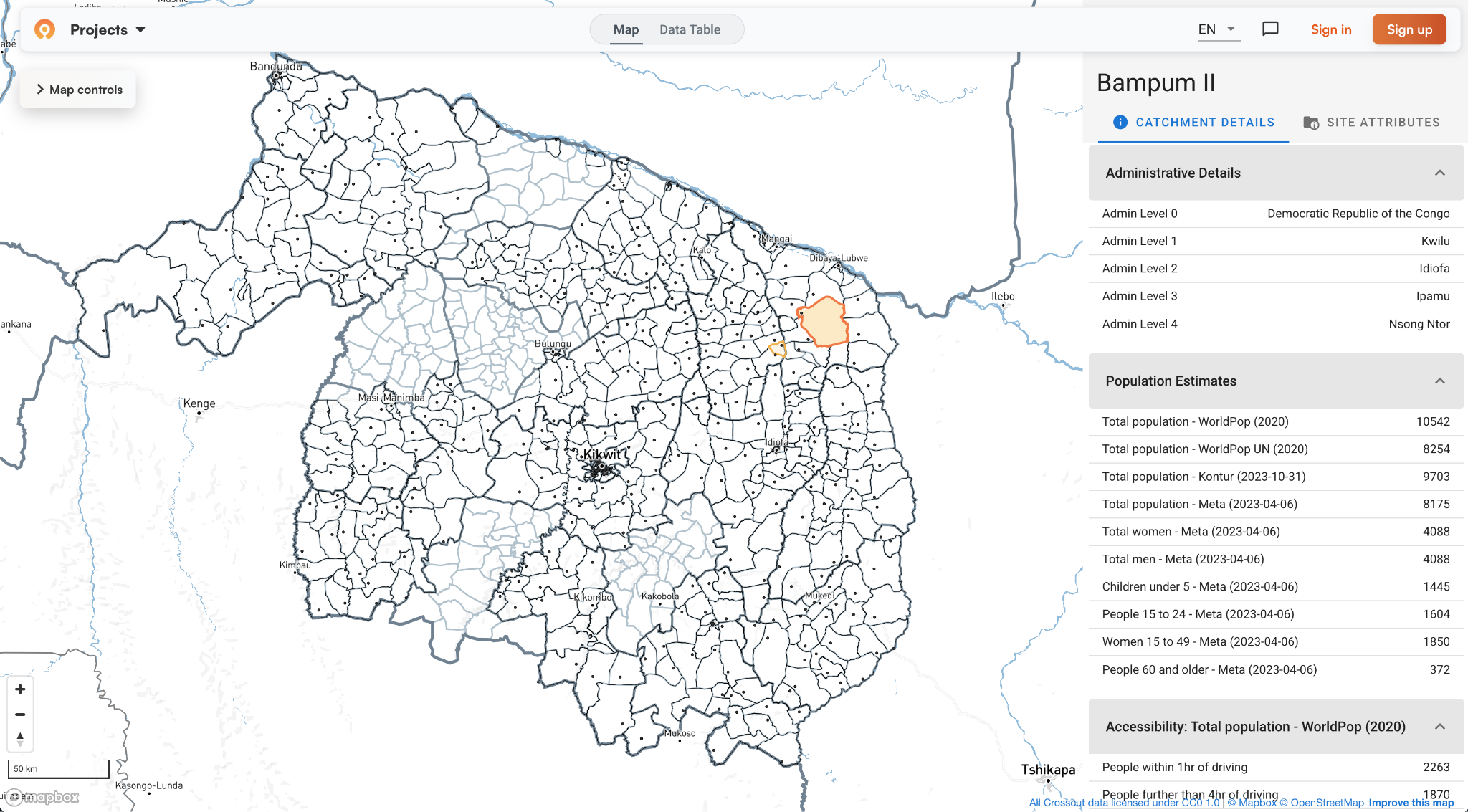
The source of target population figures varies by country, so the guide asks staff to triangulate the most up-to-date population data they can find. The Crosscut App attaches estimates from WorldPop, GRID3, Meta, and Kontur to every catchment area, along with a building count, so staff can check those sources against each other and against their own figures.
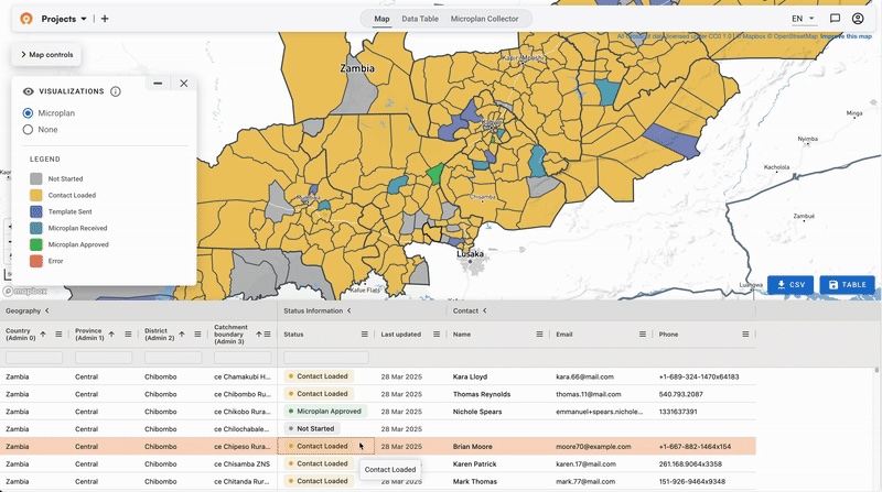
To fill in the table itself, the Microplan Collector sends it out as an Excel template, health facilities email it back, and the district gets one compiled dataset connected to its maps.
Why hand-drawn catchment maps fall behind
The guide only mentions using geospatial data and GIS tools once, likely because most maps are hand-drawn models from teams with no GIS experts on staff. A hand-drawn map usually meets every planning requirement, but WHO asks districts to review their microplans at least once a year, and more often when the population shifts or admin units change.
Redrawing a paper map by hand takes time, so the reviews often don't happen. But skipping them means new settlements never get added, and the population table no longer matches the map. The service labels fall behind as well. A community marked for outreach may now need more than a monthly visit, or a new road may put it within easy reach of the facility.
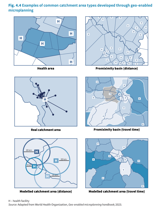
A digital map also makes comparisons that a paper map would struggle with. The guide shows several ways to draw a catchment area, from health areas set by the ministry to areas modeled on distance or travel time. Comparing a modeled catchment with the area a facility actually serves can show communities that live close to a facility but go elsewhere for care. Our guide to choosing the right catchment area mapping method covers when each approach fits.
However, staff still need a paper copy on the wall, since WHO asks every facility to make this a habit. The Crosscut App exports printable catchment area maps that run on any standard office printer, with the schools, health facilities, and other points of interest the team has marked. Staff can mark up the printed copy during a review or community meeting, photograph it, and send the changes back, so the next print reflects what the team learned.
Dividing catchment areas: Fixed, outreach, and mobile services
Every community on the sample facility map is labeled for fixed, outreach, or mobile services. That label tells staff how the community gets vaccinated. Fixed services run at the health facility for people who can travel there easily. Outreach teams hold sessions at a school or community site that staff can reach and return from in one day. Mobile teams cover communities too far for a day trip, which means they stay overnight.
To account for all of these communities, the guide asks each facility to plan with a mix of all three zones and to review that mix regularly.
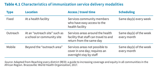
The guide also assigns rough distances on those tiers. Outreach sessions are often planned for rural communities five to fifteen kilometres from the facility. Communities more than ten kilometres out may need mobile services organized from the district level when transport or terrain make a same-day round trip impossible.
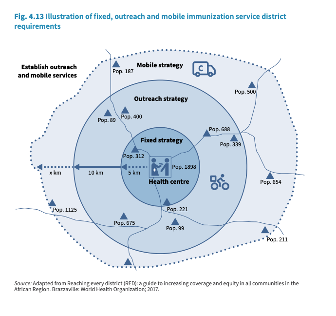
Distance rings are a stand-in for travel time
The guide points out the limit of measuring land by distance. Outreach has to account for seasonal rains or other seasonal changes, and mobile services exist for hard to reach locations. A community eight kilometers away on a flat road and one eight kilometres away across a river valley need different services, but a ring drawn at ten kilometers puts them in the same tier.
The real question and answer behind each ring is time. Staff need to know whether they can travel out and back in a day, and whether caregivers can reach the facility at all. Travel-time maps in the Crosscut App can answer that question by using roads, terrain, and slope instead of straight-line distance. Crosscut can draw the basic distance rings the guide describes, for teams that need to match national guidelines or compare the two. Teams using paper maps can utilize local knowledge and weather forecasts.

Distance rings can also overlook communities, since informal, seasonal, and temporary settlements often don't appear on facility lists. To plan services around each facility, teams use site-based maps. To find the communities those lists miss, they use settlement-based maps, which start from where people live. Travel time can be added to either, and the right catchment mapping method depends on the question the team is asking.
The same catchment maps can track disease surveillance
Module 6 of the guide asks staff to mark each reported case of a vaccine-preventable disease, such as measles, on the catchment maps they made for microplanning. When several cases appear in the same part of a catchment area, it usually means many children there are unvaccinated. The guide asks districts to compare these case reports with their coverage data from the past year, and to give extra support to the communities with the most cases.
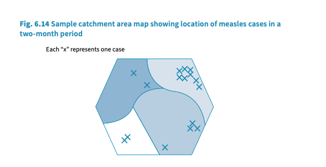
But a paper map only shows the communities someone remembered to draw, and each redraw loses the cases marked on the old one. Settlements left off the map never get their cases plotted, the district never sees the cluster, and each year's microplan starts over without the data from the year before. When case data is on a digital catchment map, teams can find outbreak risk in individual communities instead of waiting for district totals to rise.
Building and maintaining these maps in the Crosscut App
The Crosscut App consolidates every step of this process. Staff can upload a list of health facilities, and the free tool draws the catchment area for each facility within the district's administrative boundaries. You can choose from eight catchment algorithms, depending on whether you need facility catchments, settlement-based areas, or travel-time maps. Accessibility maps then show how long it takes to walk to the facility from each part of the catchment.
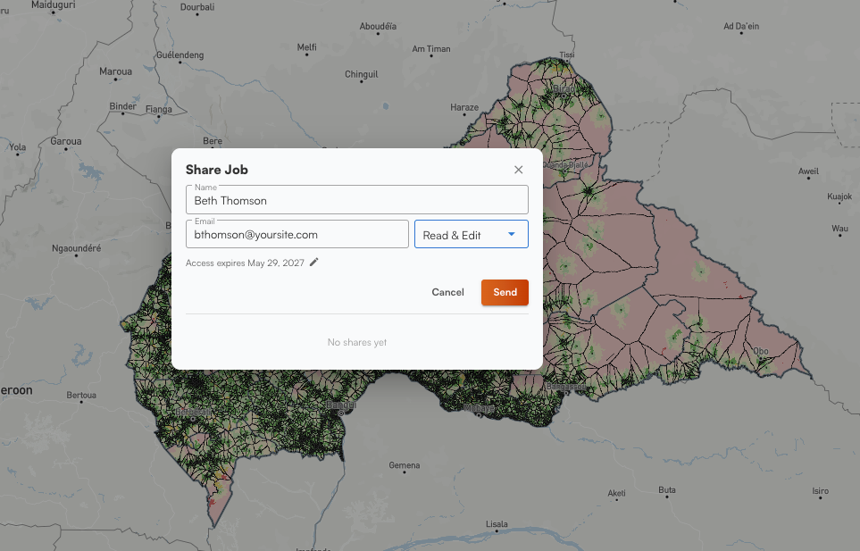
Population estimates, points of interest, and Microplan Collector submissions all going into the same catchment map as the boundaries. And editing a boundary after validating a new community only takes a few small edits. Teams can also share projects with an incoming officer and open the maps their predecessor maintained instead of starting over.
The Crosscut App is built for WHO immunization guidance
WHO asks districts to review their microplans at least once a year, and more often if local populations ebb and flow. Here’s where the Crosscut App meets those needs:
When teams can depend on the same map from one review to the next, each year starts from existing program data. Teams can keep the boundaries they validated with community leaders, refresh the population figures, and keep the corrections field staff made the year before.
The Crosscut App is free to use, you can build these maps yourself, and you can share them with your team. If you want help moving away from more redundant mapping strategies for your health campaign, our advisory team can provide that information to your team.
Frequently asked questions
What is a catchment area map in routine immunization?
A catchment area map shows every community a health facility is responsible for vaccinating, with the facility's service boundary drawn around them. WHO's Immunization in Practice guide asks every district and every health facility to display one, paired with a table of population and target age groups per community. Our explainer on what a catchment area is covers the concept from the ground up, and site-based catchment areas show how the boundary gets drawn around a facility.
How do you create a health facility catchment area map?
Start with a list of health facilities and their GPS coordinates, the administrative boundary your district reports against, and the best population figures available. WHO accepts hand-drawn maps, and many facilities still make them that way. The Crosscut App draws the same maps automatically from a facility list, attaches population estimates to each catchment area, and offers eight mapping methods for different program questions. Building the maps takes a few minutes with no GIS training required.
What should a health facility catchment area map include?
Every village, street, and community in the catchment area, including new developments, informal and seasonal settlements, and temporary dwellings. The guide also asks for cold-storage and waste-disposal sites, schools, landmarks where people gather, and a service label showing whether a fixed site, an outreach visit, or a mobile team reaches each community. Settlement-based maps help find the communities missing from existing lists, and points of interest put schools and other sites on the same map.
What is the difference between fixed, outreach, and mobile immunization services?
Fixed services run at the health facility on the same days every week, for communities with easy access. Outreach services run monthly at a school or community site that staff can travel to and return from in one day, typically five to fifteen kilometres out. Mobile services cover communities beyond a day's round trip and require an overnight stay by staff. Travel-time accessibility maps show which tier each community falls into on real roads and terrain rather than straight-line distance.
Do you need GIS software for geospatial microplanning?
No. WHO's guides accept hand-drawn maps, and Immunization in Practice is written for health workers rather than GIS analysts. Free browser tools now cover the mapping steps, from drawing facility catchment areas to editing boundaries after community validation, without QGIS or ArcGIS training. Hand-drawn maps are hard to keep current, because staff have to redraw the whole sheet each time a community changes.
Which WHO guides cover geospatial microplanning and catchment area mapping?
Each health program has its own guidance. Immunization in Practice and the RED strategy cover routine immunization, and WHO's immunization campaign field guide covers supplementary immunization activities. WHO and PAHO's NTD microplanning manual covers mass drug administration, the AMP toolkit covers bed net distribution, and WHO's indoor residual spraying manual covers spray campaigns. Our program-by-program reference collects all of them with links to every source document.
Related reading
Related Posts
What the AMP toolkit says about catchment area maps for ITN distribution campaigns

What WHO's immunization campaign guide says about catchment area maps
Madagascar's schisto MDA: Getting 19 district microplans into one place