
What the AMP toolkit says about catchment area maps for ITN distribution campaigns

A mass net campaign hands out long-lasting insecticide-treated nets to a whole population, house by house, in a country that usually runs one about every three years. Before a single net gets delivered, planners need to ensure that every household gets registered.
The Alliance for Malaria Prevention built its toolkit for insecticide-treated net (ITN) distributions around that registration exercise. They call household registration the key to the entire campaign. They suggest starting with microplanning and mapping, so the number of workers (whether they be community health workers or volunteers) and the number of days are enough to reach all areas and all households.
This article goes deeper into the net campaign section of our program-by-program microplanning guide. The guidance below comes from the AMP toolkit, with extra information about how to build these catchment area maps for free in the Crosscut App.
The mass ITN distribution relies on mostly hand-made maps
Microplanning happens health facility by health facility, usually about four to six months before the distribution dates. The AMP toolkit opens that exercise with a map of the health facility catchment area, and lists what belongs on it:
- Health outposts and private dispensaries.
- Other buildings where net distribution could take place, such as schools, community centres, or religious institutions.
- Areas that are difficult to access, such as riverine or mountainous ground.
- Population groups with known barriers to taking up health services (for example, refugees, nomadic or transient populations, or orphans and vulnerable children).
- Roads and paths, and the distances between landmarks.
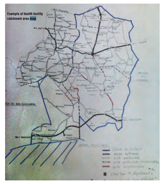
The toolkit's first example is a hand-drawn sheet from Côte d'Ivoire showing paved roads, dirt roads, major centres, and village locations.
A second example from Togo goes further, listing out the stretches between villages where access breaks down or where the team knows people can't traverse.
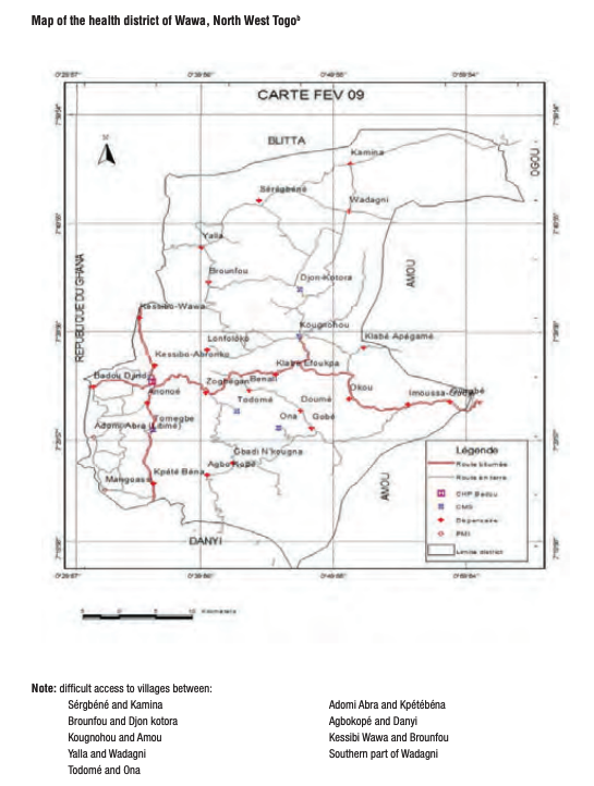
Both maps serve the same purpose. Central and regional teams arrive to support microplanning without knowing the area. The map tells registrars which villages a health facility covers and which will be hard to reach. The toolkit also tells programs to pull any catchment area maps that already exist, since those carry the scattered communities a fresh sketch tends to miss.

The challenge is that producing a map for every health facility in a country normally means a GIS unit or a consultant working through them one at a time, on a timeline the campaign does not control. The Crosscut App can streamline this process, because the tool comes preloaded with roads, settlements, and facility data, putting that timeline back with the program.
Distance between houses determines the worker count
Registration workload follows households rather than people. The toolkit puts a registrar at 25 to 30 households a day in urban areas and 20 to 25 in rural ones, and fewer wherever houses spread out. Programs add a 10 percent buffer to the household estimate to cover inaccurate population data, then staff supervision at one supervisor for every ten registrars in rural areas and one for every fifteen in urban areas.
Those registration rates are used to come up with three specific numbers a program has to commit to months ahead of the planned campaign:
- How many workers to recruit and train.
- How many days registration will run.
- How many nets to order, using the national figure for people per net.
All three calculate the estimated number of households as the denominator. The toolkit names that estimate as a major campaign risk, because census projections run high while average household size runs small, people move around, and campaigns end up short of nets.
Where the household estimate comes from
In the AMP toolkit workflow, the figure comes from two places: the national census projection for the health area, and the village list the health facility fills in on its demographic worksheet. Neither of those is visible on the hand-drawn map, so a facility can draw every village it serves and still be working from a population figure nobody has checked since the last census round.
The Crosscut App produces a second figure by building settlement-based catchment areas around each population centre and counting the buildings inside them from OpenStreetMap, Overture, and Google footprints. Those footprint datasets cover every structure in a settlement, including shops and animal shelters. We worked with Loamin on the PMI Evolve project to sort structures into residential and non-residential by size, shape, and proximity to roads and neighbours, reaching 85% accuracy across the whole country.
A program running both methods has two independent measurements on the same health area. The Crosscut App puts the building count alongside the population estimates in WorldPop, Meta, and GRID3, allowing users to assess each one in the context of the others rather than trusting any single one. When the models agree with each other and the health facility's figure comes in far below all of them, the health facility needs a follow-up call to figure out why.
If the estimate holds up, the catchment area map divides the registration work. Travel time layers mark the settlements furthest from a road, where a registrar covers fewer households a day, and fair supervisory areas split the health area into zones carrying similar workloads.
ITN distribution sites get chosen by distance
After registration is complete, households collect their nets at a distribution point. AMP's toolkit models these on the sites used for measles campaigns, because people already know where they are, and sorts them by distance from the health facility:
- Fixed sites at the health facility itself.
- Advanced sites in a school or other permanent structure, for people living five to ten kilometres out.
- Mobile sites for populations beyond ten kilometres, though nets are bulky enough that stand-alone campaigns rarely run them, and stock a community distribution point instead for several hard-to-reach villages within walking distance.
Each site's daily capacity determines how many sites a health area needs. An urban site team serves 300 to 400 people a day, a rural team anywhere from 150 to 200. The challenge is that a village five kilometres from the health facility can be two hours away depending on the terrain. The toolkit sets its site tiers in kilometres, but the people walking to those sites count in hours.
The Crosscut App measures walking and driving time from every village to every proposed distribution point, which shows you where the five and ten kilometre tiers break down. Two-tier catchments keep the plan organised the way the worksheets do, with each distribution point mapped inside the health facility catchment it belongs to.

What happens to the numbers after the map
The microplanning template is a spreadsheet. The toolkit describes a workbook covering population by village for each health facility catchment, personnel for registration and distribution, net pre-positioning, distribution sites with their distance from the facility, transport, and supervision circuits. Health facilities enter their household estimate and the formulas return the workers needed.
In most cases, health facility staff fill in their workbook and email it to the district lead. The district reviews the submissions, combines them, and emails them to the national team. The Crosscut App works inside that email to Excel pipeline instead of asking programs to replace it.
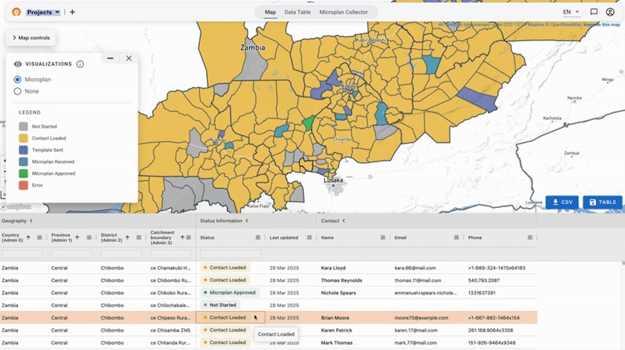
The Microplan Collector runs that exchange from one dashboard, sending each admin unit its own template and showing which units have submitted and what they reported. Every estimate gets compared against WorldPop, Meta, and GRID3, so a health area reporting 2,800 people where all three models show closer to 8,000 gets flagged for follow-up.
Comparing the planning estimate to what registration found
At the reporting stage, the toolkit asks campaigns to attach the final microplanning results to the campaign report and compare the macro and micro figures against each other. The macro figure is the national projection the campaign was budgeted on, and the micro figure is what registration actually found on the ground.
Malaria programs that keep the map, the registration counts, and the original estimate in one place can run that comparison directly. They finish the round holding a household figure grounded in a door-to-door count rather than a projection. Three years from now, the next campaign starts from that number instead of the census again.
Table: Satisfying what the AMP toolkit asks for
The core goal is getting every household registered
Workers in these malaria campaigns walk every street and knock on every door either way. The catchment area map conveys how many of them there are, how long they have, and whether anyone planned for the villages at the far edge of the health area.
AMP's microplanning guidelines come with completed templates from campaigns in Burundi, the Central African Republic, Ghana, Mozambique, and Uganda. We bundled them into one download so your workbook starts from a working example rather than a blank sheet. Our settlement catchments for Sub-Saharan Africa are published openly with population and building counts attached, free to download and use without attribution.
The Crosscut App is free to use for malaria net campaigns. Build the map for each health facility, export it as a printable PDF for the supervisors who need one, and skip the wait for updated catchment area maps. If you want help sizing a registration round or working through the data you already hold, our advisory team does that work with programs directly.
Frequently asked questions about mapping for net campaigns
What does the AMP toolkit say about mapping for a net distribution campaign?
The toolkit puts microplanning and mapping before household registration, and asks each health facility to prepare a map of its catchment area showing health outposts, candidate distribution buildings, difficult-access areas, roads and paths, and the distances between landmarks. Existing catchment area maps are the recommended starting point, since they already carry the hard-to-reach areas and scattered communities. If your program holds GPS coordinates for its health facilities, you can build those maps from the coordinates directly.
How many households can one registrar cover in a day?
The toolkit uses 25 to 30 households a day in urban areas and 20 to 25 in rural ones, based on about 15 minutes per household and a six to seven hour working day that includes walking between houses. Where the population spreads out, the number drops, which is why two health areas with identical household counts can need different numbers of workers. Splitting a health area into balanced registration zones keeps the difference from landing on one team.
How do you decide where ITN distribution points go?
Net campaigns usually reuse the sites people know from measles campaigns, tiered by distance from the health facility: fixed sites at the facility, advanced sites at a school or similar structure for people living five to ten kilometres out, and community distribution points for villages beyond that. An urban site team serves 300 to 400 beneficiaries a day and a rural team 150 to 200. Site-based catchment areas show what each proposed site would cover, and a travel time analysis shows which villages fall outside all of them.
How many nets does a campaign order?
Quantification runs off the household registration, using a national figure for people per net, commonly 1.8. The toolkit flags quantification as a major campaign risk, because census projections tend to overstate population while average household size tends to be smaller than predicted, which leaves campaigns short. Triangulating the submitted plans against WorldPop, Meta, and GRID3 catches the health areas where the figures disagree before the order goes in.
How do you find the communities a net campaign is about to miss?
Registration only reaches the households a plan knows about, so the gaps show up on the map before they show up in the coverage survey. Reading the ground as settlements rather than as a list of sites is what surfaces the hamlets nobody assigned, and our walkthrough on finding the communities a campaign is missing covers the steps.
Can you microplan a net campaign without GIS software?
Yes. The toolkit's own examples are hand-drawn, and the microplanning template is an Excel workbook. The mapping still has to show every village, including the ones that are hard to reach, so free browser tools like the Crosscut App cover the same ground without a GIS specialist and export printable maps for teams working on paper. Our guide to the mapping methods walks through which one fits which campaign. Registration data collected on a phone goes the same way: the Crosscut App pulls household records straight from CommCare and ODK or KoboCollect and pushes finished maps and estimates into DHIS2 for programs already working there.
Related reading
Related Posts
What WHO's immunization campaign guide says about catchment area maps

Madagascar's schisto MDA: Getting 19 district microplans into one place

What WHO's NTD microplanning manual says about operational maps
